A Practical Guide to React Native UI Components
Discover the best React Native UI components and libraries to build beautiful, high-performance apps. This guide makes UI development clear and simple.
By Paridhi
28th Sep 2025
Last updated: 9th Apr 2026
React Native UI components are the essential building blocks for your mobile app. Think of them as pre-made pieces—like text, images, and buttons—that you snap together to create every screen your users will see and interact with. For anyone involved in building a mobile product, understanding these components is the first step to turning an idea into a reality.
Understanding Your App Building Blocks
Building a mobile app might seem complex, but it boils down to arranging simple pieces in a smart way. React Native provides a starter kit of these essential pieces, known as Core Components. These are the fundamentals you'll use for everything, from a basic login screen to a dynamic, scrollable feed.
If you're a founder mapping out an MVP, a product manager writing specs, or a designer creating mockups, getting a handle on these components is invaluable. It demystifies the development process and creates a shared language for the entire team, making collaboration smoother and more effective.
The Three Most Essential Components
Let's focus on the three core building blocks. If you understand these, you can understand how almost any app screen is constructed.
-
<View>The Container: Think of a<View>as an invisible box. Its job isn't to be seen, but to hold and organize other components. You use it to group items, structure layouts, and define sections of a screen. For instance, a user's profile header might be a<View>containing their picture and name. -
<Text>The Words: This one is simple. Any time you see text on the screen—a button label, a user's comment, a headline—it’s a<Text>component. You can't just type words freely; they must always be wrapped in a<Text>tag to be displayed. -
<Image>The Visuals: Need to display a logo, a product photo, or a user's avatar? The<Image>component is what you'll use. It’s the dedicated tool for rendering any visual asset within your app.
These three components are deceptively powerful. Consider an app like Instagram: a post is just a <View> acting as a container, which holds an <Image> for the photo and several <Text> components for the username, caption, and comments.
From Simple Bricks to Complex Structures
The real magic of React Native is how these basic pieces combine. A "button," for example, isn't a single, rigid component. It's often just a <Text> component ("Sign Up") placed inside a styled <View> that's been programmed to respond to a tap. This compositional approach gives developers immense flexibility.
The core idea behind React Native is to provide a small set of simple, powerful tools that can be combined in endless ways. Instead of offering a clunky, pre-built component for every scenario, it gives you the fundamental bricks to build exactly what you need.
When Facebook released React Native in 2015, it was revolutionary. It allowed developers to write code once and deploy it as a true native app on both iOS and Android. The framework has since evolved from a few basics like <View> and <Text> to a rich ecosystem with high-performance lists and complex interactive elements.
Here’s a quick-reference table to help bridge the gap between technical and non-technical team members.
Your Core React Native Component Toolkit
| Component | What It Does (Simple Analogy) | Common Use Case |
|---|---|---|
<View> | An empty, invisible box for organizing other items. | Creating screen layouts, grouping elements together. |
<Text> | A label for displaying any written words. | Showing usernames, article content, button labels. |
<Image> | A picture frame for displaying photos and icons. | User avatars, product images, logos. |
<ScrollView> | A long roll of paper that lets you see content that doesn't fit on the screen. | Displaying articles or terms of service pages. |
<TextInput> | A blank line on a form where the user can write something. | Login forms, search bars, comment boxes. |
<Button> | A simple, pre-styled clickable button. | Submitting a form or confirming an action. |
Grasping how these core pieces work is the key to everything else. Once your team is comfortable with them, you can more effectively discuss, design, and build the features your users will love.
Why Build Your UI with React Native

It’s one thing to understand the components, but why choose this approach in the first place? For founders, product managers, and engineering leads, the decision to use React Native UI components is a strategic one that directly impacts budget, timeline, and team efficiency.
The most significant challenge in mobile development is building a great app for both iOS and Android without doubling your work, your team, and your costs. React Native directly solves this problem by allowing your team to build a single application that runs natively on both platforms.
This "write once, run anywhere" capability isn't just a technical detail—it’s a powerful business advantage. It means one development team can serve your entire user base, whether they're on an iPhone or an Android device. For lean teams and startups where every dollar and hour counts, this is a game-changer.
The Power of Code Reuse
The single biggest benefit of using React Native is code reuse. Instead of building two separate apps from scratch, developers write one codebase that powers the app's logic, layout, and user interface for both operating systems.
This high level of code sharing is the framework's core value proposition. Teams often find they can reuse 70-85% of their codebase across both platforms. This efficiency boost leads to faster development cycles and can reduce development costs by up to 40% compared to building two separate native apps. For a deeper dive, it's worth comparing React Native with native development approaches.
For your project, this translates to tangible benefits:
-
Faster Time-to-Market: Launch on both iOS and Android simultaneously, reaching your entire potential audience from day one.
-
Reduced Development Costs: A single codebase requires fewer developer hours and a smaller team, directly lowering your operational expenses.
-
Consistent User Experience: Your app looks and feels the same on every device, strengthening brand identity and making the experience more intuitive for all users.
One Team, One Product
Adopting React Native also transforms how your team operates. It eliminates the need for separate iOS and Android teams, which often work in silos with different tools, workflows, and release schedules.
With React Native, your entire mobile team unites around a single technology stack. This simplifies communication, streamlines the development process, and makes maintaining and updating the app far easier over the long term.
Instead of getting bogged down in platform-specific technicalities, your team can focus on what truly matters: building an excellent user experience. When a new feature is built or a bug is fixed, it's resolved once for everyone. This unified approach makes your team more agile and responsive, allowing you to iterate on your product faster—a crucial competitive advantage in any market.
Choosing the Right UI Component Library
Once your team is familiar with React Native's Core Components, you'll quickly realize that building every single button, form, and navigation bar from scratch is inefficient. It's time-consuming and pulls developers away from working on your app's unique features. This is where third-party UI component libraries become essential.
Think of these libraries as professionally designed, pre-built kits for your app. They provide a suite of ready-to-use React Native UI components that are already styled, accessible, and often include polished animations and platform-specific behaviors. For a founder, this means a faster path to a functional prototype. For a designer, it ensures a consistent visual system. For a developer, it's a massive productivity boost.
However, not all libraries are the same. Each has a distinct philosophy and feature set. The goal isn't to find the "best" library, but the one that best fits your project's specific needs, your team's skills, and your brand's identity.
Defining Your Project Needs
Before diving into options, gather your team and align on a few key questions. Answering these upfront will prevent costly mistakes down the line.
-
How much customization is required? Are you building a quick prototype where a standard look is acceptable? Or does your app need to adhere to a strict, pixel-perfect brand guide with custom fonts and interactions?
-
What is our team’s skill level? Some libraries are easy to start with but can be restrictive later. Others offer total control but have a steeper learning curve. Be realistic about your team's expertise.
-
What is our timeline? If speed is the top priority, choose a library with excellent documentation and a polished look out of the box. A library that requires extensive setup is a poor choice for a tight deadline.
Clarifying these points will help you filter the dozens of available libraries down to the two or three that are a genuine fit for your product.
This infographic illustrates how components are arranged using layout rules—a core concept in React Native's built-in system and most external libraries.
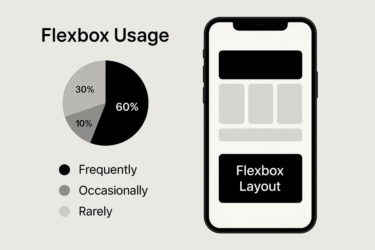
This visual demonstrates Flexbox, the layout system that powers how components are positioned on the screen. It's the technology that ensures your app looks great on any device, from a small phone to a large tablet.
Comparing Top React Native UI Libraries
Let's examine some of the most popular libraries in the React Native ecosystem. We’ll break them down by their ideal use case to help you match a tool to your project's goals.
The goal isn't to find the "best" library overall, but the best one for your project. A tool that's perfect for a fast-moving startup's MVP might be too restrictive for a large enterprise app with a unique brand.
Here's a high-level comparison to help your team choose the right UI component library based on project needs and key characteristics.
Comparing Top React Native UI Libraries
| Library | Best For | Styling Approach | Key Feature |
|---|---|---|---|
| React Native Elements | Rapid Prototyping | Simple Prop-Based Styling | Incredibly easy to use and consistent across platforms, making it great for beginners and fast builds. |
| NativeBase | High Customization | Utility-First CSS | Highly themeable and accessible, it's built for projects that need to enforce a strict design system. |
| UI Kitten | Brand Consistency | Theme-Based Styling | Comes with built-in light and dark modes and is designed around a central theme file, perfect for brand-centric apps. |
| React Native Paper | Material Design Apps | Follows Google's Material Design | If you want your app to have a native Android look and feel everywhere, this is your best bet. |
While these libraries dramatically accelerate development, you can push the velocity even further. Many teams use a library as a foundation and then build custom UIs for key screens. This is a workflow where tools like RapidNative shine, turning simple prompts directly into clean, production-ready component code.
Ultimately, choosing a library is a significant decision. The best advice is to build a small prototype screen with your top two choices. A hands-on test is the most effective way to see which one truly aligns with your team's workflow and your product's vision.
Styling and Theming Your Components
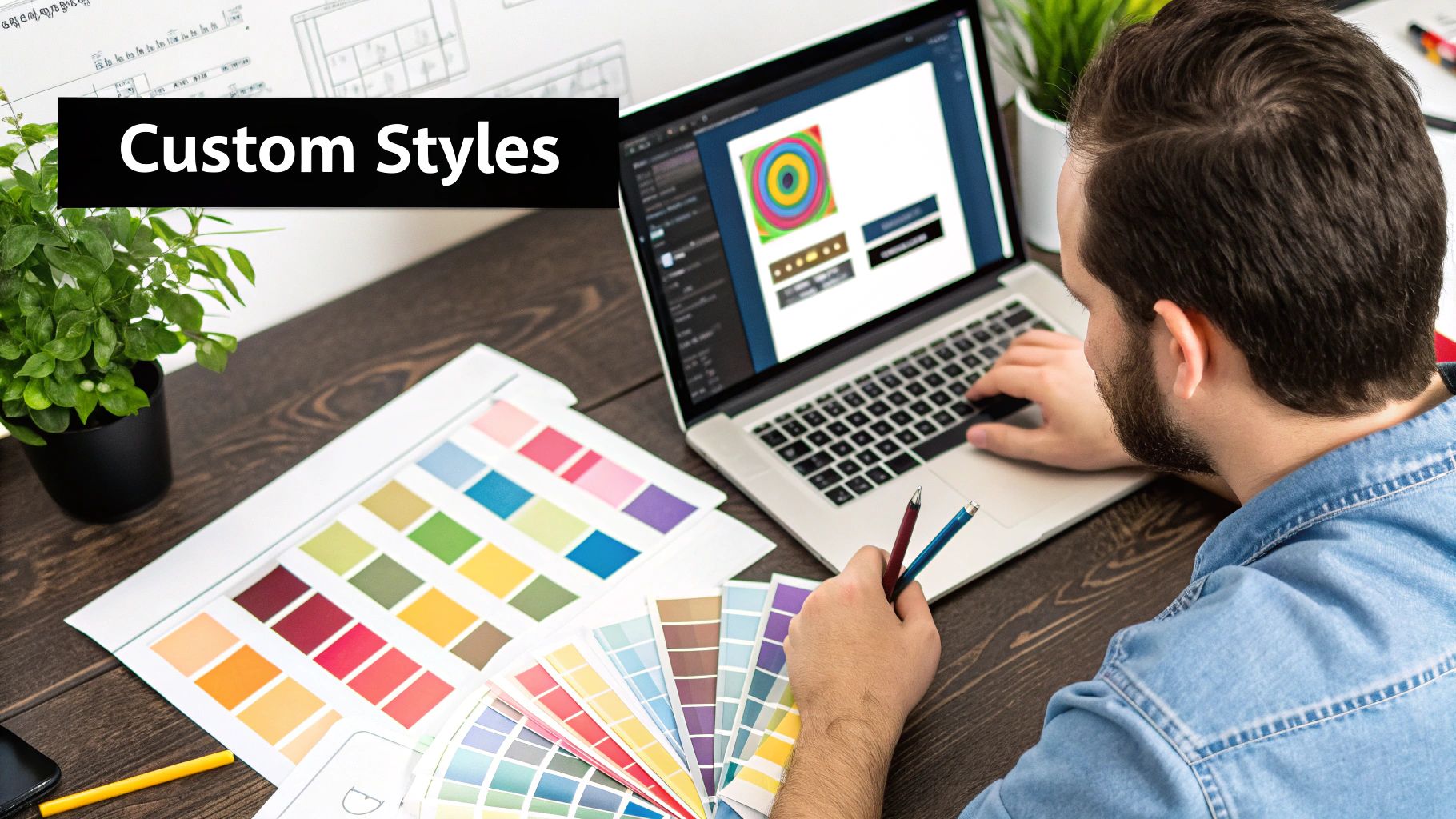
Selecting a component library is a great first step, but what makes an app feel polished and professional is a cohesive visual identity. This is achieved through styling and theming—the process of defining your app's visual DNA, including its colors, fonts, spacing, and component styles, to ensure every screen feels unified.
For designers, this is how a brand guide comes to life in a digital product. For developers, it’s about writing maintainable code that avoids a tangled mess of one-off styles. Neglecting a proper theming strategy often leads to inconsistent UIs and costly redesigns down the road.
A smart theming strategy makes future updates simple. For example, if your company rebrands with a new primary color, a well-structured theme allows you to update a single line of code. Instantly, every button, header, and icon across the app reflects the change. Without a theme, a developer would have to manually find and replace hundreds of individual style properties.
The Power of StyleSheet
React Native provides a core tool called StyleSheet for this purpose. While it’s possible to style components by passing a style object directly as a prop (known as "inline styling"), using StyleSheet.create is the recommended practice for a key reason: performance.
When you use StyleSheet, React Native sends your style definitions to the native side of your app just once. This optimization prevents the app from creating and passing a new style object every time a component re-renders, resulting in better performance, especially on complex screens or long lists.
Think of StyleSheet as a tool that both improves performance and organizes your code. By separating styles from component logic, you make both easier to read, debug, and maintain. It’s a simple practice that pays significant dividends.
This separation of concerns also helps non-technical team members review visual code more easily and keeps your component logic focused on its functionality.
Building a Central Theme File
The most effective way to manage your app’s visual identity is to create a central theme file. This is essentially a JavaScript object that stores all your design tokens—the specific, named values for colors, fonts, and spacing that constitute your brand.
Here’s a simple example of what a theme file might look like:
// theme.js
export const colors = {
  primary: '#4A90E2',
  secondary: '#50E3C2',
  text: '#333333',
  background: '#FFFFFF',
};

export const typography = {
  h1: {
    fontSize: 24,
    fontWeight: 'bold',
  },
  body: {
    fontSize: 16,
    lineHeight: 24,
  },
};

export const spacing = {
  small: 8,
  medium: 16,
  large: 24,
};
By creating this single source of truth, you ensure visual consistency across the entire application. When a developer needs to style a new component, they don’t guess the hex code for your brand's primary blue; they import it directly from the theme.
Applying Your Theme in Practice
Let’s look at a practical "before and after" example with a simple card component.
Before (Hardcoded Styles)
This works, but it's brittle. If the primary brand color changes, you have to manually find and replace '#4A90E2' everywhere it appears.
import { View, Text, StyleSheet } from 'react-native';

const Card = ({ title, content }) => (
  <View style={styles.card}>
    <Text style={styles.title}>{title}</Text>
    <Text style={styles.content}>{content}</Text>
  </View>
);

const styles = StyleSheet.create({
  card: {
    padding: 16,
    backgroundColor: '#FFFFFF',
    borderRadius: 8,
  },
  title: {
    fontSize: 18,
    fontWeight: 'bold',
    color: '#4A90E2', // Hardcoded color
  },
  content: {
    fontSize: 14,
    color: '#333333',
  },
});
After (Using a Theme File)
By importing values from our theme.js file, the component becomes more robust and easier to update. The styles are now connected to your design system, not just arbitrary values.
import { View, Text, StyleSheet } from 'react-native';
import { colors, typography, spacing } from './theme'; // Import theme

const Card = ({ title, content }) => (
  <View style={styles.card}>
    <Text style={styles.title}>{title}</Text>
    <Text style={styles.content}>{content}</Text>
  </View>
);

const styles = StyleSheet.create({
  card: {
    padding: spacing.medium, // Using theme value
    backgroundColor: colors.background, // Using theme value
    borderRadius: spacing.small,
  },
  title: {
    fontSize: 18,
    fontWeight: 'bold',
    color: colors.primary, // Using theme value
  },
  content: {
    ...typography.body, // Spreading typography styles
    color: colors.text,
  },
});
This structured approach is critical for scaling a mobile product. It empowers your team to build beautiful, consistent React Native UI components that are as easy to maintain as they are to create.
How AI Tools Are Changing the Game for UI Development
Building beautiful, consistent React Native UI components is one challenge; building them quickly is another. Even with the best component libraries and a solid theming system, a significant amount of developer time is spent manually translating designs from a tool like Figma into code. AI-powered tools are now emerging to compress that entire workflow from days into minutes.
This evolution means that anyone on the product team, regardless of their coding expertise, can now generate high-quality, production-ready code from a simple text description or a design file. These tools close the gap between an idea and a functional component, helping teams ship features faster without sacrificing quality.
From Prompt to Production Code
Consider this common scenario: a product manager has an idea for a new user profile layout. The traditional process involves writing a detailed spec, creating a ticket, and waiting for an engineer to build it. Now, they can simply describe it.
Using a tool like RapidNative, they can type a prompt like, "Create a user profile card with a circular avatar on the left, the user's name and handle next to it, and a follow button on the far right." In seconds, the tool generates the complete React Native code. This isn't just a static image; it's real, functional code that automatically adheres to the project's existing theme and style guide.
This new workflow offers clear advantages:
-
Massive Time Savings: The tedious back-and-forth between design and development for common UI elements is virtually eliminated.
-
Best Practices Built-In: AI tools are trained to produce clean, modular code that is already optimized for performance and accessibility.
-
Empowers the Whole Team: Founders, designers, and PMs can experiment with UI ideas directly, freeing up developers to focus on complex business logic and architecture.
A Real-World Example
Imagine a startup needing to build a new onboarding flow quickly to gather user feedback. The designer has completed the mockups in Figma, and the timeline is tight.
The traditional approach would require a developer to painstakingly code each screen, meticulously matching the Figma file pixel by pixel. With an AI tool, the team can import the Figma designs and receive fully coded React Native screens, complete with navigation, in a fraction of the time.
This fundamentally changes the speed of iteration. If user feedback suggests a button should be a different color or a layout needs adjustment, the change can be made with another simple prompt instead of initiating a new development cycle.
This allows teams to prototype, test, and validate ideas at a pace that was previously unimaginable. Building React Native UI components evolves from a purely technical task into a collaborative, creative process that the entire team can participate in.
Common Questions About React Native UI
As teams begin working with React Native UI components, a few key questions often come up. This FAQ provides clear, practical answers for founders, designers, and developers alike.
How Do React Native Components Compare to Native iOS and Android Components?
Think of React Native components as skilled interpreters. When a developer uses <Button>, React Native instructs the device to render its own native, platform-specific button—not a web-based imitation.
This means your app gets the genuine look, feel, and performance of a native application. While you may not find every obscure native control out of the box, all essential UI elements are covered, and the vast open-source community has likely built anything else you might need.
Can I Mix Custom Designs with a Pre-Built UI Library?
Absolutely. In fact, this is the standard approach for most professional app development. Popular component libraries like NativeBase or UI Kitten are designed to be customized and extended.
This hybrid model offers the best of both worlds. You can use the library's pre-built components to quickly assemble standard parts of your app (like forms and modals), and then build your own custom components for the unique, brand-defining features. It strikes the perfect balance between development speed and a distinct user experience.
Is It Hard to Create Our Own Reusable Components?
Not at all—this is a core strength of the React paradigm. If your team finds itself repeatedly building the same user profile card, you can encapsulate that design into a single, reusable <ProfileCard> component.
Creating your own library of reusable components is a best practice for any serious project. It makes your codebase cleaner, easier to update, and dramatically accelerates future development as you can simply reuse your custom-built pieces.
This modular approach ensures consistency and saves a tremendous amount of time that would otherwise be spent on repetitive coding.
How Does React Native's Market Position Affect My Project?
React Native is not a niche framework; it's one of the most popular technologies for building mobile apps today. Backed by Meta, it's used in production by major companies like Microsoft, Shopify, and Tesla.
For your project, this means you are choosing a mature technology with a large, active community that continuously builds tools, fixes bugs, and offers support. This strong market position reduces project risk by ensuring access to a large talent pool of developers, a rich ecosystem of libraries, and the confidence of long-term stability. If you have more specific questions about how this technology can fit into your project, feel free to contact our team for a consultation.
Ready to build your app?
Turn your idea into a production-ready React Native app in minutes.
Free tools to get you started
Free AI PRD Generator
Generate a professional product requirements document in seconds. Describe your product idea and get a complete, structured PRD instantly.
Try it freeFree AI App Name Generator
Generate unique, brandable app name ideas with AI. Get creative name suggestions with taglines, brand colors, and monogram previews.
Try it freeFree AI App Icon Generator
Generate beautiful, professional app icons with AI. Describe your app and get multiple icon variations in different styles, ready for App Store and Google Play.
Try it freeFrequently asked questions
What is RapidNative?
RapidNative is an AI-powered mobile app builder. Describe the app you want in plain English and RapidNative generates real, production-ready React Native screens you can preview, edit, and publish to the App Store or Google Play.
Can I export the code?
Yes. RapidNative generates clean React Native and Expo code that you can export at any time. No lock-in, no proprietary format. Hand it to your developers or keep building inside RapidNative.
Is RapidNative free to use?
Yes. You can build apps on the free plan with no credit card required. Paid plans unlock unlimited AI generations, code export, and direct publishing to the App Store and Google Play.
Do I need to know how to code?
No. Most users build apps by describing what they want in plain English. Developers can drop into the code whenever they want more control, but coding is optional.
How long does it take to build an app?
Most users have a working first screen in under a minute. A full MVP usually takes a few hours instead of the weeks or months traditional development requires.