Building Data-Driven Apps: Lists, Charts, and Dashboards
(156 chars):** Build data-driven mobile apps with lists, charts, and dashboards using AI. Prompt patterns, chart libraries, list scaling, and real backend integration.
By Rishav
21st Jul 2026
Last updated: 21st Jul 2026
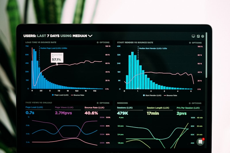
Most tutorials on building a data-driven mobile app show you how to render a FlatList with three items and call it a day. Real apps are messier. They have thousands of rows, six kinds of chart, live data that keeps changing, and a stakeholder who wants a new KPI added by Friday.
If you're building on top of an AI mobile app builder, the interesting question isn't "can I make a chart appear on screen?" — of course you can. The interesting question is: what does the AI actually ship, and does it hold up when you push real data through it?
This guide walks through how to build data-driven React Native apps with RapidNative — the lists, the charts, the dashboards, and everything glueing them together. We'll cover the prompt patterns that produce good output, the libraries that come pre-wired, how mock data becomes a real backend, and the pitfalls to steer around.
What "data-driven" actually means on a phone
Before we generate anything, it's worth being precise about what we're building.
A data-driven mobile app is one where the UI is a function of a data source that changes — not a designed screen with pretty placeholder content. In practice that means four things have to work together:
- Lists that scroll smoothly through more items than fit on screen (using virtualization, not
.map()). - Charts that update when the underlying data changes, and don't lie about scale.
- A data layer — mock JSON, a real API, or a backend — that the UI reads from.
- A refresh model that decides when to re-fetch, when to cache, and how to handle loading and error states.
Any AI builder can produce screens that look like this. Fewer produce screens that behave like this. The gap between those two is where projects die.
The prompt patterns that produce good output
Most people prompting an AI to "build me a dashboard" get back a beautifully styled screen with three hardcoded cards and a chart made of magic numbers. That's a mockup, not an app. The trick is to describe the data model alongside the visual, so the generator has something to bind to.
Here's a prompt that gets you a screen. It's the kind of thing most people write:
"Build a fitness tracking dashboard with a weekly steps chart and a list of recent workouts."
And here's a prompt that gets you a working app:
"Build a fitness tracking dashboard. The data model has a
Workoutentity with fields: id, date, activityType (running/cycling/walking/strength), durationMinutes, caloriesBurned, distanceKm. The dashboard has three KPI cards at the top showing total workouts this week, total minutes, and calories burned. Below that, a bar chart of daily calories for the last 7 days. Below the chart, a scrollable list of recent workouts sorted by date descending, each row showing activity icon, duration, distance, and calories. Include mock seed data with 30 workouts across the last 30 days."
The second prompt is longer, but it does the AI's thinking for it. It names the entity, defines the fields, describes the widgets, and asks for seed data. What comes back is not a screenshot — it's a screen wired to a real (in-memory, initially) data model that you can iterate on.
The same pattern works whether you're describing an inventory tracker, a sales dashboard, a habit tracker, or a health monitor. Describe the shape of the data, not just the shape of the screen.

What ships out of the box
When RapidNative generates a data-driven app, it doesn't hallucinate a chart library — it picks from a curated set that's already installed and tested in the generation templates. Knowing what's in the box helps you write better prompts.
For lists, generated code uses React Native's built-in FlatList for anything longer than a handful of items. The system prompt explicitly instructs the model to prefer FlatList with numColumns and columnWrapperStyle for grids, because virtualization is the difference between a smooth 10,000-row list and a scroll that stutters at row 200. For sectioned data (e.g., grouped by day, category, or letter), SectionList shows up automatically when the prompt describes that structure.
For charts, the fullstack template ships with react-native-gifted-charts — a pure React Native charting library that renders line, bar, pie, and area charts without a WebView. The admin dashboard template pulls in recharts for web-side visualizations. Both come pre-styled to work with the app's theme, so a chart generated at midnight in dark mode still looks right at noon in light mode.
For data fetching and caching, the fullstack template includes @tanstack/react-query (React Query) — the de-facto standard for server state in React apps. When you ask the AI to fetch data from an API, what you get back is a useQuery hook, proper loading/error states, and automatic caching. Not a raw fetch in a useEffect with three race conditions.
For the backend itself, every generated fullstack app includes a real database, authentication, file storage, and realtime updates via Vibecode DB — the multi-backend abstraction that can swap between local SQLite, Supabase, and PocketBase depending on where the app is deployed. This is the difference between "here's a prototype with mock data" and "here's an app with a working backend on day one." We've written about how this works in Full-stack in one prompt if you want the deeper dive.
Building a KPI dashboard: a walkthrough
Let's build a real dashboard end-to-end. We'll do a simple sales analytics screen for a small ecommerce brand.
Step 1 — The prompt.
"Build a sales analytics dashboard. Data model: an
Orderhas id, orderDate, customerName, productName, category (electronics/apparel/home/beauty), quantity, unitPrice, status (pending/shipped/delivered/refunded). The screen shows: (1) four KPI cards at the top — total revenue this month, orders this month, average order value, and refund rate, each with a trend arrow vs last month; (2) a line chart of daily revenue for the last 30 days; (3) a pie chart showing revenue by category; (4) a searchable, filterable list of recent orders below. Seed with 200 orders over the last 45 days spanning all categories."
Step 2 — What happens next.
The generator plans the screen, decides which components to use, and streams the code back into the real-time preview. You watch the file tree grow: a Dashboard.tsx screen, a KpiCard component, a RevenueChart component, a CategoryChart component, an OrdersList component, and a seed.ts file with 200 fake orders. Each part is a real, exportable React Native component.
Step 3 — Iterate visually.
Now the interesting part. The KPI card looks fine but the trend arrow is showing next to the wrong number. You don't need to re-prompt from scratch. Point-and-edit lets you click the KPI card and say "make the trend arrow smaller and put it above the number instead of next to it". The AI changes just that component and the preview refreshes. Point-and-edit is what makes tuning a dashboard tolerable — the alternative is describing every micro-change in text.
Step 4 — Swap mock data for real data.
The seed data got you moving. Now you want to hit a real endpoint. You prompt: "Replace the seed data with a fetch to https://api.mybrand.com/orders?range=45d, returning JSON in the same shape as the current Order model. Handle loading and error states."
Because the components already read through a useQuery hook (or the equivalent context wrapper), swapping the data source is a single-file change. The chart, the list, and the KPI cards keep working because they were bound to the shape of the data, not to hardcoded values.

Lists at scale: from 20 rows to 20,000
The FlatList default is smooth up to a few hundred items. Past that, small choices start mattering.
Give every item a stable key. The generated code always sets a keyExtractor — usually keyExtractor={(item) => item.id}. Do not remove this because you "don't need it right now." Without a stable key, React re-renders the whole list on every state change and your scroll stutters.
Memoize row components. For lists with expensive rows (images, nested content, tap handlers), the generated renderItem function returns a component wrapped in React.memo. This means rows off-screen don't re-render when unrelated state changes.
Paginate large datasets. For anything beyond a few thousand rows, the generator will suggest paginating — either with onEndReached for infinite scroll or with explicit page controls. Ask the AI to "add infinite scroll pagination that loads 20 more items when the user scrolls to the bottom" and it will wire up onEndReached, onEndReachedThreshold, and a footer loading spinner in the right places.
Handle empty and error states. A list that shows nothing when the data is empty looks broken. The generated code includes ListEmptyComponent — usually a friendly illustration and a suggested action — because the system prompts explicitly instruct the model to handle empty states. Same for loading skeletons and error retry buttons.
Here's the shape of what comes out for a paginated list, roughly:
<FlatList
  data={orders}
  keyExtractor={(item) => item.id}
  renderItem={({ item }) => <OrderRow order={item} />}
  onEndReached={loadMore}
  onEndReachedThreshold={0.5}
  ListEmptyComponent={<EmptyState message="No orders yet" />}
  ListFooterComponent={isFetching ? <ActivityIndicator /> : null}
  refreshControl={
    <RefreshControl refreshing={isRefreshing} onRefresh={refresh} />
  }
/>
That's not glamorous code, but it's the right code — and it's what actually holds up on a real device with a real dataset.
Charts that don't fake it
A common failure mode for AI-generated dashboards: the chart looks great, but the axis labels are wrong, the scale is deceiving, or the data being plotted is a static array that doesn't match what the list shows. Data drift between the "chart source" and the "list source" is one of the fastest ways to lose stakeholder trust.
The fix is architectural: compute chart data from the same source that feeds the list. When you prompt RapidNative, describe it this way:
"The revenue chart and the orders list should read from the same
ordersarray. The chart's Y-axis is total revenue per day, grouped by orderDate. The list is the same orders sorted by orderDate descending."
Now the chart and the list can never disagree, because they're derived from a single source of truth. If the user filters the list to a category, the chart re-aggregates and updates too.
The generated code uses useMemo for the aggregation so the chart doesn't re-compute on every render:
const dailyRevenue = useMemo(() => {
  const buckets = new Map<string, number>();
  for (const order of orders) {
    const day = order.orderDate.slice(0, 10);
    buckets.set(day, (buckets.get(day) ?? 0) + order.unitPrice * order.quantity);
  }
  return Array.from(buckets, ([date, value]) => ({ date, value }));
}, [orders]);
This is the pattern the AI reaches for by default — not because it's showing off, but because that's what's in the system prompts and templates it was trained against.
For chart types, most dashboards need only three: line/area for time series, bar for comparisons across categories, and pie/donut for share-of-total. Pick the right one and don't over-decorate. Every color you add is a piece of information you're asking the reader to remember.

From prototype to production
At some point, the app stops being a prototype and starts being something users depend on. A few things change at that boundary.
Real backend, not mock JSON. The Vibecode DB that ships with fullstack projects gives you tables, auth, file storage, and realtime out of the box, so the transition is usually a config change rather than a rewrite. For teams that want to point at their own Supabase, Firebase, or a custom REST/GraphQL API, prompt the change and it re-wires the fetching layer.
Auth on the data. A dashboard for one user is easy. A dashboard where every user sees their own data is a permissions problem. Ask the AI to "scope all queries to the current user's teamId" and it threads the auth context through the query hooks. Don't skip this — it's much easier to add row-level security while you're building than to retrofit it after launch.
Performance on real devices. Test on a mid-range Android with real network latency, not just an iOS simulator with local mock data. RapidNative includes a QR-code preview flow that runs the app inside Expo Go on your actual phone — see Expo QR code — which is the fastest way to catch a chart that looks smooth on a MacBook and drops frames on a Pixel 4a.
Export and own the code. When you're ready to ship, export the full React Native project. You get the source code — screens, components, hooks, the data layer, everything — and you can push it to your own repo, run it locally, extend it in Cursor or VS Code, and ship to the App Store and Play Store. No vendor lock-in. No "we host your app" model.
People also ask
What's the best chart library for React Native in 2026?
For most apps, react-native-gifted-charts is the sweet spot: pure React Native (no WebView), lightweight, and supports the common chart types with sensible defaults. victory-native (with Reanimated + Skia) is more capable if you need custom interactions or animated transitions. react-native-chart-kit is fine for very simple use cases. RapidNative's fullstack template picks gifted-charts because it hits the 80/20 without dragging in native dependencies.
How do I connect a React Native app to an API?
The modern answer is TanStack Query (React Query). It gives you useQuery for reads and useMutation for writes, with caching, retries, and refetch-on-focus built in. Wrap your app in a QueryClientProvider at the root, then any component can pull data with a one-line hook. RapidNative-generated fullstack apps set this up automatically.
Can I build a dashboard without writing code?
Yes — if you can describe what you want in plain English and iterate visually. Ask for the data model, the widgets, and how they should interact. Use point-and-edit to refine the UI. When you're happy, export the code and hand it to a developer to review before you ship — the generated code is production-ready, but a human review at the boundary is always worth doing.
Why do my charts and list show different numbers?
Because they're reading from different data sources. Rewire both to read from a single array (or a single query result) and derive the chart values with useMemo. Never let the chart and the list have independent "truths" — that's how you end up with a dashboard nobody trusts.
How much does it cost to build a dashboard app?
A rough answer: agencies quote $30,000–$80,000 for a mid-complexity data-driven mobile app; an in-house team is 6–10 weeks. With an AI builder, most teams have a working prototype in a day and a shippable app in a couple of weeks — the 3-year TCO breakdown has the full comparison.
The takeaway
Building a data-driven mobile app with lists, charts, and dashboards used to mean either hiring a team or spending six weekends learning React Native. It doesn't anymore. What it takes now is a good prompt (describe the data, not just the screen), a builder that ships the right libraries out of the box, and enough discipline to keep your chart and your list reading from the same source.
If you want to try it, start from any prompt at rapidnative.com — no credit card required. Describe a dashboard you've been meaning to build, watch it come to life in the preview, and if you like it, export the code and take it from there.
Ready to build your app?
Turn your idea into a production-ready React Native app in minutes.
Free tools to get you started
Free AI PRD Generator
Generate a professional product requirements document in seconds. Describe your product idea and get a complete, structured PRD instantly.
Try it freeFree AI App Name Generator
Generate unique, brandable app name ideas with AI. Get creative name suggestions with taglines, brand colors, and monogram previews.
Try it freeFree AI App Icon Generator
Generate beautiful, professional app icons with AI. Describe your app and get multiple icon variations in different styles, ready for App Store and Google Play.
Try it freeFrequently asked questions
What is RapidNative?
RapidNative is an AI-powered mobile app builder. Describe the app you want in plain English and RapidNative generates real, production-ready React Native screens you can preview, edit, and publish to the App Store or Google Play.
Can I export the code?
Yes. RapidNative generates clean React Native and Expo code that you can export at any time. No lock-in, no proprietary format. Hand it to your developers or keep building inside RapidNative.
Is RapidNative free to use?
Yes. You can build apps on the free plan with no credit card required. Paid plans unlock unlimited AI generations, code export, and direct publishing to the App Store and Google Play.
Do I need to know how to code?
No. Most users build apps by describing what they want in plain English. Developers can drop into the code whenever they want more control, but coding is optional.
How long does it take to build an app?
Most users have a working first screen in under a minute. A full MVP usually takes a few hours instead of the weeks or months traditional development requires.