Figma to Code: A Practical Guide for Mobile Teams
Master figma to code with a practical workflow turning Figma designs into production-ready apps—from design systems to automated conversion.
By Suraj Ahmed
19th Dec 2025
Last updated: 19th Dec 2025

Bringing a Figma design to life in a React Native app is one of the most critical handoffs in the mobile development cycle. This is where your visual blueprint becomes a tangible, interactive product in your users' hands. A smooth process leads to a pixel-perfect app that ships on time. A messy one creates a cascade of inconsistencies, bugs, and delays that can derail a project.
This guide is for founders, product managers, designers, and developers building mobile products. We'll skip the academic theory and focus on a practical, battle-tested workflow that turns stunning designs into production-ready code.
The Modern Blueprint for Figma to Code
Gone are the days when developers had to squint at a static JPEG, manually measure pixels, and guess at hex codes. The modern Figma to code workflow is a systematic, collaborative process that turns visual concepts into functional mobile apps. For founders and product managers, this means getting a working prototype into users' hands faster. For developers, it means ditching the tedious UI busywork and focusing on what matters: robust logic and solid architecture.
A sloppy handoff is a recipe for friction. When designers and developers aren't speaking the same language, the end product suffers. A well-defined blueprint solves this problem by creating a shared source of truth.
Why a Structured Process Matters
A streamlined workflow isn't just about speed—it's about creating a shared language. When your design system in Figma perfectly mirrors your component library in React Native, everyone is building from the same set of blocks.
This structured approach helps teams:
- Kill the Guesswork: With clear naming conventions and defined design tokens for colors, fonts, and spacing, developers know exactly what to build. No more ambiguity.
- Build with Consistency: Every button, card, and screen looks and behaves precisely as intended. The result is a cohesive, professional user experience.
- Ship Faster: Automating the initial translation of layouts and styles frees up your engineering team to tackle the hard problems instead of recreating basic UI.
Essentially, the modern workflow breaks down into three core phases: meticulous design preparation, smart code generation, and finally, human-led refinement to get it production-ready.
This visual guide breaks down the key stages in a successful Figma to code pipeline.
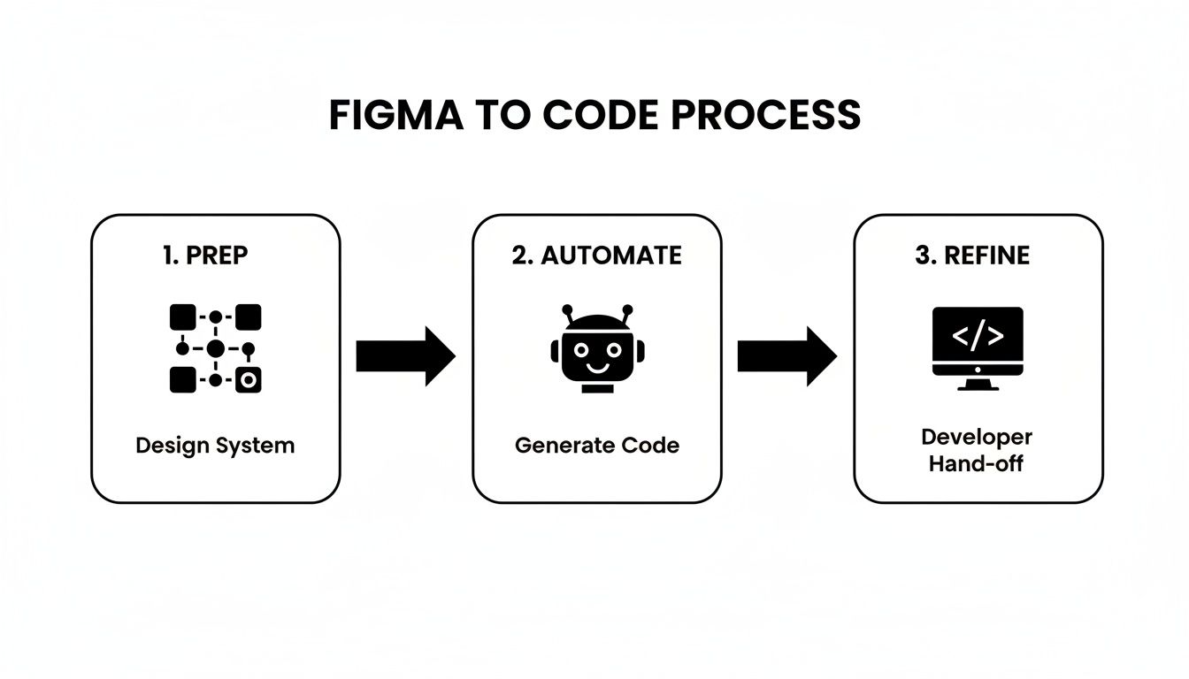
As the chart shows, a great handoff isn't a single event. It's a continuous loop where upfront preparation and final refinement are just as crucial as the conversion step itself. You can see how this blueprint translates into real-world applications by exploring examples in our portfolio of successful web projects.
Key Stages in the Figma to React Native Workflow
Here’s a quick summary of what this workflow looks like in practice, highlighting who is involved at each point to ensure a smooth transition from design to development.
| Stage | Primary Goal | Key Stakeholders |
|---|---|---|
| Design Prep & Handoff | Create a "developer-ready" Figma file with a clear design system, auto layout, and component variants. | UI/UX Designers, Product Managers |
| Token & Component Mapping | Translate Figma's design tokens (colors, typography) and components into a React Native component library. | Front-End Developers, UI/UX Designers |
| Automated Conversion | Use tools and plugins to generate initial boilerplate code from Figma layers and components. | Front-End Developers |
| Manual Refinement | Clean up generated code, implement state management, add business logic, and ensure code quality. | Front-End/Mobile Developers |
| QA & Testing | Validate the implementation against the original design on various devices and screen sizes. | QA Engineers, Developers, Designers |
This table underscores that turning a design into a functional app is a team sport, requiring tight collaboration at every turn.
The Rise of AI-Powered Conversion
This entire process is now getting a massive boost from AI. For instance, we recently saw a startup convert five complex landing page designs into production-ready React code in just 30 minutes using an AI tool. That’s an average of six minutes per page, allowing them to launch their product two full weeks ahead of schedule.
These tools are collapsing timelines from days into minutes, proving just how much efficiency is on the table.
When you treat the Figma file as the ultimate "source of truth," you create a powerful system where design updates flow into the codebase with almost zero friction. This is the key to building mobile products that are maintainable and can scale over the long term.
Getting Your Figma Designs Ready for Handoff
A smooth Figma-to-code process begins with the prep work. The success of the conversion is decided long before a developer ever sees the file. The way you structure, name, and organize your Figma designs has a massive impact on the quality and speed of the handoff. Skipping this prep is like building on a shaky foundation.
Think of your Figma file not as a visual mockup, but as the actual blueprint for the React Native app. Every choice, from naming a layer to setting up a color style, ripples through the entire development workflow. A tidy, well-organized file saves everyone time and headaches.
Start With a System, Not Just a Sketch
The biggest mental shift for designers is moving from "drawing pictures" to building a design system. This means using Figma's features to create a single source of truth that can be translated directly into code.
Get these fundamentals locked in from the start:
- Styles and Variables are Key: Every color, font, and spacing unit should be a Figma style or variable. Don't manually pick
#007AFFfor a button; apply yourcolor-primary-500style. This creates design tokens that map one-to-one with code. A developer can then definecolors.primary.500once in their theme file (e.g., intailwind.config.js) and reuse it across the app. - Embrace Component-Driven Design: Every reusable element—buttons, cards, input fields—should be a component with clearly defined variants. For example, your
Buttoncomponent should have variants forstate=default,state=disabled,type=primary, andtype=secondary. This structure perfectly mirrors how a developer builds a reusable<Button>component in React Native that accepts different props.
When you design this way, you're building a functional library of parts that behave like their code counterparts, making the whole Figma to code process feel natural and predictable.
Auto Layout Isn't Optional, It's Essential
If you take away one thing, let it be this: use Auto Layout for everything. It is the single most important feature for ensuring your designs translate into responsive mobile layouts. Why? Because it works just like CSS Flexbox, the backbone of styling in React Native. Using Auto Layout forces you to define how elements should grow, shrink, and wrap on different screen sizes.
When you meticulously apply Auto Layout, you're essentially pre-writing the layout logic for the developer. A well-structured frame with the right constraints and spacing directly translates into a clean
<View>with predictable Flexbox properties. This alone can save your engineering team hours of guesswork.
A screen built with manually positioned groups will inevitably break on different devices. A screen built entirely with nested Auto Layout frames will adapt fluidly, just like a well-coded React Native screen.
The Unsung Hero: Clean Naming Conventions
This might sound like a small detail, but a disciplined approach to naming your layers is a massive time-saver. Vague names like Frame 284 or Group 1021 are a developer’s nightmare; they force them to click through endless layers just to figure out what’s what.
Instead, settle on a clear naming system that describes what an element is and what state it's in.
| Bad Example | Good Example | Why It Matters |
|---|---|---|
Rectangle 5 | Button-Background-Primary | It describes the element's role and variant, making it instantly clear. |
Group 42 | Card-Header | It communicates the component's internal structure and hierarchy. |
Copy of Button | Button-State-Disabled | It defines the component's state, which maps directly to a prop in code. |
This simple habit makes your design file easy to navigate. When a developer inspects a component, the layer structure itself tells a story about how it should be built. A developer should be able to look at your layer tree and immediately understand the UI's architecture.
Mapping Design Elements to React Native and NativeWind
You've got a clean, developer-ready Figma file. Now it's time to turn those visual concepts into actual code. This is where we bridge the gap between design and development, mapping the logic of your design system directly onto a modern React Native stack. For this workflow, we'll use NativeWind, which brings the power and developer-friendly experience of Tailwind CSS into the React Native ecosystem.
Think of this step as creating a true "single source of truth." When a designer tweaks a color style in Figma, that change should flow into the code without tons of manual work. Getting this alignment right is the secret to an efficient Figma to code pipeline.

This synergy isn't just a "nice-to-have." Figma has reshaped how teams work, with its user base expected to grow from 4 million in 2022 to over 10 million individual users worldwide by 2025. Nearly 95% of Fortune 500 companies now rely on Figma to build a seamless connection between their design and engineering teams. For more details, check out this in-depth analysis of Figma's market statistics.
From Figma Styles to a Tailwind Config
The key to this translation process is design tokens. These are the named values for your visual design choices—your colors, font sizes, and spacing units. In the last section, we called these "Styles and Variables" in Figma. Now, we'll mirror them in our code.
In a NativeWind project, the tailwind.config.js file is where you define all your design tokens. The goal is simple: make this configuration file an exact reflection of your Figma design system.
Here’s a practical example:
Figma Color Styles:
primary/500=#4F46E5neutral/100=#F3F4F6neutral/900=#111827
Mirrored in tailwind.config.js:
// tailwind.config.js
module.exports = {
  theme: {
    extend: {
      colors: {
        primary: {
          500: '#4F46E5', // Corresponds to primary/500 in Figma
        },
        neutral: {
          100: '#F3F4F6', // Corresponds to neutral/100 in Figma
          900: '#111827', // Corresponds to neutral/900 in Figma
        },
      },
    },
  },
  // ... other config
};
This one-to-one mapping is a game-changer. A developer no longer has to guess hex codes. Instead of writing messy inline styles like style={{backgroundColor: '#4F46E5'}}, they can use a clean utility class: bg-primary-500. It’s not just neater; it's infinitely more maintainable.
Building a Component From Figma to React Native
Let's walk through building a simple Button component, translating its Figma variants directly into a reusable React Native component with props.
The Figma Component Setup:
Imagine a Button component in Figma with two properties:
- Type:
Primary,Secondary - State:
Default,Disabled
The designer uses the color styles we just defined to build these variants. The Primary button uses primary/500 for its background, while the Disabled state uses neutral/100.
The React Native Component in Code:
The developer's job is to build a <Button /> component that accepts type and disabled props to control its appearance. With NativeWind, the code is incredibly straightforward.
import { TouchableOpacity, Text } from 'react-native';
import { styled } from 'nativewind';

const StyledButton = styled(TouchableOpacity);
const StyledText = styled(Text);

const Button = ({ type = 'primary', disabled = false, title }) => {
  // Conditionally apply classes based on props
  const buttonClasses = [
    'py-3 px-6 rounded-lg',
    type === 'primary' && !disabled && 'bg-primary-500',
    type === 'secondary' && !disabled && 'bg-neutral-100',
    disabled && 'bg-neutral-100',
  ].filter(Boolean).join(' ');

  const textClasses = [
    'font-bold text-center',
    type === 'primary' && !disabled && 'text-white',
    (type === 'secondary' || disabled) && 'text-neutral-900',
  ].filter(Boolean).join(' ');

  return (
    <StyledButton className={buttonClasses} disabled={disabled}>
      <StyledText className={textClasses}>{title}</StyledText>
    </StyledButton>
  );
};

export default Button;
By translating Figma variants directly into component props, you create a shared language. A designer asking for a "secondary, disabled button" translates perfectly to
<Button type="secondary" disabled={true} />in the codebase. This clarity eliminates ambiguity and speeds up the entire development cycle.
This disciplined approach ensures your app’s UI is built from a predictable, maintainable set of rules that directly reflect the original design intent. For a deeper look at this entire workflow, check out our complete guide on converting Figma designs to React Native code.
Automating the Initial Code Conversion
Let’s be honest: manually translating a pixel-perfect Figma design into React Native code is a massive time sink. It's repetitive, error-prone work that burns out developers and stalls progress on features that actually matter. This is where automation tools come in, promising to do the heavy lifting of that initial figma to code conversion.

The market for these tools is diverse, from simple Figma plugins that generate single-component snippets to powerful platforms that convert entire screens. The goal isn't to find a magic button that builds your whole app. Instead, you want a tool that can reliably generate about 80% of the UI boilerplate, freeing up your team to focus on the crucial remaining 20%.
So, What Are Your Options?
Not all automation tools are created equal. They generally fall into a few categories, and picking the right one depends on your team's workflow and project complexity.
Here's a quick look at the common approaches:
- Figma Plugins (Snippet Generators): These live inside Figma and are great for quick tasks. You select a component, run the plugin, and get a code snippet. They're perfect for a button or an input field but don't handle entire screen layouts.
- AI-Powered Platforms (Full-Screen Converters): This is where things get interesting. Tools like Builder.io or Codia AI analyze your whole design to generate code for a full screen. They are incredibly useful for scaffolding layouts and getting a solid structural foundation in minutes.
- Developer-Focused CLI Tools: Some solutions are built for the terminal, integrating directly into a developer's local environment. These usually offer more configuration and are geared toward teams that want to bake code generation into their existing development pipeline.
This shift isn't just for small teams anymore. By early 2025, it's expected that 95% of Fortune 500 and 78% of Forbes 2000 companies will use Figma. They lean on AI plugins and services to keep their UIs consistent and pixel-perfect everywhere.
A Closer Look at Automation Tools
To help you navigate the options, here’s a table comparing the different types of tools. Each has its place, and the "best" one often depends on the specific job.
Comparing Figma to Code Automation Tools
| Tool Type | Best For | Common Limitations |
|---|---|---|
| Figma Plugins | Generating code for individual, simple components. | Can't handle complex layouts or screen-level logic. |
| AI Platforms | Rapidly scaffolding entire screens and basic component structures. | Code often needs significant manual refactoring for production. |
| CLI Tools | Integrating code generation into an existing CI/CD pipeline. | Steeper learning curve; less visual and more config-heavy. |
| RapidNative | Generating high-quality, production-ready React Native/NativeWind code. | Still in development (our Figma plugin is coming soon!). |
As you can see, the trade-off is usually between speed and control. A quick plugin might save you five minutes, but a more integrated platform can save you days of initial setup.
The Real Deal with AI Conversion
AI-powered platforms feel almost instantaneous. They're great at identifying layout structures, applying styles from a design system, and churning out JSX boilerplate for React Native. For a standard login screen or product grid, the results can be shockingly accurate.
But you have to know their limits. These tools are masters at translating the "what" (the visual design) but have zero understanding of the "how" (the app's logic).
The sweet spot for AI code generation is the initial structural scaffolding. It can build the house, but a developer still needs to do the plumbing and electrical—implementing state management, connecting to APIs, and wiring up user interactions.
In other words, don't expect these tools to write your Zustand stores or handle complex API data fetching. Their output is a launchpad, not the final destination. This is a core part of the modern app design to code workflow we see today. It’s a similar trend in other creative fields; for instance, the rise of AI photo editor online tools shows how automation is handling repetitive visual tasks, freeing up creators to focus on the bigger picture.
A Practical Way to Evaluate These Tools
When you're trying out these tools, focus on the quality and maintainability of the code. A tool that generates a tangled mess of unreadable code just creates more technical debt.
Here are a few questions to ask when trying a new tool:
- How's the Code Quality? Is it producing clean, readable JSX? Or a nightmare of nested views and inline styles?
- Does it "Get" React Native? Is it optimized for React Native and styling libraries like NativeWind? Generic HTML/CSS converters often produce code that doesn't feel right in a mobile context.
- Can I Build on It? How easy is it to take the generated code and add logic? The output should be modular and easy to refactor into reusable components.
Ultimately, the right tool is one that fits into your process without friction. It should handle the grunt work of UI transcription and let your developers get back to building a great, scalable application.
Refining Generated Code for Production
Automated tools are an incredible launchpad, but their output isn't the finish line. The code you get from a Figma to code process is a fantastic first draft. It nails the visual structure and styling, but it’s a developer's job to breathe life into it and make it robust, maintainable, and ready for the real world.
Think of it this way: the tool gives you a perfect kit of pre-cut parts. Now, you, the engineer, have to assemble them into a high-performance machine. This means structuring the code logically, separating concerns, and prepping it to handle real data and user interactions.
From Raw JSX to Reusable Components
The first step is to tackle the monolithic blocks of JSX that these tools often spit out. It's common to see an entire screen crammed into a single file. While it might look right on the simulator, it's a nightmare to maintain.
Your mission is to refactor this into a set of small, reusable components. For a mobile app, this is crucial. You want to break everything down to its smallest parts (like buttons and inputs) and then compose them into larger structures (like a search bar or a header).
- Before: A single
UserProfileScreen.tsxfile has everything—the avatar, user details, and action buttons all jumbled together. - After: The screen becomes a clean composition of imported components:
<Avatar>,<UserInfoBlock>,<ActionButton>, and<PostList>. Each lives in its own file, ready to be reused anywhere.
This practice, known as componentization, is fundamental to modern React. It’s what lets you update the style of your main button in one place (ActionButton.tsx) and see that change reflected across the entire app instantly.
Separating Logic from Presentation
Generated code often mixes visual layout with placeholder data. To make your app functional, you need to pull these apart. In React Native, a great way to do this is with custom hooks to manage state and business logic.
A "presentational" component should only care about how things look. It gets data and functions as props and renders the UI. A "container" component or a custom hook handles the messy part—fetching data, managing state, and responding to user input.
By isolating logic in custom hooks (like a
useUserProfilehook), you keep your UI components incredibly clean. The component itself doesn't need to know where user data comes from; it just knows how to display it. This makes your code so much easier to test, debug, and reason about down the line.
For example, a useUserProfile(userId) hook can handle fetching user data from an API, along with managing loading and error states. The UserProfileScreen component then just calls this hook and passes the resulting data to its presentational children. This is also where you would plug in a state management library like Zustand or Redux for any state that needs to be shared globally.
Establishing a Scalable Folder Structure
As your app grows, a messy folder structure will slow you down. While there's no single "right" way to organize files, a feature-based approach works exceptionally well for React Native projects.
Here’s a solid starting point that scales nicely:
- /src/components/: For shared, universal components (
Button.tsx,Card.tsx,Input.tsx). - /src/screens/: Holds the top-level component for each screen (
HomeScreen.tsx,ProfileScreen.tsx). - /src/features/: The real workhorse. Complex features get their own folder with their own components and hooks (
/src/features/authentication/,/src/features/chat/). - /src/hooks/: For custom hooks that are shared across multiple features (
useAuth.ts,useApi.ts). - /src/navigation/: All your React Navigation setup, stacks, and route configurations live here.
- /src/lib/ or /src/utils/: A home for helper functions and other miscellaneous utilities.
Organizing your project this way keeps related files together, making it intuitive for anyone on the team to find what they need. Investing time in these architectural patterns is what transforms a prototype into a professional-grade product built to last.
Validating the Final Build Across Devices
A design can look flawless in Figma, but the real moment of truth is when it lands on an actual device. This is the final and most critical stage of the figma to code journey: quality assurance. Cutting corners here is a surefire way to ship a buggy app and disappoint your users.
The mission is simple: ensure the build doesn't just look like the Figma design, but that it behaves correctly on every device. You need to confirm that layouts don't break on a small screen, buttons are easy to tap, and the app doesn't grind to a halt on older phones.

From Pixels to Performance
A solid testing plan goes beyond a quick visual check. To catch problems before your users do, your team—developers, designers, and product managers—needs to examine the app from every angle.
Here’s a practical checklist for testing:
- Visual Regression Testing: Automate this. Tools like Storybook can compare component screenshots against the original design, providing an excellent first line of defense for catching unintended UI changes.
- Functional Testing: Get hands-on and run through the core user flows. Can you sign up, log in, and make a purchase on a brand-new iPhone and a three-year-old Android?
- Device and OS Diversity: You have to test on real phones. Emulators are a great start, but they won't reveal performance hiccups or weird OS-specific bugs that only show up on physical hardware.
- Responsiveness and Adaptation: How does the UI handle different screen sizes, orientations, and accessibility settings? Check what happens when a user's name is much longer than your placeholder text—does it break the layout?
This thorough testing moves you beyond just aesthetics; it makes your app resilient. For a more structured approach, explore different user experience testing methods.
Emulators vs. Physical Devices
People often ask, "Can't I just use emulators?" The real answer is, you need both. Emulators are your best friend during development for quickly checking how a layout looks on different screen sizes.
But they don't tell the whole story.
Emulators are perfect for checking layouts and basic functionality. But for gauging real-world performance, touch accuracy, and network behavior, physical devices are absolutely non-negotiable. An animation that’s silky smooth on your powerful development machine might be a stuttering mess on an older, less powerful phone.
It's on a physical device that you'll catch subtle performance drags, memory leaks, and hardware-specific glitches. If buying a ton of devices isn't practical, cloud services like BrowserStack or Sauce Labs offer access to a huge farm of real hardware. For any product owner, this final validation isn't an expense—it's an investment in your app's quality and reputation.
Ready to build your app?
Turn your idea into a production-ready React Native app in minutes.
Free tools to get you started
Free AI PRD Generator
Generate a professional product requirements document in seconds. Describe your product idea and get a complete, structured PRD instantly.
Try it freeFree AI App Name Generator
Generate unique, brandable app name ideas with AI. Get creative name suggestions with taglines, brand colors, and monogram previews.
Try it freeFree AI App Icon Generator
Generate beautiful, professional app icons with AI. Describe your app and get multiple icon variations in different styles, ready for App Store and Google Play.
Try it freeFrequently asked questions
What is RapidNative?
RapidNative is an AI-powered mobile app builder. Describe the app you want in plain English and RapidNative generates real, production-ready React Native screens you can preview, edit, and publish to the App Store or Google Play.
Can I export the code?
Yes. RapidNative generates clean React Native and Expo code that you can export at any time. No lock-in, no proprietary format. Hand it to your developers or keep building inside RapidNative.
Is RapidNative free to use?
Yes. You can build apps on the free plan with no credit card required. Paid plans unlock unlimited AI generations, code export, and direct publishing to the App Store and Google Play.
Do I need to know how to code?
No. Most users build apps by describing what they want in plain English. Developers can drop into the code whenever they want more control, but coding is optional.
How long does it take to build an app?
Most users have a working first screen in under a minute. A full MVP usually takes a few hours instead of the weeks or months traditional development requires.