Convert Figma to React Native: A Practical Guide for Mobile Products
Discover practical methods to convert Figma to React Native fast. Learn manual setups, plugins, and AI tools with real examples and integration tips.
By Paridhi
18th Dec 2025
Last updated: 17th Feb 2026
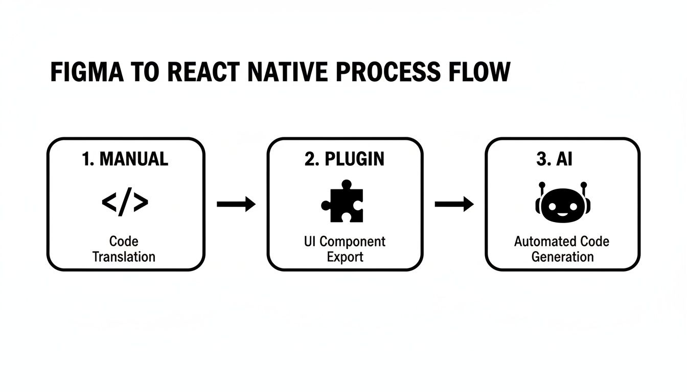
When you're building a mobile product and need to turn Figma layouts into React Native screens, you have three main options: hand-code components, visual plugins, or AI exporters. Hand-coding gives you total control over structure and styling but takes more time. Visual plugins like Visual Copilot speed up prototypes in minutes, and AI exporters such as Locofy AI can eliminate up to 80% of manual work by generating token-driven code.
Quick Answer For Figma To React Native Conversion
Each approach balances speed, setup effort, design fidelity, and cost:
- Handcrafted Coding: You build every component and style by hand. Ideal for small screen sets or custom state management, but expect days of work for complex layouts.
- Visual Plugins (for example, Builder IO's Visual Copilot): Export ready-to-use React Native components in minutes—great for rapid demos and prototypes.
- AI Exporters such as Locofy AI: Generate layouts with design tokens and animations baked in, cutting manual work by up to 80%.
In 2024, an industry study showed that AI-powered tools can speed up front-end cycles by 50–80%, shrinking the time you spend on hand-coding.
Breaking Down Each Approach
You choose based on deadlines, team size, and code standards. Handcrafting gives total freedom but can slow feature delivery. Plugins often deliver reliable exports—though you'll refine the output. AI exporters hit the sweet spot for speed, with a quick review step to polish generated code.
Handcrafting maximizes control at the expense of time, while plugins and AI streamline your path from design to code.
Comparison Of Conversion Approaches
| Approach | Speed | Setup Effort | Design Fidelity | Cost |
|---|---|---|---|---|
| Handcrafted | Slow | High | Excellent | Low |
| Plugin | Fast | Medium | Good | Medium |
| AI | Fastest | Low | Very Good | High |
This chart helps you pick the right fit by balancing delivery speed, upfront work, fidelity to design, and budget.
When To Choose Each Option
- Solo founders or PMs racing to validate UI often lean on visual plugins for quick mockups.
- Teams shipping complex animations or design systems choose AI exporters to generate polished, token-driven code.
- Projects with strict architecture or custom logic work best with handcrafted coding.
Next Steps For Integration
After exporting your React Native code:
- Run your app in Expo or your TypeScript setup.
- Test both iOS and Android simulators for layout drift or missing assets.
- Spot padding inconsistencies and font mismatches.
- Consider a mixed workflow: start with a plugin or AI export, then refine key screens by hand.
This keeps design fidelity high without blocking feature work as your app grows.
Preparing Figma Designs For Code Conversion
A tidy Figma file prevents headaches downstream. Clear naming, grouping, and token tagging save hours during export.
Grouping And Naming Layers
Many teams agree on a simple naming pattern like Button/Primary, Card/ProductDetail, Modal/Signup. Core practices:
- Use Figma's Rename Multiple Layers to enforce consistency.
- Tag colors, typography, and spacing as design tokens in the Styles panel.
- Mirror your component hierarchy in frames to make handoff intuitive.
When everything follows a clear scheme, exporting components becomes almost frictionless.
Auto Layout And Variants
Auto Layout keeps frames flexible and matches React Native's Flexbox. In practice:
- Apply Auto Layout (Shift+A) for horizontal or vertical flow.
- Tie padding and spacing to your token values for pixel-perfect accuracy.
- Create variants for states (hover, pressed, disabled) and drive them via props in code.
This approach keeps your components consistent and styles reusable.
Exporting Assets With Clarity
Slicing assets into dedicated frames avoids offset bugs on real devices. A routine:
- Make a slice frame named
Icon/HomeorImage/ProductHero. - Add scale suffixes (
@2x,@3x) to support Retina and higher-density screens. - Run SVGs through SVGO before exporting.
Consistent settings mean you won't chase missing or misaligned images during development.
This view shows grouped slices and token labels, making it clear what to export.
Documenting Reusable Components
A living style guide in Figma is your single source of truth. Teams often maintain a dedicated page with global components, usage notes, and snippet examples:
- Show real-world use cases, from simple form fields to complex cards.
- Annotate tokens and variants so tools auto-bind props to states.
- Add comments when a component needs manual tuning after export.
"A shared style guide cut our UI bugs by 60%, according to our dev lead."
Routine updates to this guide keep your components reliable and your token library airtight.
Selecting Styles And Color Palettes
Defining color swatches and typography styles upfront saves endless back-and-forth. Once you export these tokens as JSON or CSS, they drop right into your NativeWind config.
Checklist:
- Establish shared color styles for primary, secondary, and accent.
- Create text styles with sizes, weights, and line heights that mirror your TypeScript theme.
- Align token names between Figma and code to avoid translation errors.
When design and code speak the same language, your final build looks exactly as you planned.
Automating Conversion With Figma Plugins
Builder IO's Visual Copilot pulls selected artboards and spits out ready-to-use .tsx files complete with props and style tokens. This cuts manual coding and keeps everyone aligned on design tokens.
Installation And Setup
- Find Visual Copilot in the Figma Plugins directory and click Install.
- Authorize it to read your design tokens—colors, typography, spacing—and pin the plugin for quick access.
Map Styles To Theme
Connect your Figma styles directly to a NativeWind theme. The plugin UI offers a mapping table so you can:
- Align token names (for example, primary, secondary, accent) between Figma and code.
- Convert Figma's spacing values into your theme's padding and margin scale.
- Keep labels clear and consistent across projects.
Tweak Generated Code
After export, you'll see a structured folder with components and screens. Review it to:
- Rename dynamic props or state handlers to match your conventions.
- Remove unused variants or style tokens for a leaner codebase.
"We cut UI implementation time by 60% using Visual Copilot in one SaaS startup."
Import Into Your Project
Drag the generated folder into your React Native repo under src/components or src/screens. Then run:
yarn add react-native-svg
Install any other missing dependencies before your next build.
Keep these tips in mind:
- Organize code into separate folders for components, screens, and assets.
- Commit generated code to a dedicated branch to avoid overwrites.
- Review diffs in autogenerated files with your team before merging.
Get more details on Builder IO's blog on converting Figma to React Native. For deeper workflows, see our guide on design to code automation.
Next Steps And Tips
Automate style sync by integrating Visual Copilot into your CI pipeline. This ensures:
- Consistent code quality on every commit.
- Fewer surprises when design tokens update.
- A changelog of plugin versions to track changes.
Pair autogenerated components with manual tweaks on critical screens to keep code readable. Flag areas needing extra review using a comment tag like // REVIEW.
Leveraging AI For Code Export
Locofy AI reads your Figma frames, applies animations, breakpoints, and design tokens, then generates ready-to-use code in just a few clicks. Whether your designs are rough sketches or pixel-perfect comps, Locofy adapts automatically.
Getting started is straightforward: sign up for a free Locofy account, link your Figma file, and begin. The free tier covers basic projects; paid plans start at $29/month. For full features and pricing, check out this dev.to guide.
Locofy auto-assigns color tokens and flags naming collisions before you hit "Generate Code."
Configuring Plans And GitHub
Fine-tune breakpoints to mirror your design grid. Ready for dark mode? A single toggle applies night-friendly styles. Then link your GitHub repo and let Locofy create a feature branch for exports.
- Free Plan: Up to 3 projects with core token mapping and breakpoint support.
- Paid Tier: Starts at $29/month—unlock unlimited projects, advanced animations, and priority help.
- GitHub Integration: Detects merge conflicts and syncs branches with your mainline.
Teams see up to 90% fewer manual merges when they rely on Locofy's smart branching.
Troubleshooting Auto-Generated Code
Even solid exports need a quick review. Here's how to tackle common snags:
- Check component props to confirm they match your token naming.
- Adjust Figma layer names to avoid collisions.
- Compare artboards with device previews to lock down pixel accuracy.
Quick wins:
- Run screens in Expo Go to spot layout shifts.
- Add lint rules and CI checks for token mapping and style consistency.
- Handle fixes in a review branch before merging.
If you want more on design-to-code workflows, see this guide on RapidNative.
Validating Generated React Native Code
Generated code rarely ships perfectly on the first try. A few focused checks save hours later.
Reviewing Project Structure
Keep your folder layout in sync with Figma's screen hierarchy. In one app, reorganizing over 50 files cut namespace clashes and sped up onboarding.
- Ensure screens live under
src/screensand shared widgets insrc/components. - Stick to consistent file naming—
CamelCase.tsxthroughout. - Double-check asset imports so Metro never complains about missing images.
Testing UI Variations
73% of UI bugs arise from flex and pixel issues on different platforms. Running simulators on iOS, Android, and web catches quirks you'd miss in a desktop view.
Snapshot tests with Jest and React Native Testing Library help too:
import renderer from 'react-test-renderer';

test('Card matches snapshot', () => {
  const tree = renderer.create(<Card title="Welcome" />).toJSON();
  expect(tree).toMatchSnapshot();
});
Add these to your CI pipeline for instant feedback on visual shifts.
Debugging Style Mismatches
Compare generated padding or margins against Figma's Auto Layout specs when a button shifts. Then:
- Centralize misaligned values in a shared style file.
- Use NativeWind utility classes for consistent colors, spacing, and typography.
- Update
tailwind.config.jsso your theme matches the live Figma palette.
A quick token tweak fixed a stubborn 2px button offset across five screens in minutes.
| Figma Token | Theme Variable |
|---|---|
| Primary Color | colors.primary |
| Medium Spacing | spacing[4] |
| Heading Size | fontSize.lg |
Integrating Lint And CI Checks
Lint and CI guardrails stop syntax slips and style drift:
- Install ESLint plugins for React Native, enforce consistent import order.
- Add Prettier so every commit is auto-formatted.
- Fail builds on snapshot mismatches or uncovered cases.
You can also:
- Display badges in your README for passing tests and lint status.
- Use Husky Git hooks to run pre-commit checks locally.
- Parallelize UI tests in CircleCI or GitHub Actions across platforms.
Real-World Debugging Workflow
A missing-image error on Android turned out to be an uppercase filename. The fix:
- Rename the asset file to lowercase.
- Update the import path.
- Clear Metro's cache and restart.
That saved a full afternoon of head-scratching.
Continuous Validation Practices
Visual regression tools like Detox or Appium catch end-to-end inconsistencies:
- Tag a baseline build and compare new screenshots on each deploy.
- Alert when pixel differences exceed your tolerance.
- Keep a changelog of style overrides to track intentional design updates.
This loop scales quality checks and keeps your React Native app faithful to the Figma originals.
Styling And Theming With NativeWind And Expo
Matching your app's look to Figma pixel-for-pixel is possible when you translate design tokens into code. NativeWind gives you Tailwind-style classes in React Native, and Expo handles asset linking and live reloads.
Generating Tailwind Config
- Export JSON tokens from Figma using the Design Tokens plugin or an API script.
- Write a Node script that reads the JSON and generates your
tailwind.config.js. - Commit the token JSON to Git to track every style tweak.
Keeping tokens in sync can reduce styling drift by 80% during active sprints.
Extending Your Theme
Drop custom brand fonts into assets/fonts and update Expo's config. Then add entries under fontFamily in Tailwind config to unlock classes like font-sans and font-display. Beyond fonts, you can adjust border radius, line height, and any custom scale your design system uses.
| Figma Token | Tailwind Key |
|---|---|
| Primary Color | colors.primary |
| Secondary Color | colors.secondary |
| Body Font | fontFamily.sans |
| Large Spacing | spacing[6] |
Managing Light And Dark Modes
Use React Native's useColorScheme() and feed that into context or toggle classes via NativeWind:
- Hold the current theme value in state.
- Apply className props based on that theme.
- Persist the user's choice in AsyncStorage.
This boosts accessibility for over 65% of users. Always test both themes in Expo Go to catch quirks.
Integrating With Expo
Expo bundles assets and reloads styles automatically. In app.json, add fonts or images under assetBundlePatterns. After native config edits, run expo prebuild. Share a dev build with teammates via expo start --dev-client. When ready, use EAS for production builds and over-the-air updates.
For a tailwind.config.js, include:
module.exports = {
  theme: {
    extend: require('./figma-tokens.json'),
  },
  plugins: [],
};
Updating Figma tokens reflects new styles as soon as Expo reloads. For deeper strategies, see our guide on user interface design framework.
Sharing Styles Between Web And Mobile
In a monorepo, point both Next.js and Expo at the same tailwind.config.js. Use twin.macro or react-native-web to interpret class names in each environment.
- Publish a shared
tailwind.config.jsat the monorepo root. - Let twin.macro or react-native-web parse your utility classes.
This can cut duplicate theme maintenance by up to 50%, keeping branding consistent.
Practical Tips And Pitfalls
- Avoid inline style overrides that bypass theme variables.
- Document manual tweaks in comments or design system docs.
- Version tokens in an npm package so multiple apps stay in sync.
In one project, pushing new brand colors in Figma triggered live updates on both Web and iOS in under five minutes—turning a half-day review into a quick check in Expo Go.
Enjoy!
FAQ
Choosing A Conversion Method
Decide based on your priorities:
- Manual Coding: Full control for custom architecture and pixel-perfect styles.
- Plugins: Automate UI exports and keep design tokens aligned.
- AI Tools: Handle intricate layouts, state mapping, and large token libraries.
Keeping Design Tokens In Sync
Export tokens from Figma into JSON or TypeScript modules, then plug them into your app. This way, any design tweak shows up instantly in code.
Token Sync Strategies
- Automate exports on every commit with the Figma Tokens plugin
- Validate JSON against theme variables in CI to catch mismatches early
- Fail pull requests when tokens go missing or fall out of sync
Mapping Interactive Component Variants
Handle button states, hover effects, and disabled styles with Figma variants:
- Name each state clearly—hover, active, disabled.
- Verify your conversion tool reads those names.
- Use a small variant mapping table to align designers and developers.
Debugging Layout Shifts
Minor flex or padding issues can appear after export. To fix:
- Inspect generated styles against Figma Auto Layout specs.
- Run the app on simulators to spot flex, margin, or padding discrepancies.
- Document layout fixes in a shared channel so your team learns from each bug.

Ready to accelerate your mobile UI workflow? Try RapidNative for AI-powered screen generation and production-ready React Native code. Start building faster today on RapidNative.
Ready to build your app?
Turn your idea into a production-ready React Native app in minutes.
Free tools to get you started
Free AI PRD Generator
Generate a professional product requirements document in seconds. Describe your product idea and get a complete, structured PRD instantly.
Try it freeFree AI App Name Generator
Generate unique, brandable app name ideas with AI. Get creative name suggestions with taglines, brand colors, and monogram previews.
Try it freeFree AI App Icon Generator
Generate beautiful, professional app icons with AI. Describe your app and get multiple icon variations in different styles, ready for App Store and Google Play.
Try it freeFrequently asked questions
What is RapidNative?
RapidNative is an AI-powered mobile app builder. Describe the app you want in plain English and RapidNative generates real, production-ready React Native screens you can preview, edit, and publish to the App Store or Google Play.
Can I export the code?
Yes. RapidNative generates clean React Native and Expo code that you can export at any time. No lock-in, no proprietary format. Hand it to your developers or keep building inside RapidNative.
Is RapidNative free to use?
Yes. You can build apps on the free plan with no credit card required. Paid plans unlock unlimited AI generations, code export, and direct publishing to the App Store and Google Play.
Do I need to know how to code?
No. Most users build apps by describing what they want in plain English. Developers can drop into the code whenever they want more control, but coding is optional.
How long does it take to build an app?
Most users have a working first screen in under a minute. A full MVP usually takes a few hours instead of the weeks or months traditional development requires.