Making Mobile Websites: A Practical Guide for Product Teams
Learn practical steps for making mobile websites with real-world design, performance, and strategy insights to boost your mobile presence.
By Suraj Ahmed
3rd Feb 2026
Last updated: 3rd Feb 2026

Let's get one thing straight: making a mobile website isn't about squishing your desktop design onto a smaller screen. It's a fundamental business requirement that directly impacts your bottom line. For founders, PMs, and designers, a bad mobile experience doesn't just frustrate visitors; it actively sends them running to your competitors.
This means your company's success is directly tied to how well your product performs on a five-inch screen.
Why Your Product Lives or Dies on Mobile
We can skip the part where I say "mobile is important." You already know that. Instead, let's talk about the real, immediate damage a clumsy mobile site does to your business. Every time a user has to pinch-to-zoom, wait for a giant image to load, or struggles to tap a tiny button, you're losing a sale. For anyone building a product, this isn't just a design problem—it's a critical business risk.

The High Stakes of User Patience
Today’s customers are not patient, especially on their phones. They expect things to work instantly. This isn't just a hunch; the data tells a clear story.
Mobile phones now drive nearly 63% of all global web traffic, but that huge audience comes with a catch: bounce rates on mobile are way higher than on desktop. A huge part of the problem is speed. Studies consistently show that a mobile site loading in one second converts 3 times more than one that takes five seconds. If a user has to wait ten seconds? Forget it. You can dig into more mobile traffic statistics to see just how tightly speed and user retention are linked.
A slow mobile website is like a physical storefront with a broken door. People might try to get in, but most will give up and go somewhere else. Every second of delay is another potential customer walking away.
From Poor UX to Financial Impact
This user frustration creates a ripple effect that hits your most important business metrics. If you're on a team building a mobile product, connecting these dots is crucial for justifying the time and resources it takes to get mobile right.
Let's look at the real costs.
The High Cost of a Poor Mobile Experience
A frustrating mobile experience isn't just an annoyance; it's a direct drain on your company's finances.
| Metric | Impact of Poor Mobile Experience |
|---|---|
| Conversion Rate | A 1-second delay in mobile load times can decrease conversions by up to 20%. |
| Customer Retention | 53% of mobile users will abandon a site that takes longer than 3 seconds to load. |
| Brand Perception | 57% of consumers say they won't recommend a business with a poorly designed mobile website. |
| Acquisition & Bounce Rate | Pages that load in 2 seconds have an average bounce rate of 9%; at 5 seconds, it jumps to 38%. |
What these statistics show is a clear pattern: speed and usability aren't "nice-to-haves." They are essential for turning visitors into customers.
Here’s how a bad mobile experience directly hurts your key performance indicators (KPIs):
- Increased Customer Acquisition Cost (CAC): You're paying for ads to drive traffic, but if that traffic lands on a slow, unusable page, they'll leave immediately. You're burning money on clicks that have zero chance of converting.
- Decreased Lifetime Value (LTV): A terrible first impression makes a second visit unlikely. You never get the chance to build a relationship or earn repeat business, which kills the long-term value of that customer.
- Eroded Brand Trust: Your website is your digital front door. If the mobile version is neglected, it tells customers you don't value their experience, damaging their trust in your brand's overall quality.
Ignoring your mobile presence isn’t a small technical mistake—it’s a major strategic blunder. In the next sections, we'll get into the practical, actionable steps for making a mobile website that not only keeps users around but actually helps grow your business.
Adopting a Mobile-First Product Mindset
Making a great mobile website is more than a coding challenge—it’s a shift in how your team approaches product development. We hear "mobile-first" all the time, but it’s not a buzzword. Think of it as a strategic constraint that brings clarity and discipline to your process.
To get this right, you have to start by genuinely understanding mobile-first design. The core idea is simple: design for the smallest screen first. Instead of taking a cluttered desktop site and trying to shrink it, you begin with the absolute essentials that fit a phone's screen.
This limitation is surprisingly freeing. It forces your team to answer the most important question: "What is the one thing a user absolutely must be able to do here?" By zeroing in on that core action, you naturally cut through the noise.
From Strategy to Sketches
This mindset shift affects the whole team, not just developers. It’s about how product managers, designers, and founders think about solving problems from day one.
A PM using a mobile-first lens would write a Product Requirements Document (PRD) that opens with the primary mobile user journey.
- User Story: "As a commuter rushing to work, I need to reorder my usual coffee with a single tap so I can get in and out of the cafe fast."
- Core Feature: A big, can't-miss "Reorder Last Item" button on the home screen.
- Secondary Features: Browsing the full menu or customizing an order are still available, but they're tucked away, not cluttering the main path.
This focus guarantees the most important goal is met without friction. For a designer, this means starting with low-fidelity sketches on paper or a whiteboard. You can map out and validate an entire user flow before a line of code is written, making it cheap and easy to spot what works. We cover this process in our guide to prototyping a website.
The Measurable Impact on Business Goals
A mobile-first mindset isn't just a design philosophy; it delivers measurable business results. When you prioritize the mobile experience, you're aligning your product with how people actually live and shop today.
The numbers don't lie. Mobile-optimized sites can see up to 40% higher conversion rates. A full 62% of companies reported a jump in sales after launching a responsive mobile website. And with 85% of users expecting a company's mobile site to be just as good—if not better—than its desktop counterpart, you can't afford to ignore it.
By designing for the smallest screen first, you aren't just making a better mobile site. You're building a cleaner, more focused, and more intuitive product on every single device. The constraints of mobile force you to be a better product builder.
This focus pays off when you scale the design up to desktop. Instead of subtracting elements from a complicated interface, you're thoughtfully adding features into the extra space. The result is a more cohesive, user-friendly product across all platforms.
Building a Truly Responsive Website
Responsive design makes a website look and feel great on any device, from a tiny smartphone to a massive desktop monitor. It’s not about building two separate sites; it's about crafting one smart, flexible layout that adapts to any screen. For any product team, understanding these core concepts is crucial for building experiences people enjoy using.

Think of it like pouring water into different-shaped glasses. The water—your content—takes the shape of its container without changing what it is. That's responsive design, and it’s built on a few foundational techniques.
The Building Blocks of a Fluid Layout
At the heart of responsive design are fluid grids. This is a shift away from old-school, rigid web design. Instead of telling a browser "this box is 300 pixels wide," developers use relative units, like percentages.
For example, a sidebar might be set to occupy 30% of the screen's width, while the main content area gets the remaining 70%. This means that no matter how wide or narrow the screen is, those elements always stay in proportion. It’s what stops that dreaded horizontal scrollbar from appearing on a phone.
The next piece is flexible images. Just like the grid, images are designed to scale gracefully within their containers. If you place an image inside that 30% sidebar, it will automatically shrink or grow to fit perfectly, never breaking the layout.
Bringing Responsive Components to Life
These ideas make sense when you see how they apply to actual components on a page. Let's break down a couple of classic examples.
Example 1: The Navigation Menu
- On Desktop: A full horizontal navigation bar with links like "Home," "Products," and "Contact" makes perfect sense. It’s easy to scan and click.
- On Mobile: Squeezing that same bar onto a small screen would be a disaster. A responsive approach transforms it into the familiar "hamburger" icon (three lines). Tapping it opens the menu in a clean, vertical list that’s easy for a thumb to navigate.
Example 2: The Product Card
- On Desktop: An e-commerce site might show a grid of four product cards in a row. Each has room for an image, name, price, and a big "Add to Cart" button.
- On Mobile: Four cards across a phone screen would be microscopic. The layout smartly "reflows" to stack them vertically. Now, each card takes up the full width, making the image clear and the button easy to tap.
A truly responsive website doesn't just shrink content; it thoughtfully reorganizes it. The goal is to preserve the hierarchy and function of every element, ensuring the user's journey is intuitive no matter the device.
By understanding these patterns, product managers and designers can have more productive conversations with developers. You can move beyond just saying "make it mobile-friendly" and start discussing exactly how a component should behave on different screens. For a deeper dive, check out our guide on how to create a mobile phone website. This collaborative approach ensures everyone is aligned on the real goal: making your website work beautifully for every user.
Optimizing for Speed and Accessibility
Getting your layout to look great on any screen is a huge win, but what really makes or breaks the mobile experience is what users feel: speed and accessibility. A site that pops up in an instant feels professional. A site that everyone can use opens your doors to a wider audience.
These aren't just technical afterthoughts; they’re central to a great user experience.
Speed isn't a nice-to-have; it’s a basic requirement. We’ve all been there—waiting for a page to load on a shaky mobile connection. Even a one-second delay feels like an eternity. That’s why Google created its Core Web Vitals, a set of real-world metrics that measure what users actually care about: loading speed, interactivity, and visual stability.
Think of them like this:
- Largest Contentful Paint (LCP): How fast does the most important thing on the screen show up? This is your site’s first impression.
- First Input Delay (FID): How quickly can someone tap a button or fill out a form? Lag here is frustrating.
- Cumulative Layout Shift (CLS): Does the content jump around while it loads? Nothing is more annoying than trying to tap a link, only to have an ad push it down and make you tap the wrong thing.
The goal is simple: load fast, become usable instantly, and don't move things around while doing it.
Practical Steps for a Faster Mobile Site
There’s no magic bullet for a lightning-fast site. It’s about a series of smart tweaks that add up. Your team can get quick wins by focusing on common performance hogs.
Giant, unoptimized images are almost always the number one offender. That beautiful hero image might look amazing on a desktop, but it can cripple a site on a 4G connection. The fix? Compress images without sacrificing too much quality and use modern formats like WebP, which pack the same punch as a JPEG in a smaller file.
Another big win comes from minimizing your code. This means stripping out all the unnecessary stuff—comments, extra spaces, long variable names—from your HTML, CSS, and JavaScript files. The code does the exact same thing, but the browser can download and process it much faster. For a deep dive into squeezing performance out of a site, there are great industry-specific guides, like this one on mobile optimization for smartphone car dealerships.
Accessibility isn't a feature you tack on at the end. It's about consciously designing and building your product to include people with disabilities, not exclude them. It’s just part of making a high-quality product.
Designing for Everyone from the Start
Beyond speed, accessibility ensures your product can reach everyone, including the 1 in 4 adults in the U.S. living with a disability. This isn't just about compliance; it’s about good, inclusive design that creates a better experience for all users.
A great place to start is with semantic HTML. This means using HTML tags for their intended purpose. If something is a button, use the <button> tag, not a <div> styled to look like one. This simple habit gives screen readers the context they need to help users with visual impairments navigate your site.
Color contrast is another easy one to get right. If your text color is too close to your background color, it’s tough for anyone to read. For someone with low vision, it can be completely illegible. There are plenty of free online tools to check if your color combinations meet WCAG (Web Content Accessibility Guidelines) standards.
Finally, think about how people get around your site. Can someone access every link, button, and form field using only their keyboard? This is essential for users who can’t use a mouse or a touchscreen. The easiest way to check is to try it yourself. Hit the "Tab" key and see if you can logically move through every interactive element. If you get stuck, you’ve found an accessibility gap that needs fixing.
Website, PWA, or Native App: Making the Right Call
We've covered the essentials of making a fast, responsive, and accessible mobile website. Now comes the big strategic decision: do you stick with a high-performing mobile site, level it up to a Progressive Web App (PWA), or go all-in on a native app?
This isn't just a technical debate. It’s a crucial business decision that hinges on your goals, your budget, and the relationship you want to build with your users.
Before you can think about app-like features, you have to nail the fundamentals.
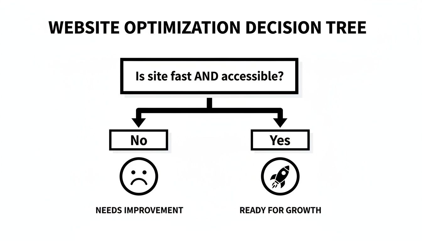
If your site isn't fast and accessible, any investment in more advanced tech is premature. You have to earn the right to ask for more user commitment.
What Are We Really Talking About?
Let’s get practical and break down what each option means for your product.
-
Mobile Website: This is your foundation. Anyone with a browser can reach it—no installs, no friction. It's your digital storefront, easily found on Google and shared with a link. For discoverability, nothing beats it.
-
Progressive Web App (PWA): Think of a PWA as a mobile website on steroids. It gives you the reach of the web with app-like features. Users can add it to their home screen, it can work offline, and you can send push notifications. It’s a great middle-ground, bridging the gap without the hassle of an app store.
-
Native App: This is the most immersive option. A native app is built for a specific OS (iOS or Android) and downloaded from an app store. It delivers the best performance and can tap directly into the phone's hardware—think advanced camera functions, GPS, or contact lists.
The native app market is projected to pass $1.1 trillion by 2034, but the bar is incredibly high. A painful 73% of users will ditch an app if the design is clunky or confusing.
This decision is a classic strategic trade-off. You're balancing the broad reach of the web against the deep, high-performance integration of a native app. The right answer is tied directly to what your product does and how your business works.
Mobile Website vs PWA vs Native App A Strategic Comparison
To help your team make an informed decision, this table breaks down the key differences across the criteria that matter most—from user experience and cost to long-term maintenance.
| Criteria | Mobile Website | Progressive Web App (PWA) | Native App (iOS/Android) |
|---|---|---|---|
| Reach & Accessibility | Highest. Accessible via any browser on any device. No installation required. | High. Works in a browser but can be "installed" to the home screen. | Lowest. Requires users to find and download from a specific app store. |
| Performance | Good. Highly dependent on optimization. | Very Good. Caching and service workers offer near-native speed. | Excellent. Direct access to device hardware delivers the fastest, smoothest experience. |
| Device Integration | Limited. Basic access to camera, location, etc. | Moderate. Can access push notifications, offline storage, and some hardware. | Full. Complete access to device hardware (GPS, camera, contacts, etc.). |
| Offline Functionality | None. Requires an active internet connection. | Yes. Service workers allow for robust offline access to content and features. | Yes. Designed for offline functionality, with data syncing when connected. |
| Development Cost | Low. The most affordable option to build and maintain. | Medium. More complex than a website, but cheaper than native. | High. Most expensive due to separate codebases and specialized skills required. |
| Distribution | Web-based. Discovered through search engines, social media, and links. | Web-based. Same as a mobile site, but with an "add to home screen" prompt. | App Store. Reliant on app store optimization (ASO) and marketing. |
| Updates & Maintenance | Simple. Deploy changes to the server, and all users see them instantly. | Simple. Updates are deployed instantly like a website. | Complex. Updates must be submitted, approved, and downloaded by users. |
Choosing the right path means aligning your technical strategy with your business goals. There's no single "best" option—only the one that best serves your product and your users.
The Four Key Questions to Ask Your Team
Before you commit, gather your team and have an honest conversation around these four points.
-
What Hardware Do We Really Need? Does your core feature rely on the phone’s hardware? If you're building a photo editor needing fine-tuned camera controls or a fitness app using background GPS, a native app is probably the only way to go. If your main needs are push notifications and offline access, a PWA is a compelling choice.
-
What's Our Real-World Budget and Timeline? A mobile website is the quickest and cheapest to get live. A PWA adds some cost and complexity but is still far more accessible than native development. Building native apps is a major investment, often requiring separate teams for iOS and Android. For a deeper dive, check out this comparison of native vs. hybrid app development.
-
How Will People Find Us? This is huge. Mobile websites and PWAs thrive on search and social sharing. Native apps live inside the walled gardens of app stores, where getting discovered is a tough marketing challenge.
-
How Crucial is Peak Performance? For visually rich games or complex productivity tools where every millisecond counts, nothing beats native. But for most other use cases—e-commerce, news sites, social platforms—a well-built PWA delivers an experience so smooth that users won't know the difference.
By carefully weighing these factors, you can move forward with confidence, knowing you've chosen the path that gives your product the best chance to succeed.
Common Questions About Making Mobile Websites
When you're building a product, the mobile side of things can bring up a lot of questions. Let's get straight to the practical answers you need.
Should we build a separate "m-dot" mobile site?
The answer today is a firm no. A few years back, you’d see separate "m-dot" sites (m.yourbrand.com) built just for phones. That approach is now a relic.
Running two different sites is a maintenance nightmare. You have to update content in two places and manage two SEO strategies. A single, responsive website that fluidly adjusts to any screen is far smarter and more efficient. It’s also what search engines like Google heavily favor, and it keeps your brand experience consistent for everyone.
What's the real difference between responsive and adaptive design?
People often use these terms interchangeably, but they work differently. Here's a simple breakdown for your team:
-
Responsive Design is a single, flexible layout. It uses a fluid grid that automatically stretches and rearranges content to fit whatever screen it's on. It’s one design to rule them all.
-
Adaptive Design is more like having a few distinct layouts. The server detects the device's screen size and serves up a specific, pre-built layout for that "breakpoint" (e.g., a phone layout, a tablet layout, a desktop layout).
Today, responsive design is the go-to standard. It’s more versatile and ensures a seamless experience across the countless device sizes out there.
What’s the ballpark cost to make a site mobile-friendly?
The price tag can swing from basically nothing to a major budget item.
If you’re using a modern platform like Webflow or Squarespace, most templates are already responsive out of the box. The cost is simply part of your subscription.
For a custom-coded site, the cost hinges on its complexity. Trying to patch up an old, rigid website to work on mobile can be more expensive than building a new one correctly from the ground up.
The most expensive mobile project is the one you have to rebuild because you didn't plan for mobile from day one. Thinking "mobile-first" isn't an extra cost—it's an investment in doing it right the first time.
How do I actually test if my site works on mobile?
Don't just rely on the "mobile view" in your desktop browser. To know how your site performs, you need to get your hands on it like a real user.
Here’s a practical testing checklist for your team:
- Use Real Phones: This is non-negotiable. Grab an iPhone and an Android phone and navigate your site. Are the buttons easy to tap? Is the text readable without pinching and zooming?
- Use Browser Dev Tools: For quick checks, the developer tools in browsers like Chrome are invaluable. You can simulate dozens of screen sizes to spot layout bugs.
- Run Google's Mobile-Friendly Test: This is a simple gut check. Plug your URL into Google's free tool, and it will give you a clear pass/fail grade with tips for what to fix.
Consistent testing is the only way to be sure you're delivering a great experience as new devices hit the market and user expectations change.
Ready to turn your mobile ideas into a working prototype without the usual friction? RapidNative is a collaborative, AI-native app builder that can transform your prompts, sketches, or product docs into production-ready React Native apps in minutes. Skip the rework and start building experiences your users will love. See how it works at https://www.rapidnative.com.
Ready to build your app?
Turn your idea into a production-ready React Native app in minutes.
Free tools to get you started
Free AI PRD Generator
Generate a professional product requirements document in seconds. Describe your product idea and get a complete, structured PRD instantly.
Try it freeFree AI App Name Generator
Generate unique, brandable app name ideas with AI. Get creative name suggestions with taglines, brand colors, and monogram previews.
Try it freeFree AI App Icon Generator
Generate beautiful, professional app icons with AI. Describe your app and get multiple icon variations in different styles, ready for App Store and Google Play.
Try it freeFrequently asked questions
What is RapidNative?
RapidNative is an AI-powered mobile app builder. Describe the app you want in plain English and RapidNative generates real, production-ready React Native screens you can preview, edit, and publish to the App Store or Google Play.
Can I export the code?
Yes. RapidNative generates clean React Native and Expo code that you can export at any time. No lock-in, no proprietary format. Hand it to your developers or keep building inside RapidNative.
Is RapidNative free to use?
Yes. You can build apps on the free plan with no credit card required. Paid plans unlock unlimited AI generations, code export, and direct publishing to the App Store and Google Play.
Do I need to know how to code?
No. Most users build apps by describing what they want in plain English. Developers can drop into the code whenever they want more control, but coding is optional.
How long does it take to build an app?
Most users have a working first screen in under a minute. A full MVP usually takes a few hours instead of the weeks or months traditional development requires.