Create a Mobile Website That Actually Converts
Learn how to create mobile phone website that converts with a mobile-first UX, fast performance, and responsive design.
By Parth
26th Jan 2026
Last updated: 26th Jan 2026

Let's be blunt: building a website today is building a mobile website. The old approach of designing for a big desktop screen and then trying to shrink it down just doesn't work anymore. The strategy has to be mobile-first. You start with the smallest screen, nail that experience, and then scale it up for larger devices.
Why a Mobile-First Website Is Non-Negotiable
If your website is clunky or slow on a smartphone, it might as well be invisible. Thinking a mobile site is just a stripped-down version of your desktop site is a rookie mistake that costs real money and alienates customers. This isn't just a technical box to check; it’s a fundamental business strategy.
The numbers don't lie. Mobile devices now drive over 60% of all global website traffic, and that trend is only going one way. Worse, 74% of people will ditch your site and likely never come back after just one bad mobile experience. You get one shot.
The Real Business Impact
This isn't just about pretty designs. Google switched to mobile-first indexing years ago, which means it primarily uses the mobile version of your site to rank you in search results. A slow, poorly designed mobile site actively hurts your SEO, sending potential customers straight to your competition.
Here’s what that looks like in the real world:
- Lost Revenue: Every frustrating tap, every hard-to-read block of text, every abandoned shopping cart is a lost sale.
- Damaged Credibility: A janky mobile site screams that you don't care about your users' experience, which completely erodes trust.
- Lower Engagement: If navigating your site on a phone feels like a chore, nobody is going to stick around to read your articles or sign up for your newsletter.
The way mobile and desktop users behave—and what they expect—is fundamentally different. This quick comparison shows why you can't treat them the same.
Mobile vs. Desktop User Expectations
| Metric | Mobile User Behavior | Desktop User Behavior |
|---|---|---|
| Attention Span | Short, task-oriented, often distracted. | More focused, willing to browse and explore. |
| Patience | Extremely low. Expects pages to load in <3 seconds. | More forgiving but still expects speed. |
| Navigation | Prefers simple menus, large touch targets, and scrolling. | Comfortable with complex menus, hover effects, and clicking. |
| Context | Often on-the-go, looking for quick answers or local info. | Typically in a fixed location, researching or completing complex tasks. |
This table makes it clear: a mobile user is on a mission, and they have no time for friction.
The conversation has moved beyond just having a mobile presence. The question founders and PMs must ask now is, "Does our mobile experience solve our customer's core problem with the least amount of friction possible?"
Ultimately, designing for mobile first forces you to focus on what’s essential. It trims the fat and results in a cleaner, faster experience that, it turns out, works better for everyone on every device. To dig deeper into the specifics, this quick guide on how to make your website mobile-friendly is a great place to start.
Mapping the User Experience for Small Screens
Before your team touches a single line of code, you need a plan. Building a great mobile website is far less about fancy visuals and much more about smart, strategic problem-solving. It all begins with mapping out the core user journey—the exact path someone takes on your site to get what they came for.
Let's use a real-world example. Imagine a visitor lands on an e-commerce site for running shoes. What are they trying to do? Find a specific model? Compare options for trail running? Or maybe just check their order status? Each of these is a completely different journey. Your job is to make the most important ones as seamless and intuitive as possible.
Getting this wrong isn't just a minor inconvenience; it has a direct, negative impact on your business. Poor mobile strategy tanks your SEO, frustrates users, and ultimately drives customers away.
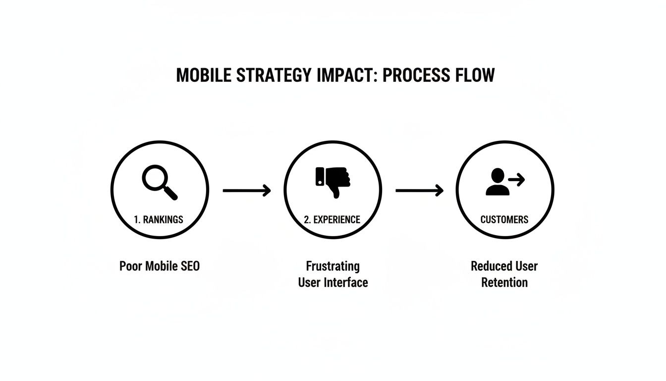
As you can see, a bad mobile experience is a direct line to customer churn. That’s a sequence no business wants to see play out.
Designing for Thumbs, Not Cursors
On a small screen, every single pixel matters. More importantly, every interaction is driven by a thumb, not a precise mouse pointer. This is a fundamental shift you have to design for. The most common mistake I see is creating tap targets—buttons, links, navigation items—that are too small or crammed too closely together.
A solid rule of thumb is to make your primary buttons at least 44x44 pixels. This isn't just a random number; it's the minimum recommended size in Apple’s Human Interface Guidelines, and it’s designed to prevent those frustrating "fat finger" errors.
Think about these practical navigation patterns that actually work:
- Bottom Tab Bar: Placing your main navigation at the bottom of the screen puts the most important actions right where a user's thumb naturally rests. It’s a huge improvement over the classic "hamburger" menu, which hides everything and forces extra taps.
- A Clear Call-to-Action (CTA): Your main CTA should be impossible to miss. It needs to stand out visually. Never make someone hunt for the "Buy Now" or "Sign Up" button.
The goal isn't just to make things look good on mobile. It's to make them work effortlessly. If a user has to pinch-to-zoom to read your text or carefully aim their thumb to tap a link, you've already failed.
Building a Solid Content Hierarchy
Let's be honest: mobile users are impatient. They need to find what they're looking for, and they need to find it now. This is where a crystal-clear content hierarchy becomes your best friend. You have to be ruthless with your prioritization, putting the most critical information "above the fold"—the part of the screen they see without scrolling.
For more in-depth strategies on this, our guide on how to design a web app is a great resource.
This means answering your user's main question immediately. If they land on a pricing page, the prices should be the very first thing they see, not a long-winded paragraph about your company's mission. Use bold, scannable headings and short, punchy paragraphs to make the content easy to digest. When you map these elements out from the start, you build a mobile site that feels intuitive and, most importantly, respects your user's time.
Picking the Right Tools for the Job
Deciding how to build your mobile website can feel like wading through an alphabet soup of tech jargon. If you're a founder or product manager, you don't need to learn to code. But getting a handle on the basic building blocks will make your conversations with the engineering team a whole lot more productive.
Let's break down the most common options, without the technical overload.
At the heart of every single website are two things: HTML for the structure (the bones) and CSS for the style (the paint and furniture). For any mobile site today, the magic word is responsive. This just means using modern CSS to create flexible layouts that automatically adjust to fit any screen, from a tiny smartphone to a huge desktop monitor. This isn't optional anymore; it's the absolute baseline.
Moving Beyond the Basics
For a straightforward business site, a blog, or a simple online store, sticking with responsive HTML and CSS is often all you need. It’s clean, fast, and gets the job done. But what if you're building something more complex, something that needs to feel dynamic and interactive? That's when you'll start hearing about JavaScript frameworks.
- React and Next.js: Think of these as adding a turbocharger to your website. Tools like React let developers build intricate user interfaces from small, reusable pieces, making everything feel snappy and responsive—almost like a native app. Next.js takes it a step further, building on top of React to add powerful features for better performance and SEO from day one.
These frameworks are a fantastic choice if your product involves things like live data feeds, user-specific dashboards, or complex search and filter options. The trade-off? They introduce more complexity and will take longer to build than a simple static site.
The goal isn't to pick the "best" new technology. It’s about picking the right tool for the specific job you need to do. Always start with the simplest solution that serves your users and scale from there.
What About Progressive Web Apps (PWAs)?
Imagine your website could act and feel even more like a native app. That’s the promise of a Progressive Web App (PWA). Essentially, a PWA is a website built with specific modern tech that allows it to be “installed” on a user’s home screen, send push notifications, and even work when the user is offline.
For example, a PWA for a coffee shop could let a customer save their favorite order to their home screen and receive a push notification when it’s ready. This hybrid model gives you the best of both worlds: the massive reach of the web combined with the sticky, engaging features of an app. We've seen that Progressive Web Apps can drive 68% higher engagement than their standard mobile site counterparts. If you're a product team trying to validate an idea quickly, this is a huge deal. You can dig deeper into these powerful website statistics and see how they impact user behavior.
So, when does a PWA make sense? It’s a great fit if your users need to access your service frequently or would benefit from offline access. Think of a news app, a task manager, or a social media platform. By understanding these different paths, you can guide your team toward building a mobile website that not only looks great but is built on a smart, scalable foundation.
Building for Performance and Accessibility
Let's be blunt: a beautiful mobile website that takes forever to load or is a nightmare to navigate for some users is a failure. Performance and accessibility aren't just technical chores to check off a list; they are the foundation of a great user experience. And they absolutely have a direct impact on your bottom line.
The numbers don't lie. Even a one-second delay in load time can tank your conversions by 7%. On the flip side, smart moves like using a Content Delivery Network (CDN) can speed up your site by a whopping 60%. When you realize 88.5% of people will ditch a website if it's too slow, the need for speed becomes crystal clear.

Making Your Mobile Website Fast
Slow websites don't just annoy visitors; Google actively penalizes them in search rankings. Here’s a no-nonsense checklist to get your site running in the fast lane:
- Compress Your Images: This is the big one. Unoptimized images are almost always the main culprit behind slow pages. Use modern formats like WebP and run your images through a tool like TinyPNG to slash file sizes without losing visual quality.
- Minimize Your Code: Every line of code, every space, every comment adds to the page weight. Have your developers minify your CSS, JavaScript, and HTML. This process strips out all the unnecessary characters, making the files smaller and faster to download.
- Leverage Browser Caching: This is a clever way to make return visits almost instant. Caching tells a user's browser to save static parts of your site—like your logo, fonts, and stylesheets. When they come back, their browser already has those files, so the page just snaps into place.
If you're looking to get a serious performance boost, exploring professional website optimization services can give you the expert edge you need.
Designing an Inclusive Experience
Web accessibility, or "a11y," is simply about making sure your website can be used by everyone, including people with disabilities. This isn't just about ticking a compliance box; it's about growing your audience and, frankly, building a better product.
Put yourself in the shoes of someone who uses a screen reader. If they encounter a link that just says "Click Here," it's meaningless. But if that link says "Read our pricing plans," they know exactly what to expect. It's that simple.
Accessibility isn't an edge case. It's a core component of good design. Building an inclusive site often reveals and fixes usability problems that affect all of your users, not just those with disabilities.
Here are a few practical things you can do right away:
- Use Semantic HTML: This is foundational. Ask your developers to use tags like
<nav>,<header>, and<button>for what they were made for. This gives screen readers and search engines the structural clues they need to understand your content. - Check Color Contrast: Text that blends into the background is a common and easily fixed mistake. Use a contrast checker tool to make sure your text is legible for everyone, especially users with low vision.
- Ensure Keyboard Navigation: Unplug your mouse. Can you get to every link, button, and form field on your site using only the "Tab" key? If not, you've got work to do. Every interactive element must be reachable for people who can't use a mouse.
Launching, Testing, and Getting Found on Google
Getting your site live is a huge milestone, but it's really just the beginning. Once you launch a mobile-first website, the real work starts. The first order of business is putting it through its paces with testing that goes way beyond just shrinking your browser window on a laptop.
True mobile testing is about seeing your site exactly as your users do. That means using browser developer tools to emulate specific devices, from the newest iPhone to a more common mid-range Android. Even more critically, you need to simulate real-world network conditions. Your site might fly on your office Wi-Fi, but what happens on a spotty 3G connection? Uncovering these breaking points before your audience does is absolutely essential.
Real-World Testing Scenarios
Don’t just poke around randomly. You need a plan. Create a checklist of the most important user journeys and test them under less-than-ideal conditions. For an e-commerce site, that might mean running through a complete checkout process on a simulated slow network. If you're building a SaaS product, try signing up for a free trial on a small screen.
- Device Emulation: Fire up Chrome DevTools or a similar tool to see precisely how your layout behaves on different screen sizes and resolutions.
- Network Throttling: Intentionally slow down your connection to pinpoint performance bottlenecks and identify images or scripts that are just too heavy for mobile.
- Physical Device Testing: Honestly, nothing beats testing on actual hardware. Grab some phones from friends or colleagues, or use a device lab service to catch those weird, device-specific bugs that emulators can miss.
The most valuable feedback comes from watching your website perform under imperfect conditions. A site that only works perfectly on a fast connection and the newest phone simply isn't ready for the real world.
Getting Discovered on Mobile Search
Once you're confident the site is robust, your focus can shift to helping people find it. Since Google switched to mobile-first indexing, the mobile version of your website is the primary one it uses for ranking. If your mobile site isn't great, your search performance will suffer.
The absolute first thing you should do is set up Google Search Console. This free tool is non-negotiable; it's how Google communicates directly with you about your site's health. Use the URL Inspection tool to submit your most important pages and verify that Google sees them as indexed and mobile-friendly.
From there, it's all about making sure your content is tailored for how people search on their phones. Mobile queries tend to be shorter, more direct, and often phrased as questions. Use clear, scannable headings and keep your paragraphs short. If you run a local business, make sure your address and hours are incredibly easy to find. For a deeper look at evaluating your site’s usability, check out these different user experience testing methods. By keeping an eye on your performance in Search Console, you'll quickly see what’s working and what needs a bit more attention.
Accelerating Your Mobile Vision with Prototypes
Let's be honest: the old-school cycle of design, develop, test, and repeat can be a real killer for momentum. When you're trying to get a new mobile website idea off the ground, that process feels like wading through mud. It burns through your budget and, worse, your time—often on features that, it turns out, nobody even wanted.
Fortunately, we don't have to work that way anymore. There's a much smarter approach to bridge the gap between a promising concept and a product people can actually use.
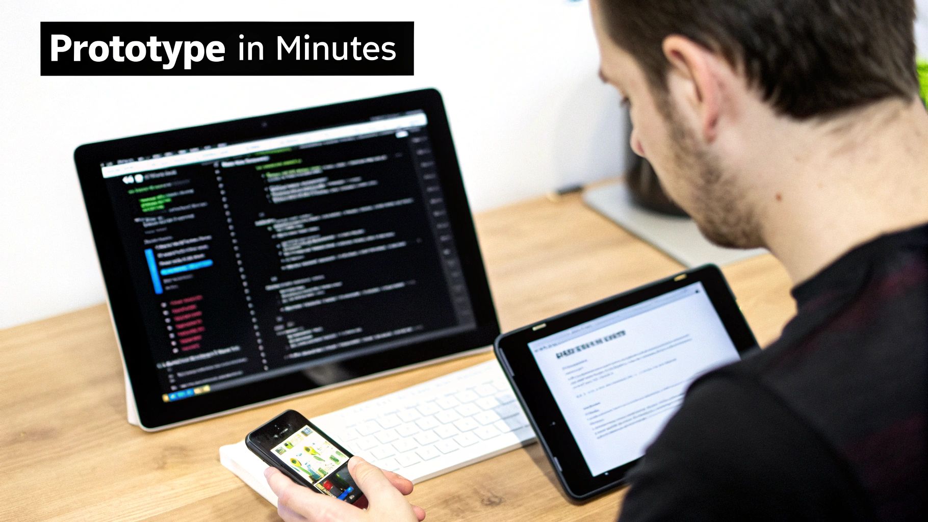
Modern tools, especially those with AI workflows, can take you from a rough idea to a high-fidelity, testable prototype in minutes. I'm not talking about static mockups; I mean a realistic, interactive mobile experience that you can put directly into your users' hands. This lets you get genuine feedback almost instantly.
From Idea to Production Code Seamlessly
This completely upends the traditional, often messy, handoff between design and development. Gone are the days of misinterpreted specs and endless back-and-forth emails. Instead, the prototype you've already validated with real users becomes the direct blueprint for the final product.
The goal is to eliminate friction. By turning a tested prototype directly into production-ready code, you ensure that what users loved during testing is exactly what gets built.
This is a game-changer, especially when you consider the web development market is projected to hit $82.4 billion by 2026. For founders and product managers, AI-driven workflows that go from a simple prompt to a functional app can slash development time. It's a bit like how 77% of developers are now using AI tools to work faster.
When your prototype can be exported as no-lock-in code, it scales right into a production app, giving you a serious competitive edge. To understand more about this trend, you can explore key web development statistics.
This isn't just about saving time. It's about making sure your whole team is on the same page, building something that has already proven its worth. If you want to dive deeper into this process, check out our guide on how to build a prototype.
Common Questions About Mobile Websites
When you're ready to build a website for mobile, a few questions always seem to pop up. I see this all the time with founders and product managers trying to balance a tight budget with a great user experience. Getting these answers right from the start can save you a ton of headaches later on.
Mobile-Friendly vs. Mobile-First: What's the Real Difference?
This is probably the most common point of confusion. A mobile-friendly site is essentially a desktop design that's been tweaked to not look broken on a phone. It scales down, but it wasn't born there.
A mobile-first site, on the other hand, is designed for the smallest screen from day one. You start with the core essentials and then progressively add features and complexity for tablets and desktops. This approach is the industry standard now because it forces you to prioritize what truly matters, which almost always leads to a cleaner, faster experience for most of your users.
How Much Does a Mobile Website Cost?
This is the "how long is a piece of string?" question. A simple site using a DIY builder might only set you back a few hundred dollars. A complex, custom-built web application? That could easily run you $25,000 or more.
The real key to managing costs is defining a laser-focused scope for your minimum viable product (MVP). This is where using a prototyping tool to validate your UI/UX before a single line of code is written can be a game-changer. It prevents you from wasting money building features nobody wants.
Remember, user expectations are through the roof. A staggering 83% of mobile users expect a seamless experience, no matter what device they’re on. And 85% think a company's mobile site should be just as good, if not better, than its desktop counterpart. You can dig into more of these web development statistics and what they mean for your business.
The crucial question isn’t about building a website or an app. It's about choosing the right channel to solve your customer's problem most effectively.
Website or Native App: Which Path to Take?
Finally, there's the big debate: responsive website or native mobile app? There's no single right answer, just the right answer for you.
- A responsive website is your best bet for reaching the widest possible audience. It’s accessible through any browser and discoverable on search engines like Google.
- A native app is what you build for deep engagement with your most loyal users. It lets you tap into device-specific hardware like the camera or GPS and can work offline.
A common and very effective strategy is to start with a top-notch mobile website to build your audience. Once you have a dedicated user base, you can invest in a native app to serve them even better.
Ready to bring your mobile website idea to life in minutes, not months? With RapidNative, you can turn your prompts, sketches, or product docs into a high-fidelity, interactive prototype with production-ready code. Start building for free at RapidNative.
Ready to build your app?
Turn your idea into a production-ready React Native app in minutes.
Free tools to get you started
Free AI PRD Generator
Generate a professional product requirements document in seconds. Describe your product idea and get a complete, structured PRD instantly.
Try it freeFree AI App Name Generator
Generate unique, brandable app name ideas with AI. Get creative name suggestions with taglines, brand colors, and monogram previews.
Try it freeFree AI App Icon Generator
Generate beautiful, professional app icons with AI. Describe your app and get multiple icon variations in different styles, ready for App Store and Google Play.
Try it freeFrequently asked questions
What is RapidNative?
RapidNative is an AI-powered mobile app builder. Describe the app you want in plain English and RapidNative generates real, production-ready React Native screens you can preview, edit, and publish to the App Store or Google Play.
Can I export the code?
Yes. RapidNative generates clean React Native and Expo code that you can export at any time. No lock-in, no proprietary format. Hand it to your developers or keep building inside RapidNative.
Is RapidNative free to use?
Yes. You can build apps on the free plan with no credit card required. Paid plans unlock unlimited AI generations, code export, and direct publishing to the App Store and Google Play.
Do I need to know how to code?
No. Most users build apps by describing what they want in plain English. Developers can drop into the code whenever they want more control, but coding is optional.
How long does it take to build an app?
Most users have a working first screen in under a minute. A full MVP usually takes a few hours instead of the weeks or months traditional development requires.