How to Design a Web App Users Will Actually Love
Learn how to design a web app from scratch with this practical guide. We cover user research, wireframing, prototyping, and developer handoff for modern teams.
By Rishav
15th Jan 2026
Last updated: 15th Jan 2026
Building a web app that people actually love to use isn't about guesswork or blindly following the latest design trends. It's a methodical process, a journey from a rough idea to a polished, functional product. This guide is your roadmap, breaking down each step without the technical fluff.
We’ll walk through how to pin down your app's core purpose, get inside the heads of your users, and turn all that insight into wireframes and prototypes that feel right. Think of it as your blueprint for creating something that truly solves a problem for a specific group of people.
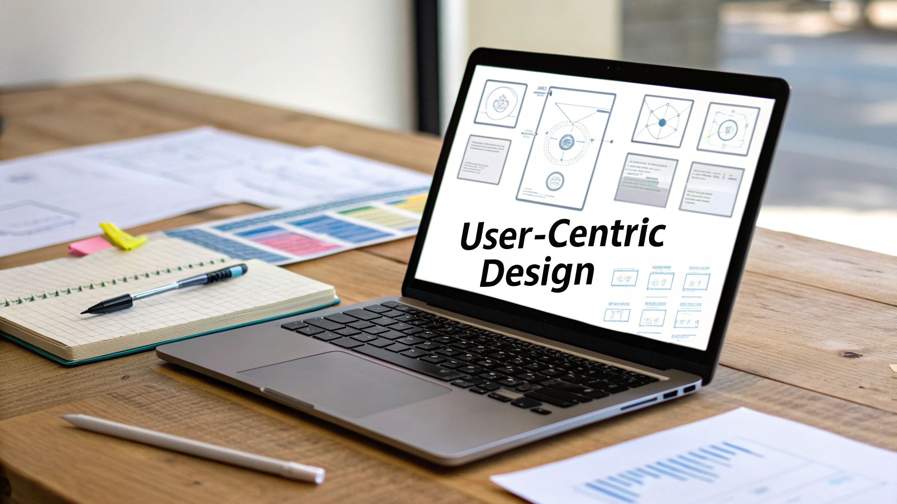
To get started on the right foot, it’s essential to ground your work by mastering user-centered design principles. This mindset keeps the focus exactly where it should be: on the person who will be using your app every day.
Why a Solid Design Process Matters
Good design is far more than just a pretty interface; it’s a critical business asset. In a crowded market, a thoughtful design process is what separates a product that gets used and loved from one that gets ignored.
And for good reason. A staggering 94% of people form their first impression of a website—and its credibility—based on visual design alone. Even crazier, they make that judgment in just 0.05 seconds. There's no room for error.
This means that knowing how to design a web app isn't just a nice-to-have skill; it's essential for anyone building a product. The entire process boils down to a simple, repeatable cycle: understand a real user problem, design a practical solution, and hand it off for development.
This diagram shows how these three core stages fit together.
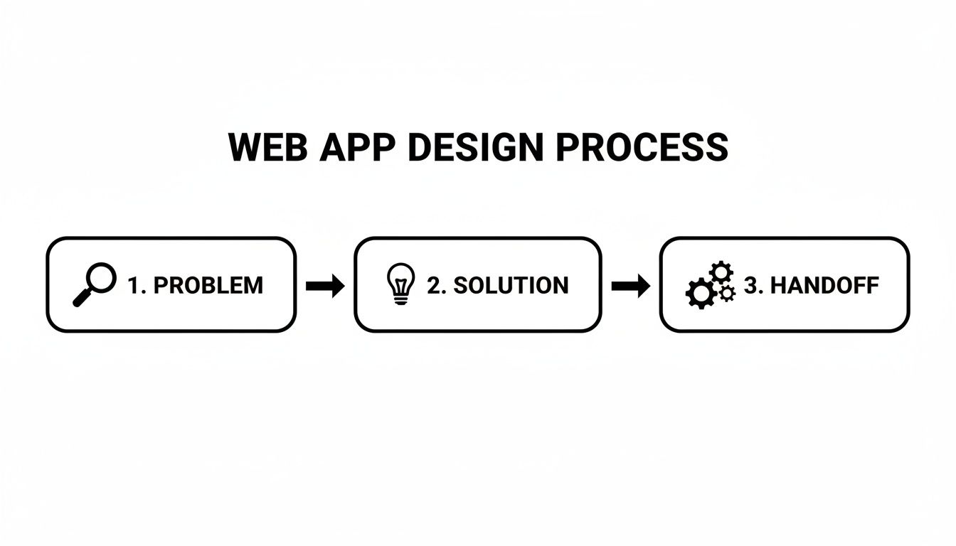
As you can see, every successful app starts with a deep dive into a real user problem. Only then can you move on to crafting a solution and, finally, preparing a clear handoff to the engineering team.
Before we dive into the nitty-gritty of each step, here's a high-level look at the entire journey. This table breaks down the core phases you'll go through, from initial concept to final implementation.
The Core Phases of Web App Design
| Phase | Primary Goal | Key Activities |
|---|---|---|
| Discovery & Strategy | Define what to build and why. | User interviews, competitor analysis, defining goals & scope. |
| UX & UI Design | Shape the app's structure and feel. | User flows, wireframing, visual design, prototyping. |
| Testing & Handoff | Validate the design and prepare for development. | Usability testing, gathering feedback, creating design specs. |
Each of these phases is critical. For founders, PMs, and designers, skipping a step might seem like a shortcut to launch faster, but it almost always leads to costly revisions down the road.
A well-designed web app feels like a thoughtful conversation with the user. It anticipates their needs, speaks their language, and guides them effortlessly toward their goals without causing frustration.
Ultimately, following a structured design process is your best insurance against building something nobody needs. It replaces assumptions with evidence and puts user value at the heart of every decision, paving the way for a product that not only looks great but also works brilliantly.
Nailing the Foundation with User Research
It’s tempting to jump straight into designing slick interfaces and writing code. But before you push a single pixel, every successful app starts by answering two critical questions: What problem am I really solving, and who am I solving it for?
Skipping this step is probably the single biggest reason new products fail. You can build a technically perfect, beautifully designed solution to a problem nobody actually has. This initial research phase is your best insurance policy against building features that look great on paper but get ignored by real users. It’s all about having candid conversations to ground your design decisions in actual human needs.

Creating Simple and Powerful User Personas
A user persona is a simple but powerful tool—a fictional character who represents your ideal customer. This isn't about dry demographics; it's about building empathy and keeping your design process focused. A good persona brings to life their motivations, daily frustrations, and the real-world context where they’d use your app.
For instance, if you're building an inventory app for small cafes, instead of targeting a vague "small business owner," let's create "Maria, the Coffee Shop Owner."
- Who is Maria? She's 35, runs a single-location coffee shop, and pulls 60-hour weeks. She’s comfortable with tech but completely strapped for time.
- Her goals? She needs to boost repeat business and get a handle on her chaotic inventory management.
- Her pain points? Her current POS software is a nightmare, she despises manual stock counts, and she doesn't have the bandwidth to manage a clunky loyalty program.
Suddenly, you have a clear lens. When your team is brainstorming a new feature, you can ask a simple question: "Would this genuinely help Maria, or just add another layer of complexity to her already insane day?" That's the practical magic of a well-defined persona.
Conducting Research on a Budget
Don't think you need a massive research budget to get meaningful insights. The goal is just to talk to people who fit your persona's profile. Remember, your job is to listen, not to sell your idea.
Here are a few scrappy ways to get started:
- Tap Your Network: Ask friends, family, or LinkedIn connections if they know anyone who fits the bill. A warm intro is always the easiest way to start a conversation.
- Find Online Hangouts: Search for relevant subreddits, Slack groups, or industry forums where your target users gather. Become a genuine member of the community before you start asking for favors.
- Offer a Small Thank You: A $15 coffee gift card is often more than enough to get 20 minutes of someone's undivided attention. It shows you respect their time and value their input.
In these chats, stick to open-ended questions about their current struggles. "Can you walk me through how you handle inventory right now?" will give you far more gold than "Would you like an app that automates inventory?"
The goal of user research isn't just to validate your idea; it's to be willing to invalidate it. Finding out you're solving the wrong problem early on saves immense time and money.
Defining What Users Need to Accomplish
Once you've collected these stories and insights, it's time to translate them into something actionable. The "Jobs to Be Done" (JTBD) framework is brilliant for this. It shifts your focus from what your product is to what your users can accomplish with it.
A JTBD statement is simple: "When [situation], I want to [motivation], so I can [expected outcome]."
Let's put Maria's problem into this framework:
- Situation: A customer is paying for their latte.
- Motivation: I want to add them to our loyalty program in two seconds.
- Outcome: So I can encourage them to come back without creating an awkward, time-consuming signup process.
This one sentence gives your design and product teams incredible clarity. It tells them the loyalty feature must be lightning-fast, dead simple, and baked right into the checkout flow.
Before committing to building anything, it pays to learn more about how you can validate product ideas fast and make sure you're truly on the right path. This foundational work ensures every element you design from here on out serves a real, validated user need.
Mapping the Journey and Structuring Your App
Okay, you’ve done the hard work of figuring out who your users are and what they’re trying to achieve. Now, the fun begins: mapping out the how. How will someone actually move through your app to get things done? This is where we build the app's structural backbone.
Getting this right is the difference between an app that feels like a natural extension of your user's thoughts and one that feels like a maze. Forget about colors and fonts for a moment. This stage is all about pure, cold logic—creating the architectural blueprint before you even think about putting up walls.
Charting the Course with User Flows
A user flow is your best friend here. It's essentially a simple diagram that shows the exact path a user takes to complete a single task. Think of it as a step-by-step map that forces you to consider every screen, every click, and every decision point along the way.
Let’s revisit our example: "Maria, the Coffee Shop Owner." One of her key jobs is adding a new customer to her loyalty program right at checkout. A quick user flow for that might look something like this:
- Start: Maria taps the "Pay" button on her point-of-sale screen.
- Decision: A prompt pops up: "Add to Loyalty Program?" with "Yes" and "No" options.
- Path A (Yes): She's taken to a screen to enter the customer's phone number. The system confirms the new member is added.
- Path B (No): The prompt simply closes, and the payment process continues.
- End: The transaction is complete.
Just by sketching that out, you immediately start seeing potential snags. Should we also ask for an email? What happens if the phone number she enters is already in the system? Mapping the flow helps your team spot and solve these logical puzzles before a single line of code gets written.
User flows are your first line of defense against confusing navigation. They force you to walk in your user's shoes and experience your app's logic one step at a time, revealing dead ends and awkward detours before they get built.
Building a Logical Information Architecture
While user flows focus on specific tasks, Information Architecture (IA) is about the big picture. It’s how you organize and structure everything in your app. Think of it as the high-level sitemap that determines where features live and how they relate to one another. A solid IA makes an app feel predictable.
The classic analogy is a grocery store. The store’s IA puts all the dairy in one aisle and all the produce in another. This logical grouping means shoppers can find what they need without wandering around aimlessly.
Your app's IA does the same thing by answering a few fundamental questions:
- What are the most critical items that need to go in the main navigation bar?
- What kinds of things should be tucked away inside a "Settings" menu?
- How are different features nested within each other?
A simple sitemap is often the best way to visualize this. For Maria's inventory management app, a logical IA might group features like this:
Primary Navigation
- Dashboard: Key stats at a glance.
- Inventory: View, add, and edit products.
- Suppliers: Manage vendor contacts and orders.
- Reports: Sales trends and stock level analysis.
Secondary (within Settings)
- Profile: Manage account details.
- Billing: Subscription information.
- Users: Add or remove team members.
- Integrations: Connect to other software.
This clear separation helps users build a mental model of your app. They quickly learn that "doing" tasks happen in the main navigation, while "managing" their account happens in settings. This predictability lowers their cognitive load and makes the whole experience feel effortless.
These foundational steps—mapping the journey and structuring the app—directly influence everything that comes next. They provide the logical skeleton you'll build upon with wireframes and visual designs, ensuring the final product isn't just beautiful, but fundamentally usable.
From Blueprint to Visual Reality: The Wireframing Stage
Once you've mapped out the user's journey and have a solid information architecture, it's time to start giving your app a face. This is where the abstract ideas of flows and sitemaps start to look like actual screens. We’ll begin with the bare-bones blueprint—the wireframe—and then layer on the visual details that make a product feel polished and professional.
Think of it like building a house. You wouldn't stress over paint colors before the walls are even framed. Wireframes are your digital framing. They’re all about defining space, layout, and function long before you get distracted by the shiny objects of fonts and colors.
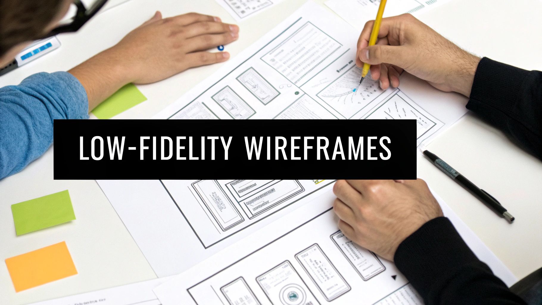
Start with Low-Fidelity Sketches
A low-fidelity wireframe is essentially a quick, black-and-white sketch of a screen. Its only job is to figure out the hierarchy of information and where key elements—like buttons, forms, and navigation—should live. By intentionally stripping away all the visual flair, you force everyone (including yourself and your stakeholders) to focus on a single, critical question: does this actually work?
Is the layout logical? Is the main call-to-action impossible to miss? Can someone figure out how to get from point A to point B without a user manual? These are the tough questions that low-fidelity wireframes help you answer, fast.
For instance, a wireframe for a user profile screen might be nothing more than a few grey boxes and some placeholder text:
- A circle up top for the profile picture.
- A big, bold line of text for the user's name.
- A few smaller lines for email and phone number.
- A clear, rectangular button simply labeled "Edit Profile."
This brutal simplicity is what makes it so powerful. You can crank out a dozen different layout ideas in an afternoon, get quick feedback, and toss out the ones that don't work without feeling emotionally attached. It's the absolute fastest way to validate your app's core structure.
Wireframing isn’t about making things pretty; it's about making things clear. You’re solving structural problems with lines and boxes so that the visual design phase can focus on creating an emotional connection.
Graduating to High-Fidelity Design
With your structural blueprint locked in, you can finally start adding the visual polish. This is where you graduate from stark grey boxes to a vibrant, high-fidelity design that looks and feels like the real deal. It’s all about creating a consistent visual system that will govern the entire app.
A solid visual system really comes down to a few key pillars:
- Color Palette: You'll want to define a primary, secondary, and accent color. Don't just pick your favorites; colors guide the user’s eye and evoke specific emotions. A fintech app might lean on a trustworthy blue, while a meditation app would probably feel better with calming greens.
- Typography: Pick one or two font families that are highly readable and match your brand's personality. Then, establish a clear typographic scale (e.g., H1 for screen titles, H2 for section heads, body text) to create a predictable hierarchy on every single screen.
- Reusable Components: Design common UI elements like buttons, input fields, cards, and modals just once. Then, reuse them everywhere. This not only makes the design process way faster but, more importantly, ensures your app feels cohesive and intuitive to users.
When you get down to designing specific screens, some elements like dashboards require extra thought. You can find some excellent deep-dive advice in these dashboard design best practices.
Designing for Every Screen Size
Let’s be real: your app will be used on everything from tiny phone screens to massive desktop monitors. Adopting a "mobile-first" approach isn't just a buzzword anymore; it's a practical discipline for creating an experience that works everywhere.
This simply means you start designing for the smallest screen first. The constraint of limited space forces you to be ruthless with prioritization. You have to ask, "What is the one thing the user absolutely must be able to do on this screen?" All the extra features and supplementary content can be added back in as the screen real estate grows.
This approach pays off in two huge ways:
- It forces focus. By starting small, you ensure the core functionality is front and center. This leads to a cleaner, more intuitive experience for mobile users, who are often in a hurry.
- It scales gracefully. It is far, far easier to add elements to a simple layout for larger screens than it is to try and cram a complex desktop design onto a phone.
By moving from flows to wireframes, building a consistent visual system, and thinking mobile-first, you create a design that’s not just beautiful but fundamentally usable. This tangible interface is now ready for the next crucial step: bringing it to life as an interactive prototype and testing it with real people.
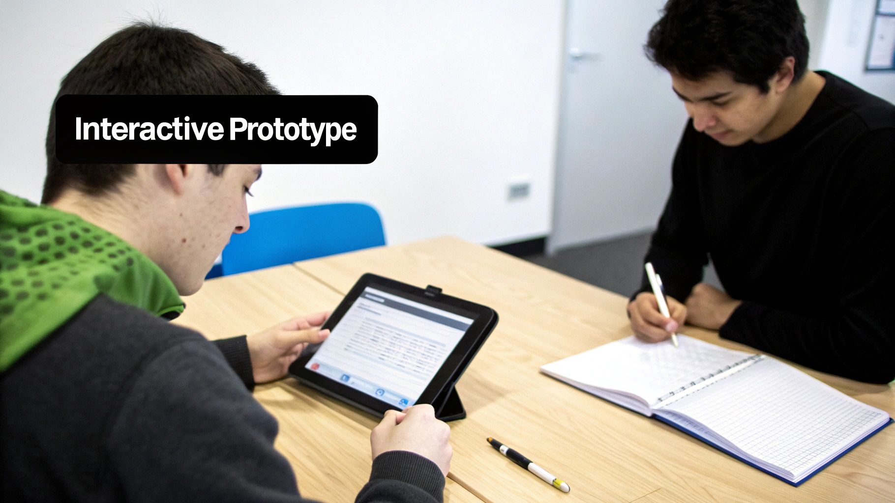
Testing and Refining with Interactive Prototypes
A static design is just a pretty picture. An interactive prototype is where your web app finally starts to feel real. This is the moment you transform those carefully planned wireframes and visuals into a clickable, tangible experience that you can hand over to actual users. It’s your first real chance to see if the logical flows you mapped out on paper translate into an intuitive journey in the real world.
The idea isn't to build a perfect, fully-coded version of your app. Far from it. The goal is to create a simulation that’s just good enough to test your core assumptions. By letting people click around, you’ll uncover confusing navigation, awkward workflows, and hidden friction points long before a single line of production code gets written. This early feedback loop is what separates good designs from great ones.
Choosing Your Prototyping Approach
Not all prototypes are created equal, and the right tool really depends on what you're trying to achieve. You don't always need a high-fidelity, pixel-perfect model to get amazing feedback. The trick is to match the prototype's complexity to the questions you need answered right now.
Deciding which type of prototype to build can be tricky, but it really boils down to where you are in the design process and what you need to learn next. Here’s a quick breakdown to help you pick the right tool for the job.
Choosing Your Prototyping Approach
| Method | Best For | Pros | Cons |
|---|---|---|---|
| Click-Through Prototypes | Early-stage testing of user flows and information architecture. | Fast and cheap to create; great for validating the overall navigation and structure. | Lacks realism; can't test complex interactions or animations. |
| Interactive Prototypes | Testing specific interactions, micro-animations, and dynamic states. | Provides a more realistic user experience; good for testing form inputs and component behavior. | Takes more time and skill to build; can be more complex to update. |
| Code-Based Prototypes | Late-stage validation and getting the most accurate user feedback possible. | Highest fidelity; users are interacting with real code, giving you precise insights. | Requires more technical expertise or specialized tools; can be slower to produce. |
No matter which path you choose, the goal is always the same: learn as much as you can, as quickly as you can, before committing to development. A tool like RapidNative fits into that high-fidelity, code-based approach by letting you generate real, interactive React Native UI from prompts, which is incredibly powerful for late-stage validation.
Running Effective Usability Tests
Once your prototype is ready, it’s time for the moment of truth: usability testing. The goal isn't to ask people if they like your design, but to watch and see if they can actually use it to get things done. This is where you uncover the hidden flaws in your logic.
A typical session involves giving a user a simple task and then stepping back to watch them try to complete it without any help. For Maria's app, you might say, "Imagine you just sold a latte and want to add a new customer to the loyalty program. Can you show me how you'd do that?" Then, you just stay quiet and observe. You'll quickly see where they hesitate, get stuck, or click on the wrong thing. Diving into different user experience testing methods can give you a solid framework for gathering these crucial insights.
The purpose of a prototype isn't to create a perfect replica of your app. It's to build just enough to learn something valuable. Each test is a chance to validate or invalidate a design assumption, getting you closer to a product people genuinely love.
Turning Feedback into Actionable Improvements
The insights you gather are worthless if they just sit in a report. They need to drive real changes in your design. After just a few user tests, you'll start to see patterns emerge. Maybe three out of five people couldn't find the settings menu, or perhaps everyone stumbled over a particular form field.
This is where the design process becomes a loop. You take these findings, head back to your design files, make targeted improvements, update the prototype, and test it all over again. This cycle of building, testing, and learning is the absolute engine of user-centered design.
This isn't just about making things look nice; it has a massive impact on the bottom line. A great user experience can boost conversion rates by up to 400%. That’s why listening to user feedback is so critical. Small tweaks can lead to huge wins. You can learn more from these insightful web design statistics.
Ultimately, prototyping and testing are your insurance policy against building the wrong thing. They replace your assumptions with hard evidence, ensuring that when you finally hand off the designs to developers, you're confident you’re building something people will not only understand but actually enjoy using.
Ensuring a Seamless Developer Handoff
You’ve done the hard work. You’ve put in the hours on research, mapping, wireframing, and testing. Now, there’s just one crucial step standing between your polished design and a live, working product: the developer handoff.
This is where your vision gets translated into actual code, and frankly, it’s where a lot of great projects start to go sideways. A sloppy, disorganized handoff is a recipe for disaster. It leads to endless back-and-forth, wasted weeks, and a final build that’s a shadow of what you designed. The goal is to eliminate all guesswork for the engineering team. A developer should never have to ping you for a hex code, guess at a margin, or wonder what a button does on click.
Everything they need to build your design with pixel-perfect accuracy should be right there, clearly documented. This simple shift transforms the handoff from a chaotic Q&A session into a smooth, efficient build.
Create a Comprehensive Design System
A jumbled folder of design files is every developer's worst nightmare. The absolute best way to hand off your work is by packaging it into a comprehensive style guide or, even better, a full-fledged design system. This isn't just another document; it’s the single source of truth for every single visual element in your app.
At a minimum, your design system should clearly define:
- Typography Scale: Every font family, weight, and size for all text elements (H1s, H2s, body copy, labels, etc.).
- Color Palette: The exact hex codes for primary, secondary, and accent colors, plus all the necessary shades for text, backgrounds, and borders.
- Spacing and Grid System: Your layout grid and the standard spacing values—like 8px, 16px, or 24px—that govern all margins and padding.
- Reusable Components: Every UI element, from buttons and form fields to complex cards and navigation bars, should be documented.
Document Every Single Component State
Static mockups only tell part of the story. Users interact with things, and those interactions trigger different states. Forgetting to design for these is one of the most common handoff mistakes, forcing developers to improvise on the spot.
For every interactive element, you need to explicitly design its various states:
- Default: The component’s appearance before any user interaction.
- Hover: How it looks when a cursor is over it.
- Active/Pressed: The state when a user clicks or taps it.
- Disabled: Its appearance when it's not interactive.
- Focus: The state for accessibility, showing which element is selected via keyboard.
A great handoff isn't about delivering assets; it's about delivering clarity. Your job is to anticipate every question a developer might have and answer it visually before they even have to ask.
Provide Clear Specs for Interactions and Animations
Finally, you have to show how things move. If an element fades in, a menu slides out, or a button has a subtle bounce on click, you need to specify exactly how that works.
Don't just write "make it animate" in the notes. Provide crystal-clear specifications for timing, easing, and duration. Modern tools like Figma are fantastic for this, letting you build these micro-interactions right into your prototypes. This is the best way to communicate them, and it becomes absolutely critical when you want to turn your design into code, as it ensures the final product feels as dynamic as you envisioned.
When you deliver a complete package—a solid style guide, all component states, organized assets, and clear interaction specs—you empower your development team to build your vision perfectly the first time.
Common Questions About Web App Design
Navigating your first web app design project can feel like a minefield of unknowns. To give you some clarity, here are quick, practical answers to some of the most common questions founders, PMs, and designers ask as they get started.
How Much Does It Cost to Design a Web App?
There’s no single price tag here, and anyone who gives you one without knowing the details is guessing. The cost is a direct reflection of the work involved.
A freelancer might put together a simple app for a few thousand dollars. On the other end of the spectrum, a complex platform built by a dedicated agency can easily run into the hundreds of thousands.
The biggest cost drivers are always:
- The number of unique screens you need.
- The complexity of the features (e.g., a simple form vs. a real-time collaborative editor).
- The depth of user research and testing required to get it right.
What Is the Difference Between a Web App and a Website?
It all comes down to interactivity. A website, like a company blog or a marketing page, is primarily for consuming information. You read, you watch, you learn.
A web app, on the other hand, is built for doing things—it’s a tool.
Think of project management platforms like Asana or design tools like Figma. You’re not just reading; you're actively creating, managing, and collaborating. You interact with the software to complete tasks, making them true applications you access through a browser.
How Long Does the Web App Design Process Take?
The timeline depends entirely on the scope. A focused Minimum Viable Product (MVP) with just the core functionality could come together in 4-8 weeks of dedicated design work.
But for a large-scale, feature-rich application, you're looking at a much longer runway. It can easily take 6 months or more to move properly through discovery, wireframing, visual design, prototyping, and iterative user testing.
Ready to turn your web app idea into a high-fidelity, interactive prototype without the slow, manual process? RapidNative uses AI to transform plain-English prompts into production-ready React Native screens and their source code. Build, test, and ship your vision faster than ever. Start building with RapidNative today.
Ready to build your app?
Turn your idea into a production-ready React Native app in minutes.
Free tools to get you started
Free AI PRD Generator
Generate a professional product requirements document in seconds. Describe your product idea and get a complete, structured PRD instantly.
Try it freeFree AI App Name Generator
Generate unique, brandable app name ideas with AI. Get creative name suggestions with taglines, brand colors, and monogram previews.
Try it freeFree AI App Icon Generator
Generate beautiful, professional app icons with AI. Describe your app and get multiple icon variations in different styles, ready for App Store and Google Play.
Try it freeFrequently asked questions
What is RapidNative?
RapidNative is an AI-powered mobile app builder. Describe the app you want in plain English and RapidNative generates real, production-ready React Native screens you can preview, edit, and publish to the App Store or Google Play.
Can I export the code?
Yes. RapidNative generates clean React Native and Expo code that you can export at any time. No lock-in, no proprietary format. Hand it to your developers or keep building inside RapidNative.
Is RapidNative free to use?
Yes. You can build apps on the free plan with no credit card required. Paid plans unlock unlimited AI generations, code export, and direct publishing to the App Store and Google Play.
Do I need to know how to code?
No. Most users build apps by describing what they want in plain English. Developers can drop into the code whenever they want more control, but coding is optional.
How long does it take to build an app?
Most users have a working first screen in under a minute. A full MVP usually takes a few hours instead of the weeks or months traditional development requires.