10 Mobile App Design Best Practices for Product Teams
A complete guide to mobile app design best practices. Learn 10 actionable strategies for UX, UI, and performance to build apps that users love in 2026.
By Sanket Sahu
25th Jan 2026
Last updated: 25th Jan 2026
In the hyper-competitive app marketplace, great design isn't just a feature; it's the foundation of user retention and business success. But what separates a forgettable app from one users love? It's the thoughtful application of proven design principles that create a seamless and valuable experience. Getting your idea from a sketch to the App Store requires navigating countless decisions, from technical execution to platform compliance.
This guide moves beyond generic advice to provide a practical roundup of mobile app design best practices. We'll break down 10 essential principles that every product manager, founder, designer, and developer needs to master. Each point is designed to be directly applicable, whether you're building an MVP, refining a feature, or overhauling an existing app. You will learn how to:
- Structure navigation that users understand instantly.
- Build for performance to eliminate frustrating lag.
- Implement accessible design to build a product for everyone.
- Create a consistent visual system that strengthens your brand.
For teams building modern, cross-platform applications, these practices are non-negotiable. They are the building blocks of intuitive, high-performance, and visually compelling mobile experiences that resonate with users and achieve critical business goals. Let's dive into the core practices that turn good apps into great ones.
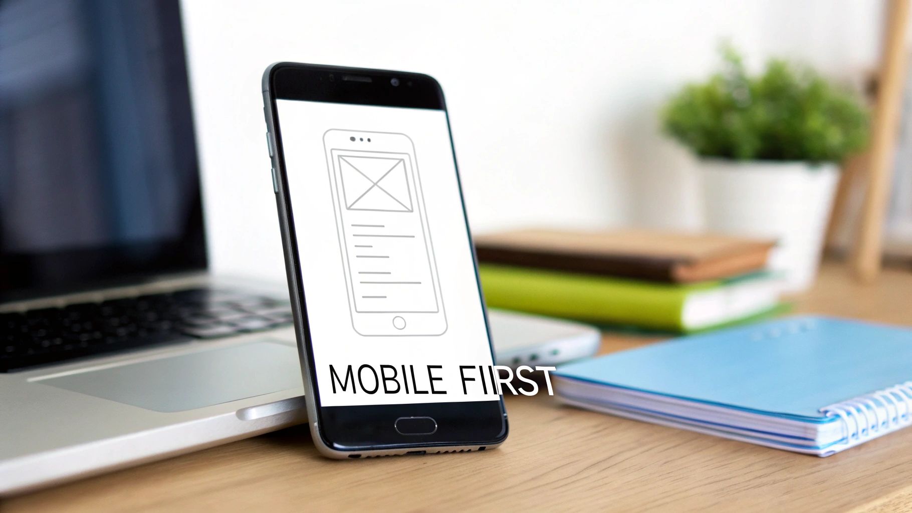
1. Start with a Mobile-First Approach
The mobile-first design approach is a core strategy where you begin designing for the smallest screen: the mobile phone. Instead of creating a complex desktop design and then trying to cram it onto a smaller device, you start with the essential content and functionality for the mobile user. This forces you to prioritize what truly matters.
From there, you progressively enhance the design by adding features and more complex layouts for larger screens like tablets and desktops. This is one of the most crucial mobile app design best practices because it builds a clean, focused product from the ground up. Apps like Instagram and Spotify are prime examples; their intuitive mobile interfaces define their brand, with desktop versions being thoughtful expansions, not cluttered afterthoughts. For a deeper look, check out this guide on Mobile-First Design.
Why it's a practical best practice
Adopting a mobile-first mindset leads to a cleaner and more performance-oriented product. Designing for mobile constraints—like smaller screens, touch-based interactions, and variable network conditions—from the outset creates a robust foundation that serves all users better, no matter their device.
Actionable Tips for Your Team
- Start with Single-Column Layouts: Begin your wireframes with a single-column structure. This forces content prioritization and naturally adapts to larger screens where you can introduce multi-column grids.
- Prioritize Above-the-Fold Content: Identify the single most important action or piece of information a user needs and place it prominently at the top of the mobile screen, requiring no scrolling.
- Test Touch Interactions Early: Use device emulators or a tool like RapidNative’s live preview to test tap targets, gestures, and button sizes on an actual touch screen from day one.
- Use Responsive Typography: Use relative units (like REMs or percentages) for font sizes to ensure text scales gracefully across different device resolutions.
- Leverage Platform-Specific Components: When scaling from a mobile-first React Native base, use platform-specific UI kits to provide an experience that feels native to iOS, Android, or the web.
2. Design for Touch, Not Clicks
A touch-friendly interface is designed specifically for fingers, which are far less precise than a mouse cursor. This principle dictates the size, spacing, and feedback of all interactive elements to prevent user frustration and accidental taps. It's a cornerstone of effective mobile app design best practices because it directly impacts usability and user comfort.
Leading platforms have established clear guidelines. Apple’s Human Interface Guidelines recommend a minimum tap target of 44x44 points, while Google’s Material Design suggests 48x48dp. Apps like Uber excel here, using large, clearly defined buttons for core actions like "Confirm Pickup," making them easy to tap even in a moving vehicle. This focus on ergonomics ensures the app feels intuitive and reliable.

Why it's a practical best practice
Designing for touch isn't just about making buttons bigger; it's about respecting the user's physical interaction with their device. A poorly implemented touch interface leads to high error rates, user abandonment, and negative reviews. By prioritizing generous tap targets and clear spacing, you build an accessible and forgiving experience.
Actionable Tips for Your Team
- Test with Actual Fingers: From the earliest stages, abandon mouse-based testing in emulators. Use a real device to ensure your components are comfortable to interact with using your thumb and fingers.
- Implement Visual and Haptic Feedback: Every interactive element must provide immediate feedback. Use visual cues like color changes for "pressed" states and consider leveraging React Native's Vibration API for subtle haptic feedback on key actions.
- Mind the Gap: Ensure there is adequate space between interactive elements. A minimum of 8-16 points of separation is a solid rule of thumb. Use utility classes like
gap-4orspace-x-2to maintain consistency. - Design for the Thumb Zone: Be mindful of "thumb reachability" on larger phones. Place primary actions and navigation elements within the natural arc of the user’s thumb, typically at the bottom of the screen.
- Use Pre-Sized Components: Leverage component libraries that offer pre-sized, touch-friendly buttons and controls adhering to platform guidelines. This accelerates development while ensuring ergonomic standards are met.
3. Build Intuitive Navigation
Intuitive navigation is the invisible scaffolding that guides users through your app. A well-designed system ensures users can find what they need with minimal effort, creating a clear path from their intent to their goal. It relies on established patterns like tab bars, hamburger menus, and bottom sheets that users already understand.
This practice is essential because poor navigation is a primary reason users get frustrated and leave. Instagram masters this with a persistent bottom tab bar for core features, while Notion uses a clean hierarchical structure with breadcrumbs for its deeply nested content. These are prime examples of mobile app design best practices that make complex apps feel simple.
Why it's a practical best practice
A logical navigation system is the backbone of a positive user experience. It reduces friction, improves retention, and makes your app feel instantly familiar. When users can effortlessly move between screens and understand their location within the app, they are more likely to engage deeply and complete key actions.
Actionable Tips for Your Team
- Choose the Right Pattern: Use a tab bar for 4-5 top-level, frequently accessed features. Use a hamburger menu for secondary items that don't need to be persistently visible. Use bottom sheets for contextual actions related to the current screen.
- Prioritize Thumb-Friendly Design: Place primary navigation elements within the "thumb zone" at the bottom of the screen. This ensures core actions are easily reachable on larger devices.
- Maintain Consistency: Keep your primary navigation visible and consistent across all relevant screens. Users should never feel lost or wonder how to get back to a main section.
- Use Clear Labels and Icons: Employ universally understood icons and concise, descriptive text labels. Avoid jargon or abstract symbols that could confuse users.
- Prototype and Test Your Flows: Before writing code, use prototyping tools to build and test your navigation flows. Validating your architecture early is a crucial part of user experience testing. To dive deeper, you can explore various user experience testing methods to ensure your navigation is truly intuitive.
4. Optimize for Performance and Speed
Performance optimization is the practice of making your app run faster and more efficiently. Slow load times, stuttering animations, and unresponsive interactions are primary reasons users uninstall an app. This involves everything from optimizing code and compressing images to implementing smart loading strategies, ensuring a smooth experience even on older devices or slow networks.
This focus on speed is a core pillar of modern mobile app design best practices. Telegram is renowned for its lightweight feel and fast performance on poor networks, while LinkedIn’s mobile app seamlessly lazy-loads its feed content to prevent initial delays. These examples prove that a snappy interface is a fundamental user expectation. For deeper insights, Google’s guidance on Core Web Vitals offers a valuable framework that translates well to native apps.
Why it's a practical best practice
A high-performing app feels professional, reliable, and respectful of the user's time. In a competitive market, a few seconds of loading delay can be the difference between a daily active user and an uninstalled app. Optimizing for performance improves key metrics like engagement, conversion rates, and overall brand perception.
Actionable Tips for Your Team
- Monitor Your Bundle Size: Keep your initial app download size small. Set a target, like under 5MB for the initial load, to ensure users on slower networks can get started quickly.
- Implement Lazy Loading: For long lists or content feeds, use React Native’s
FlatListcomponent. It renders items only as they scroll into view, drastically reducing initial memory usage and screen load time. - Optimize All Images: Use modern image formats like WebP and implement responsive sizing to serve appropriately scaled images based on the user's device screen. This minimizes download times.
- Use Code Splitting: Structure your app so that code for specific features is loaded only when the user navigates to them. This technique shrinks the initial payload.
- Test on Real-World Conditions: Use device emulators or built-in developer tools to throttle your network connection to simulate 3G or 4G. This helps you identify bottlenecks that wouldn't appear on a fast Wi-Fi connection.
5. Design for Accessibility and Inclusion
Accessible design ensures that your app is usable by everyone, including people with disabilities. This practice, often called A11y, involves creating interfaces that support assistive technologies like screen readers, accommodate various sensory and motor abilities, and offer flexibility for user preferences. It’s not an optional feature but an ethical and business imperative, expanding your app's reach to the 15% of the global population living with some form of disability.
This is one of the most impactful mobile app design best practices you can adopt. Leading platforms like Apple's iOS, with its comprehensive VoiceOver feature, and Android's Accessibility Suite demonstrate a commitment to inclusivity. Apps like BBC iPlayer and Microsoft Outlook are often praised for their robust support for high-contrast modes and dynamic text scaling.
Why it's a practical best practice
Designing for accessibility improves the user experience for everyone, not just those with disabilities. Clear contrast, scalable text, and logical navigation benefit all users, especially in challenging environments like bright sunlight or when multitasking. It future-proofs your app, fosters positive brand perception, and widens your potential market.
Actionable Tips for Your Team
- Use Semantic Components: Leverage React Native’s built-in accessibility props. Set the
accessible={true}property on custom components and useaccessibilityLabelto provide context for screen readers on all interactive elements. - Test with Screen Readers: Regularly test your app using the actual tools your users rely on. Activate VoiceOver on iOS and TalkBack on Android to navigate your interface and ensure all elements are announced clearly and logically.
- Check Color Contrast: Adhere to WCAG 2.1 AA standards by ensuring the contrast ratio between text and its background is at least 4.5:1. Use online contrast checkers during the design phase.
- Support Dynamic Type: Allow users to adjust font sizes according to their needs. Implement text scaling that reflows content gracefully without breaking the UI.
- Provide Image Alternatives: For every meaningful image or icon, include a descriptive alternative text using the
accessibilityLabelprop. This ensures users who cannot see the image still understand its purpose.
6. Build a Responsive, Multi-Device Design
Responsive design is the practice of building a single app that automatically adapts its layout to provide an optimal experience across a wide range of devices—from phones and tablets to newer foldables. Instead of creating separate, rigid designs for each, a responsive app uses a fluid grid system and flexible components that gracefully reflow to fit any screen size or orientation.
This approach is one of the most essential mobile app design best practices for reaching the broadest audience with a consistent experience. Apps like Notion and Medium are excellent examples; their UI seamlessly reorganizes from a compact, single-column view on a phone to a multi-column layout on a large tablet, all from a single codebase.
Why it's a practical best practice
A responsive strategy future-proofs your app, making it ready for the next generation of devices without requiring a complete overhaul. It streamlines development and maintenance by eliminating the need to manage multiple, device-specific versions. By designing for adaptability, you ensure a high-quality experience for every user, which is critical for retention and market reach.
Actionable Tips for Your Team
- Define Core Breakpoints: Design your layouts to adapt at key screen widths. Common breakpoints to start with are 320px (small phones), 768px (tablets), and 1024px (large tablets/small desktops).
- Utilize Dynamic Sizing: Use React Native’s
DimensionsAPI or theuseWindowDimensionshook to get screen size information and adjust styles programmatically. Favor percentage-based widths over fixed pixel values. - Handle Safe Areas and Notches: Implement the
useSafeAreaInsetshook fromreact-native-safe-area-contextto ensure your UI avoids system intrusions like the notch on iPhones or the Android status bar. - Test Orientations Thoroughly: Regularly switch between portrait and landscape modes during development. Ensure that all components remain usable in both orientations.
- Preview Across Devices: Use a multi-device preview feature to simultaneously view and test your design on phone, tablet, and web layouts, catching adaptation issues early.
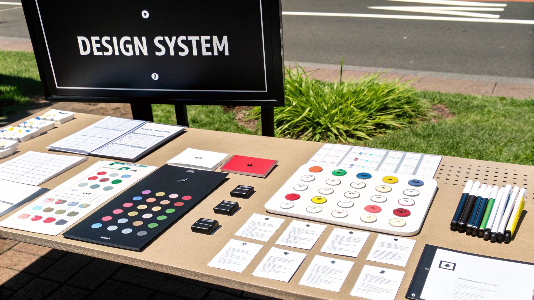
7. Create a Consistent Visual Design System
A visual design system is the single source of truth that ensures your brand is applied consistently across all screens and components. It's a collection of reusable components guided by clear standards, encompassing everything from color palettes and typography to iconography and spacing. By establishing these rules upfront, you create a unified experience that reinforces brand recognition.
This systematic approach is one of the most impactful mobile app design best practices for scaling a product efficiently. Industry-leading examples like Google's Material Design and Apple's Human Interface Guidelines show how a robust design system enables teams to build beautiful experiences faster. It moves design from a series of one-off decisions to a structured process. For a deeper dive, exploring a user interface design framework can provide essential context.
Why it's a practical best practice
A design system is the backbone of an efficient design and development workflow. It eliminates guesswork, prevents visual inconsistencies, and drastically accelerates building and iterating on features. For designers and developers, it creates a shared language and library of assets, ensuring the final product looks and feels exactly as intended.
Actionable Tips for Your Team
- Establish Design Tokens: Define core visual elements as tokens (variables) that developers can reference. This includes hex codes for colors, as well as font families, weights, and sizes.
- Create a Spacing Scale: Standardize margins and padding using a base unit, typically a multiple of 4 or 8. This ensures harmonious layouts across the app.
- Build a Reusable Component Library: Create and save foundational UI elements like buttons, input fields, and cards as reusable components. This guarantees consistency every time they are used.
- Implement a Theme: Use a context provider at the root of your app to manage themes, such as light and dark modes. This allows you to swap out design tokens app-wide with a single state change.
- Document Everything: For each component, document its purpose, usage guidelines, and variations. This is crucial for onboarding new team members and maintaining consistency.
8. Use Clear Hierarchy and Progressive Disclosure
A clear information hierarchy organizes content according to its importance to the user's primary goals. This is complemented by progressive disclosure, a technique where you reveal advanced information only when needed. Instead of overwhelming users with every option at once, you present a clean, focused interface and allow them to explore deeper functionality at their own pace.
This dual approach is one of the most effective mobile app design best practices for managing limited screen space. It drastically reduces cognitive load. For instance, the Apple Settings app groups related items and tucks detailed options into subsequent screens. Similarly, Asana uses task cards that expand to reveal subtasks and comments, keeping the main project board uncluttered.
Why it's a practical best practice
Implementing a strong hierarchy with progressive disclosure makes an app feel simpler, faster, and more intuitive. It guides the user's attention to the most valuable actions, prevents decision fatigue, and creates a sense of clarity. This is especially critical during onboarding and for complex applications where users could easily get lost.
Actionable Tips for Your Team
- Prioritize with User Research: Identify the user’s primary tasks. Use this data to determine what content and CTAs must be immediately visible versus what can be revealed later.
- Use Visual Weight to Guide Attention: Employ size, color, and typography to create a clear visual hierarchy. Your most important element, like a "Book Now" button, should be the most prominent.
- Implement Collapsible Sections: For settings or detailed views, use expandable sections (accordions) to hide advanced options. Provide clear indicators like chevron icons to show that more content is available.
- Leverage Modals and Bottom Sheets: Reserve secondary actions or additional forms for modals or bottom sheets. This keeps the main screen focused on its primary purpose.
- Group Related Information Logically: Use cards, borders, or whitespace to visually group related information. This helps users process information in chunks and understand the interface structure at a glance.
9. Build for Offline Use and Network Resilience
Designing for a mobile context means preparing for unreliable internet connections. An offline-first approach ensures your app remains functional, even when connectivity is poor or nonexistent. Instead of treating "offline" as an error, this strategy uses local device storage as the primary data source, syncing with a remote server when a connection becomes available. This is one of the most user-centric mobile app design best practices because it builds trust and reliability.
Productivity apps like Todoist and collaboration tools like Slack excel at this. Users can add tasks or draft messages without an internet connection, confident that their actions will be queued and synchronized automatically once they are back online. This resilience is critical for retaining users who might otherwise abandon an app that fails them.
Why it's a practical best practice
A resilient, offline-capable app feels fast, dependable, and always available. By assuming the network will fail, you design a more robust architecture that gracefully handles interruptions, reduces user frustration, and ensures core functionality is never blocked by a poor signal. This is vital for apps intended for use during travel, in remote areas, or in markets with inconsistent networks.
Actionable Tips for Your Team
- Implement Local Data Storage: Use
AsyncStoragefor simple key-value data or a more robust solution like SQLite or WatermelonDB to store critical application data directly on the user's device. - Detect Network Status: Integrate a library like
@react-native-community/netinfoto continuously monitor the device's connection status and trigger UI changes or sync logic accordingly. - Provide Clear User Feedback: Design a noticeable, non-intrusive indicator (like a banner or icon) to inform users when they are offline and their data is being saved locally.
- Queue User Actions: When a user performs an action offline, store it in a local queue. Once the connection is restored, process the queue to sync the changes with your server.
- Design for Data Synchronization: Plan for how data conflicts will be resolved if it's edited on multiple devices while one is offline. Implement a clear strategy, such as "last write wins" or prompting the user.
10. Add Micro-Interactions and Delightful Feedback
Micro-interactions are the small, contained moments when a user interacts with your app to accomplish a single task. These subtle animations and feedback loops—like a button changing color when tapped or a satisfying "swoosh" when an email is sent—guide users and acknowledge their actions. Far from being decoration, they are a core component of great UX, making an interface feel responsive and alive. This is one of the mobile app design best practices that transforms a functional app into a delightful one.
Slack masters this, using tiny animations on reactions and messages to create a playful, engaging environment. Similarly, the haptic feedback on keyboards like Swiftkey provides a satisfying tactile response that confirms user input. These details are crucial for communicating system status and building an emotional connection with your users.
Why it's a practical best practice
Well-designed micro-interactions make an app feel polished and human. They provide immediate, clear feedback, which reduces uncertainty and helps users understand the consequences of their actions. By turning mundane tasks into enjoyable moments, you can significantly boost user engagement and satisfaction.
Actionable Tips for Your Team
- Keep Animations Brief and Purposeful: Most feedback animations should last between 200-300ms—quick enough to not cause delays but noticeable enough to register. The goal is to inform, not distract.
- Implement Haptic Feedback: Use subtle vibrations (haptics) to confirm critical actions like a successful payment or deleting an item. This provides a tactile layer of confirmation.
- Use Skeleton Screens: Instead of a generic spinner, use skeleton screens that mimic the layout of the upcoming content. This manages user expectations and makes loading feel faster.
- Respect User Motion Preferences: Always check for the user's "prefers-reduced-motion" setting. For those who are sensitive to motion, disable or reduce non-essential animations.
- Leverage High-Performance Animation Libraries: When building with React Native, use libraries like
React Native AnimatedorReanimatedto ensure animations are smooth and performant, running at a consistent 60fps on actual devices. The smooth transition from your initial prototypes to the final build is critical, and you can discover more about the app design-to-code process and its nuances.
10-Point Comparison of Mobile App Design Best Practices
| Practice | Team Effort | User Impact | Business Value | Great For... | Key Advantage |
|---|---|---|---|---|---|
| Mobile-First Design | Med | High | High | Cross-platform apps with a primary mobile audience | Better performance, faster loads, essential-first design |
| Touch-Friendly Interface | Low | High | High | Any app with finger-based input | Reduced errors, improved accessibility, stronger engagement |
| Intuitive Navigation | Med | High | High | Feature-rich apps with many screens | Faster onboarding, predictable UX, better discoverability |
| Performance Optimization | High | High | High | Content-heavy apps and low-bandwidth environments | Improved retention, perceived speed, reduced resource usage |
| Accessible Design | Med | High | Med | Apps for broad audiences or with legal requirements | Inclusive UX, compliance, improved usability for all users |
| Responsive Design | Med | High | High | Apps targeting phones, tablets, and web | Single codebase, easier maintenance, future-proof layouts |
| Consistent Design System | High | Med | High | Large teams, multi-product companies | Faster builds, reusable UI, consistent brand experience |
| Info Hierarchy | Low | High | Med | Content-dense interfaces and task-oriented flows | Focused UX, improved scannability, progressive discovery |
| Offline Capability | High | High | High | Field apps, emerging markets, productivity tools | Offline availability, resilience, lower dependence on network |
| Micro-Interactions | Med | Med | Med | Consumer apps where delight and feedback matter | Enhanced feedback, engagement, perceived responsiveness |
Accelerate Your Design Process with RapidNative
Navigating the complexities of app development is a journey, but these principles provide a reliable compass. From embracing a mobile-first design approach to ensuring your interface is touch-friendly, and from building intuitive navigation to optimizing for peak performance, each practice serves one purpose: to create a valuable user experience. Mastering these mobile app design best practices isn't about following a checklist; it's about internalizing a user-centric mindset that informs every decision you make.
The best apps feel less like software and more like an extension of the user's intent. They achieve this through a balance of form and function: an accessible design that welcomes all users, responsive adaptation across a fragmented device ecosystem, and a consistent visual system that builds trust. By layering in a clear information hierarchy and leveraging delightful micro-interactions, you transform a functional tool into an indispensable part of a user's life.
However, knowing these principles is only half the battle. The challenge is implementing them efficiently, especially for teams who need to move quickly without sacrificing quality. The traditional handoff between design and development is often where great ideas get lost in translation or bogged down by technical debt. This is where the right tooling becomes a strategic advantage.
From Principle to Production-Ready Code
The bridge between a well-conceived design and a high-performing mobile app is notoriously difficult to cross. This is precisely the gap RapidNative was built to eliminate. Instead of just talking about mobile app design best practices, you can now generate them.
Imagine taking your product requirements, a rough sketch, or a Figma design and transforming it into an interactive, fully-coded React Native prototype in minutes. With RapidNative, you can:
- Validate Navigation Flows: Instantly test your navigation architecture with a live, tappable prototype.
- Test Touch-Friendly Targets: See and feel how your buttons and controls respond on a real device, ensuring they meet ergonomic standards.
- Refine Micro-Interactions: Implement and iterate on delightful feedback animations directly within the generated code.
- Enforce Consistency: Rapidly build out screens using a consistent visual design system, ensuring brand integrity from the start.
By automating the foundational code generation, RapidNative empowers designers, product managers, and developers to focus on what truly matters: refining the user experience. You spend less time on boilerplate setup and more time iterating on the details that create a five-star app. Because the output is production-ready React Native code, your validated design decisions are preserved, not reinterpreted, accelerating your entire product development lifecycle. This is how you embed mobile app design best practices into your workflow, making excellence the default, not an afterthought.
Ready to turn best practices into a high-performance reality? See how RapidNative can transform your ideas into production-ready React Native code in minutes, letting you build, test, and launch better mobile apps, faster. Start building your next project today at RapidNative.
Ready to build your app?
Turn your idea into a production-ready React Native app in minutes.
Free tools to get you started
Free AI PRD Generator
Generate a professional product requirements document in seconds. Describe your product idea and get a complete, structured PRD instantly.
Try it freeFree AI App Name Generator
Generate unique, brandable app name ideas with AI. Get creative name suggestions with taglines, brand colors, and monogram previews.
Try it freeFree AI App Icon Generator
Generate beautiful, professional app icons with AI. Describe your app and get multiple icon variations in different styles, ready for App Store and Google Play.
Try it freeFrequently asked questions
What is RapidNative?
RapidNative is an AI-powered mobile app builder. Describe the app you want in plain English and RapidNative generates real, production-ready React Native screens you can preview, edit, and publish to the App Store or Google Play.
Can I export the code?
Yes. RapidNative generates clean React Native and Expo code that you can export at any time. No lock-in, no proprietary format. Hand it to your developers or keep building inside RapidNative.
Is RapidNative free to use?
Yes. You can build apps on the free plan with no credit card required. Paid plans unlock unlimited AI generations, code export, and direct publishing to the App Store and Google Play.
Do I need to know how to code?
No. Most users build apps by describing what they want in plain English. Developers can drop into the code whenever they want more control, but coding is optional.
How long does it take to build an app?
Most users have a working first screen in under a minute. A full MVP usually takes a few hours instead of the weeks or months traditional development requires.