Prototyping and Testing: A Founder's Guide to Building Mobile Apps Faster
Discover prototyping and testing for mobile apps: turn ideas into interactive prototypes and gather meaningful user feedback fast.
By Damini
2nd Feb 2026
Last updated: 2nd Feb 2026
Getting a mobile app from a brilliant idea to a real product can feel like an endless slog. The good news? Modern prototyping and testing smashes that timeline. You can take your raw concepts and turn them into an interactive app for real user feedback on day one—validating your entire strategy before a developer ever touches the code.
This guide is for founders, product managers, and designers who need to move fast. It's a practical, no-fluff playbook for building and testing mobile apps in a way that saves you time, money, and costly rework.
Move Faster Than Your Competition

Let's be honest, the old way of building apps is broken. It's a slow, disconnected process bogged down by static Figma mockups, dense design documents, and a clunky handoff to the engineering team. By the time you finally get feedback from actual users, weeks—or even months—have flown by. At that point, making changes is both expensive and painfully slow.
This traditional model is full of friction and risk. It creates a wall between the people with the ideas (founders, PMs, designers) and the people building the thing, which inevitably leads to misinterpretations and costly rework. The real killer is the lag time between making a decision and seeing how it actually plays out with users.
A much smarter approach completely flips this workflow around. Instead of waiting for a pixel-perfect design or a fully coded feature, you jump straight into dynamic prototyping and testing. The whole point is to get something tangible and interactive into people's hands, and to do it fast.
Embrace a Leaner Workflow
Modern tools let you go directly from concept to a working React Native prototype. It doesn't matter if your idea is just a sketch on a whiteboard, a simple prompt in a doc, or a detailed user flow—you can generate a shareable, clickable app in minutes. Adopting the principles of the Lean Startup methodology is a game-changer here, pushing your team to focus on validated learning so you can outpace the competition.
This rapid feedback loop gives you some serious advantages:
- Slash Your Validation Time: Get reactions from real users in hours or days, not weeks.
- Cut Development Costs: Find and fix usability problems before they turn into complex engineering headaches.
- Get Everyone on the Same Page: Communication is crystal clear when the whole team can see and interact with the same product. We've written more about how to collaborate in real-time on app development.
The shift from a linear, waterfall-style process to a rapid, iterative one is profound. Let's look at what this really means in practice.
Traditional vs Modern Prototyping Workflow
| Phase | Traditional Workflow (Weeks) | Modern Workflow (Hours/Days) |
|---|---|---|
| Idea to Mockup | 1-2 Weeks | 1-2 Hours |
| Mockup to Prototype | 2-3 Weeks | 2-4 Hours |
| First User Feedback | 4-6 Weeks | 1-2 Days |
| First Iteration | 1-2 Weeks | 1-2 Hours |
As you can see, the difference isn't just incremental—it's a fundamental change in speed and efficiency. You're compressing months of work into a matter of days.
The Strategic Value of Early Testing
The importance of this change really can't be overstated. Prototyping is no longer just some optional step in the design phase; it's a core decision-making tool that has a direct line to your app's success. Changing a prototype costs a tiny fraction of what it takes to modify a live application.
By treating prototyping as the first step in development—not the last step in design—you de-risk your entire product strategy. It’s how you make sure you’re building something people actually want, not just what you think they want.
This playbook will show you exactly how to do that.
Figure Out What You Actually Need to Learn
Jumping into a prototype without a clear learning goal is like starting a road trip with no destination. You might build something that looks cool, but it won't actually get you anywhere. A prototype without a purpose is just a click-through demo, not a real tool for prototyping and testing. The whole point is to de-risk your idea by answering your biggest, scariest questions before sinking a ton of money into development.
Before you design a single screen, you have to nail down your riskiest assumptions. These are the beliefs you're holding onto that, if they turn out to be wrong, could completely tank your product. The key is to turn those assumptions into specific questions you can test.
From Vague Ideas to Testable Questions
Your riskiest assumptions are usually hiding in plain sight, disguised as confident statements about what users want or how they'll act. The trick is to flip them around and rephrase them as questions that your prototype can actually answer.
Let's say a founder wants to build a new social commerce feature into their fashion app. Their core belief is simple: "Users will want to buy products directly from a live video stream hosted by an influencer."
Here’s how we can break that big assumption down into smaller, measurable questions:
-
Assumption 1: "Users will understand how to find the live shopping events."
- Testable Question: Can a first-time user find their way from the home screen to an active live stream in less than 15 seconds?
-
Assumption 2: "The 'buy now' button during the stream is clear and compelling."
- Testable Question: What percentage of users who stick around for at least one minute of a stream will actually tap the 'buy now' button on a featured item?
-
Assumption 3: "Users will trust our app enough to buy something without leaving the live stream."
- Testable Question: Of the users who add a product to their cart from the stream, how many will make it all the way through the checkout flow in the prototype?
See the difference? We've gone from a vague hope ("I hope they like it") to a concrete hypothesis we can either prove or disprove. Setting these sharp goals ensures every user test gives you solid, actionable feedback that genuinely shapes your product.
A well-defined question is the bedrock of good prototyping. It’s the line between random clicking and focused learning, and it stops you from wasting months building features nobody will ever use.
Prioritize Your Learning Goals
You can't test everything at once, so you need to prioritize. Which questions absolutely must be answered right now?
A great way to figure this out is to plot your assumptions on a simple 2x2 matrix. On one axis, you have Certainty (How sure are we this is true?), and on the other, you have Impact (How catastrophic would it be if we were wrong?).
Your top priorities are everything in that "Low Certainty, High Impact" box. These are your biggest gambles, and they’re the first things your prototype needs to tackle. For our social commerce app, the checkout flow (Assumption 3) is probably the highest risk. If users don’t trust it enough to put in their credit card info, the entire feature is dead on arrival. If you'd like to dig deeper, you can learn more about how to validate product ideas fast with targeted testing.
By focusing your prototyping and testing on these make-or-break areas first, you guarantee you’re spending your time and resources learning what truly matters. This is how you build a product people actually want.
Build an Interactive Prototype People Can Use
Okay, you've got your goals locked in. Now comes the fun part: bringing your ideas to life. This is where we move from documents and abstract concepts to a tangible mobile app prototype—something your team and, more importantly, your future users can actually hold and use. The aim here is to build a high-fidelity prototype that feels so real, testers forget it isn’t the finished product.
In the past, this meant waiting weeks for a developer to code a few simple screens. Not anymore. Modern tools put this power in everyone's hands, allowing product managers, designers, and founders to drive the initial build themselves.
From Simple Prompts to Functional Screens
The beauty of this new workflow is how flexible it is. You can start with a simple idea or a fully fleshed-out user flow. You don't need to be a designer to get the ball rolling; a clear, simple instruction is often all it takes.
For example, you can kick things off with a straightforward text prompt:
- "Create a login screen with email and password fields, and add a Google sign-in option."
- "Design a product detail page for a sneaker, with an image carousel, price, and a big 'Add to Cart' button."
- "Build a user profile screen showing an avatar, username, bio, and a grid of their posts."
In just a few moments, these prompts generate real, interactive screens built with production-ready components. This closes the gap between imagination and reality almost instantly. If your interactive prototype happens to be a conversational AI, you might want to check out this guide on how to build a chatbot that actually works for some specific pointers.
This approach is all about moving from high-level assumptions to targeted questions that your prototype is built to answer.
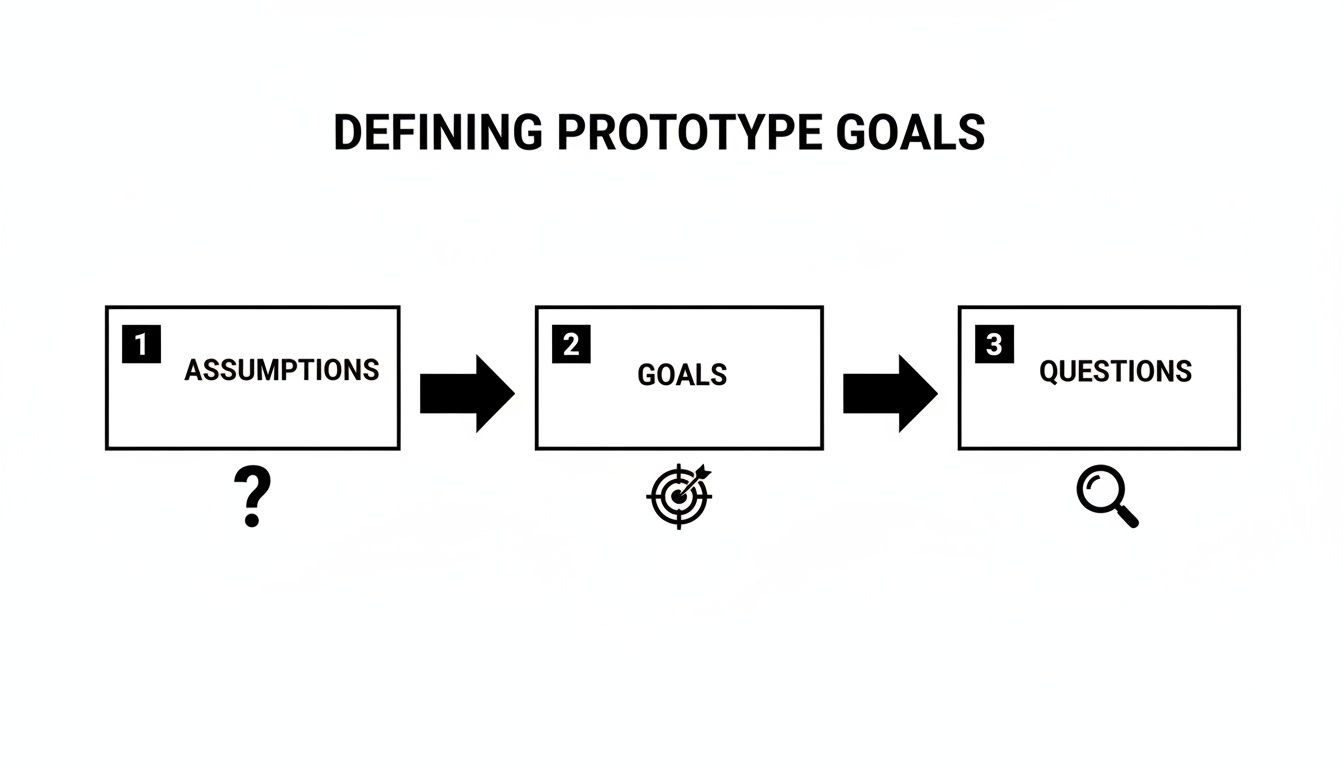
As the chart shows, a great prototype isn't just a collection of pretty screens. It's a strategic tool designed to validate or invalidate your most critical product assumptions.
Choosing the Right Starting Point for Your Prototype
Not sure where to begin? The best input method really depends on where you are in your product journey. This table breaks it down to help you pick the most efficient path forward.
| Input Method | Best For | Example Use Case |
|---|---|---|
| Simple Text Prompts | Early-stage ideation and quickly visualizing a single screen or component. | "Create a settings screen with toggles for push notifications and dark mode." |
| Detailed User Flows | Mapping out multi-step user journeys and ensuring logical navigation. | A text file outlining the steps from a user opening the app to completing a purchase. |
| Wireframes or Sketches | Translating existing low-fidelity designs into a high-fidelity, interactive format. | Uploading a picture of a whiteboard sketch for an onboarding sequence. |
| Existing Design Files | Importing polished designs from tools like Figma or Sketch to add interactivity. | Bringing in a complete UI kit to build out the final, interactive user flows. |
Ultimately, the goal is to get to a tangible prototype as quickly as possible. Don't overthink it—just pick the method that matches your current progress and start building.
Refine Your UI with Simple Commands
Once you have your initial screens, the real magic starts. This prototype isn't a static image; it's a living thing you can change on the fly with simple, conversational commands. This chat-driven editing is what makes iteration so incredibly fast.
Instead of writing up a detailed ticket for a designer or developer, you can just type what you want to see.
A product manager can skip the formal feedback loop and just command the tool directly: "Make the 'Add to Cart' button larger, change its color to a vibrant orange, and use bold text." The change happens in real time.
This intuitive loop is a game-changer. Think of the possibilities:
- "Add a search bar to the header of the home screen."
- "Change the font of all headings to Montserrat."
- "Re-arrange the items on the settings page to put 'Account' before 'Notifications'."
This gives non-technical team members the power to polish the user experience directly, making sure the prototype perfectly matches the vision before it ever gets near an engineering sprint.
Connecting Screens for Realistic Navigation
A pile of screens isn't a prototype. It only becomes one when you connect everything to simulate a real user journey. This is where you validate entire flows, not just how one screen looks. Thankfully, linking screens is as simple as clicking an element and telling it where to go.
In a matter of minutes, you can wire up an entire user flow:
- Start on the Login Screen: Link the "Sign In" button to the main "Home Screen."
- Navigate from Home: Connect a product card to its corresponding "Product Detail Page."
- Complete the Core Action: Link the "Add to Cart" button to the "Shopping Cart" screen.
- Finalize the Journey: Connect the "Checkout" button to a "Payment Confirmation" page.
By creating these interactive pathways, you get a prototype that behaves just like the final app. Users can tap, navigate, and complete tasks naturally, which is exactly what you need to get authentic, valuable feedback during testing.
Get Your Prototype into Real Users' Hands

You’ve got an interactive prototype that feels almost like the real deal. That's a huge milestone, but let's be honest: a prototype sitting on your laptop is worthless. Its entire value comes from getting it in front of actual users to see how they react. This is where your assumptions meet reality—the moment of truth in the prototyping and testing process.
Finding the right people to test your app, especially when you're working with a startup-sized budget, can feel like a massive hurdle. But it doesn't have to be complicated or expensive. The goal here is genuine, unbiased feedback that helps you build a better product, not just a pat on the back.
Finding Your First Testers
Before you even think about dropping cash on paid recruiting platforms, look at the people you can already reach. Your target audience is often closer than you think.
-
Friends and Family (with a big warning): This is the easiest group to tap into, but you have to be careful. They know you, and they’ll probably be too polite to give you the brutally honest feedback you actually need. Use them for technical checks—does the link work? Does it crash on their phone?—but take their opinions on usability with a massive grain of salt.
-
Second-Degree Connections: Time to ask for introductions. Post on LinkedIn, in relevant Slack communities, or on niche forums where your ideal users are already hanging out. Be direct and clear with your request: "I'm looking for 5 people who [describe your target persona] for a 15-minute feedback session on a new app prototype. Happy to offer a coffee gift card for your time."
-
"Guerilla" Testing: This is one of my favorite tactics. Go to a coffee shop or a co-working space where your target users might be. Offer to buy someone a coffee in exchange for five minutes of their time to test one specific flow on your prototype. It's scrappy, but this method delivers incredibly raw, unfiltered first impressions.
The key is to get your prototype onto their actual phones. With RapidNative, this is as simple as sharing a link or having them scan a QR code. This creates a much more realistic testing environment and generates far more authentic insights than watching someone click around on a laptop.
Moderated vs Unmoderated Testing
Once you've found a few willing participants, you need to decide how you'll run the test. There are two main ways to go about it, and each has its own strengths.
Moderated Testing is a live, one-on-one session, either in-person or over a video call, where you guide the user through the prototype. This approach is perfect for digging deep into the "why" behind their actions. You can ask follow-up questions in the moment and really probe into what’s causing confusion.
Unmoderated Testing is when you send a user a link with a set of tasks to complete on their own time, whenever it's convenient for them. This method is great for gathering feedback at scale and seeing how users behave when no one is watching over their shoulder. It’s also much faster and more budget-friendly.
For early-stage prototypes, my advice is always to start with 3-5 moderated sessions. The qualitative insights you get from watching someone struggle in real-time are pure gold. You’ll spot the most glaring usability issues almost immediately.
Asking the Right Questions
The way you ask questions can make or break a testing session. Your job is to be a neutral observer, not a salesperson trying to pitch their idea. You have to avoid leading questions that subtly hint at the "correct" answer.
Here’s a simple cheat sheet:
| Bad (Leading) Question | Good (Unbiased) Question | Why It's Better |
|---|---|---|
| "This checkout flow is pretty easy, right?" | "What are your thoughts on this screen?" | It opens the door for any feedback, positive or negative. |
| "Did you see the big red 'Buy' button?" | "What would be your next step here?" | It reveals if the user actually notices the button without you pointing it out. |
| "Do you like our new live stream feature?" | "Tell me what you think this feature is for." | It tests their comprehension of the feature’s purpose, not just their preference. |
Your script should focus on tasks, not features. Give them a goal, like, "Imagine you want to buy a gift for a friend. Show me how you would do that using this app." Then, the hard part: be quiet and watch. Those awkward silences are often where the most valuable insights are found.
The role of user feedback has changed dramatically. User testing isn't just a late-stage validation checkbox anymore; it's a continuous process. What used to happen once near the end of a project now happens all the time, which fundamentally improves the final product. You can discover more insights about modern mobile app development practices to see just how much this trend is shaping the industry. Getting your prototype into users' hands is the crucial first step in building this continuous feedback loop.
Turning User Feedback into Real Product Improvements
You’ve done it. You’ve run the tests and now you're staring at a mountain of raw user feedback—recordings, scribbled notes, and a bunch of direct quotes. This is the moment of truth. On its own, that feedback is just noise. The real magic happens when you turn those scattered observations into tangible improvements for your product.
This is exactly where the speed of modern prototyping and testing really pays off. It lets you close the loop between what a user says and what you build, faster than you ever thought possible.
Your first job is to synthesize all this information. Don't just treat every comment as a separate to-do item. Instead, you're on the hunt for patterns. Did three out of five testers get stuck on the exact same screen? Did more than one person call the same button "confusing" or "hidden"? These recurring themes are your treasure map, pointing directly to what needs fixing first.
From Vague Feelings to Specific Problems
Organizing this feedback doesn't have to be some overly complex process. Honestly, a simple spreadsheet or a tool like Miro is often all you need. Just start grouping similar comments. I like to create columns for the observation itself, which user said it, and the specific task they were trying to accomplish.
As you start populating this, you’ll see clusters start to form around common usability issues. It's almost always one of these three culprits:
- Navigation Friction: People just can't find their way around. You’ll hear things like, "I expected to find 'Settings' on my profile page, not buried in that main menu."
- Confusing UI/UX: The design itself isn't communicating clearly. A classic example is feedback like, "I had no idea I could tap on this image to see more details."
- Mismatched Expectations: The app simply didn't do what the user thought it would. For instance, "I thought hitting 'Save' would just update my draft, but it published the whole thing immediately!"
Going through this exercise transforms vague problems into concrete statements. You go from "some users were confused" to a much more powerful " 60% of testers couldn't figure out how to edit their profile information." Now that is a problem you can solve.
Figure Out What to Fix First
With a clear list of problems, the big question is: where do you start? You can't fix everything at once, so you have to prioritize. A really effective way to do this is to score each issue on two simple factors: user impact (how badly does this problem screw up the experience?) and implementation effort (how fast can we actually fix this?).
Your top priorities should always be the high-impact, low-effort changes. These are your quick wins—the small tweaks that make a huge difference to the user. A poorly labeled button is the perfect example of a high-impact, low-effort fix.
The real beauty of a modern prototyping workflow isn't just about getting feedback. It's about the incredible speed you can iterate. You can take a direct user comment, turn it into a fix, and have a brand new version ready for testing in minutes, not days.
This is how you build a powerful feedback loop. You can literally test, analyze, iterate, and validate a new version all in a single afternoon.
Making Changes on the Fly with Chat
This is where things get really fun. Let's say a tester tells you, "The 'Confirm Purchase' button feels a little small, and I almost missed it." In a traditional workflow, that feedback gets logged in Jira, sits in a backlog, and maybe, just maybe, gets looked at in the next design sprint.
With a tool like RapidNative, you can act on that feedback right now. You just open up the prototype and type a simple command:
“Increase the size of the ‘Confirm Purchase’ button and change its background color to our primary brand green.”
Just like that, the change happens. You've closed the gap between user feedback and product improvement in seconds. This kind of power means the whole team—designers, PMs, even founders—can make real progress without waiting for engineering resources.
You can immediately send the updated prototype link back to that same tester and ask, "How does this feel now?" That’s how you tighten the feedback loop and dramatically speed up the journey to building a product people genuinely love using.
From Validated Prototype to Production Code
So you've wrapped up your prototyping and testing cycle. You've got a validated concept, and everyone's excited. What comes next is often the messiest part of the entire process: the engineering handoff.
This is where great ideas slow to a crawl. Designers typically throw static files, a bunch of notes, and maybe a dense spec doc over the wall. Then, developers are left to piece it all together, trying to guess the original intent and rebuilding every single thing from scratch. I’ve seen this friction kill momentum on countless projects. It’s a huge source of delays and frustration.
But what if the handoff wasn't a handoff at all?
When you build with a code-based tool like RapidNative, you completely sidestep this classic bottleneck. Unlike design-only platforms where the prototype is basically a disposable picture of an app, everything you create in RapidNative—every button, screen, and interaction—is already backed by clean, production-ready React Native code. There's nothing to "translate" because the prototype is the code.
When your prototype is validated, you’re not handing over a pile of assets and instructions. You’re exporting a functional codebase.
Bridging the Gap Between Design and Development
This direct code export just erases the most painful parts of the old workflow. Developers get a project that's already structured, with components, navigation, and styling ready to go. They can pull it into their environment and start building features on day one, instead of spending weeks recreating what you already built.
The advantages here are crystal clear:
- Zero Ambiguity: What the developer sees is exactly what the user tested. There’s no room to misinterpret padding, font sizes, or how an animation is supposed to feel.
- Massive Time Savings: We're talking about a serious reduction in development costs by cutting out the entire "rebuild from mockups" phase. You keep the velocity you built up during the iteration cycles.
- Better Collaboration: Engineers can be part of the process much earlier. They can look at the generated code and give feedback on technical feasibility long before a formal handoff ever happens.
The whole handoff process changes from a transfer of documents to a simple continuation of work. The prototype isn't a blueprint for the app; it's the app's first version.
Best Practices for a Seamless Handoff
To make this transition as smooth as possible, think of the code export as a strategic step, not just a final button-click. The code is structured to be modular and easy to follow, but good communication is still the key to a successful integration.
We go into much more detail on this in our guide on how to turn your app design into code.
Once exported, engineers can pull the repository and immediately find reusable components, a logical file structure, and clean code that follows modern React Native conventions. This ensures that the speed and clarity you achieved in prototyping and testing carries right into the production cycle, getting your validated idea into the hands of users faster than ever.
A Few Common Prototyping Questions
If you're new to rapid prototyping and testing, you probably have a few questions. Let's tackle some of the ones that come up most often.
How Many Users Do I Really Need to Test With?
This is the big one. And the answer might surprise you: you don't need a massive group to get powerful insights.
For qualitative feedback, the magic number is often just five. Research from the Nielsen Norman Group famously showed that testing with five users will uncover about 85% of the usability issues in your flow. At this early stage, you're not aiming for statistical certainty; you're hunting for the big, glaring problems.
A small, focused group will give you the rich, detailed feedback you need to make meaningful improvements.
Low-Fidelity vs. High-Fidelity: When to Use Each?
Think of these as two different tools for two different jobs.
- Low-fidelity prototypes are your rough sketches. They're quick, dirty wireframes—sometimes not even interactive. Their job is to test the core idea and the basic user journey. Is the concept clear? Does the flow make sense?
- High-fidelity prototypes are the opposite. They look and feel almost exactly like the finished app, complete with polished UI, animations, and real interactions. You use these later to iron out the details and test the finer points of the user experience.
Don't skip the lo-fi step. I've seen teams jump straight into a pixel-perfect design only to realize the fundamental concept was flawed. Testing simple wireframes first saves a staggering amount of time because it proves you're building the right thing before you start making it look pretty.
Ready to build and test your mobile app ideas faster than ever? With RapidNative, you can turn your prompts, sketches, or user flows into a fully interactive React Native prototype in minutes. Start building for free.
Ready to build your app?
Turn your idea into a production-ready React Native app in minutes.
Free tools to get you started
Free AI PRD Generator
Generate a professional product requirements document in seconds. Describe your product idea and get a complete, structured PRD instantly.
Try it freeFree AI App Name Generator
Generate unique, brandable app name ideas with AI. Get creative name suggestions with taglines, brand colors, and monogram previews.
Try it freeFree AI App Icon Generator
Generate beautiful, professional app icons with AI. Describe your app and get multiple icon variations in different styles, ready for App Store and Google Play.
Try it freeFrequently asked questions
What is RapidNative?
RapidNative is an AI-powered mobile app builder. Describe the app you want in plain English and RapidNative generates real, production-ready React Native screens you can preview, edit, and publish to the App Store or Google Play.
Can I export the code?
Yes. RapidNative generates clean React Native and Expo code that you can export at any time. No lock-in, no proprietary format. Hand it to your developers or keep building inside RapidNative.
Is RapidNative free to use?
Yes. You can build apps on the free plan with no credit card required. Paid plans unlock unlimited AI generations, code export, and direct publishing to the App Store and Google Play.
Do I need to know how to code?
No. Most users build apps by describing what they want in plain English. Developers can drop into the code whenever they want more control, but coding is optional.
How long does it take to build an app?
Most users have a working first screen in under a minute. A full MVP usually takes a few hours instead of the weeks or months traditional development requires.