Building Data-Driven Mobile Apps: Lists, Charts, Dashboards
By Suraj Ahmed
27th Sep 2026
Last updated: 27th Sep 2026
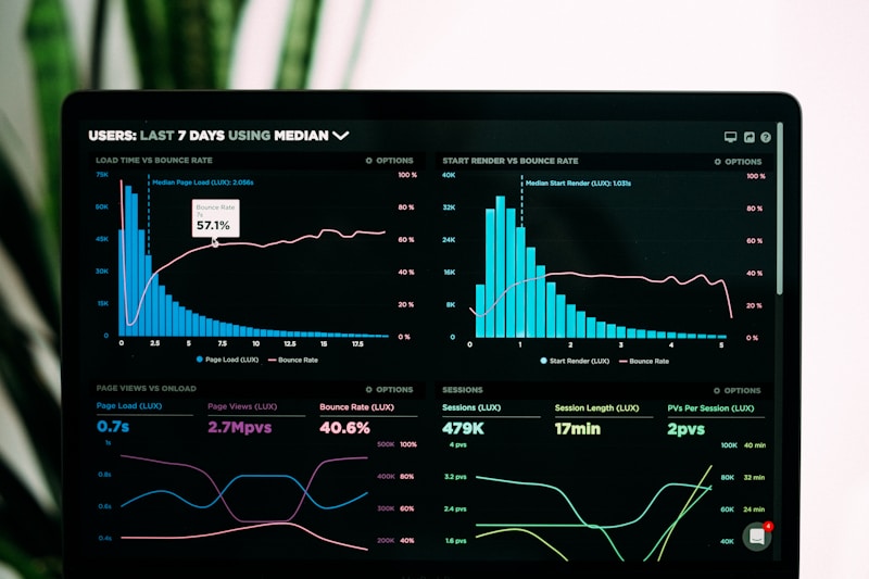
Every mobile app worth using is a data-driven mobile app. A fitness tracker is a list of workouts and a chart of weekly volume. A CRM is a list of accounts and a dashboard of pipeline. A finance app is a list of transactions and a chart of spend by category. Strip the branding and the animations and what's underneath is almost always the same three primitives — lists, charts, and dashboards — rendering data that changes over time.
That sameness is a clue. If the pattern is that universal, the hard part isn't the pattern. The hard part has always been wiring it: picking a chart library, wrestling with FlatList performance, sequencing loading and empty states, and making the whole thing feel native on both iOS and Android. This post is a practical walkthrough of how to build data-driven mobile apps end-to-end — and how RapidNative collapses the chart-library-selection and wiring work into a single prompt.
A data-driven mobile app is a React Native or Expo app whose UI is generated from a source of truth (a database, API, or local store) rather than hard-coded content. It typically pairs three UI primitives — scrollable lists for browsing records, chart views for aggregated trends, and dashboard screens that combine both with KPIs — with the state and refresh logic that keeps them in sync with the data.
By the end, you'll have a mental model for the four building blocks of every data-driven app, a repeatable pattern for prompting your way through them, and a fully working fitness analytics screen you built in under fifteen minutes.
What a data-driven mobile app really is
A UI is "data-driven" when it can be re-rendered by swapping the underlying data — not the code. Change a row in your database, pull-to-refresh, and the screen updates. Add a new category and the pie chart grows a new slice. Delete a workout and the streak recomputes.
That definition rules out most tutorials you'll find on the web. A "React Native chart tutorial" that hard-codes [10, 20, 30, 40] as the data array isn't building a data-driven app — it's building a chart illustration. Real data-driven apps have to handle five extra things a static demo never touches:
- Loading states. The first paint has no data yet.
- Empty states. A user with zero workouts still needs a screen.
- Error states. The network drops mid-fetch and the app has to say so.
- Refresh semantics. Pull-to-refresh, background poll, or push? Pick one and be consistent.
- Aggregation. The list has 10,000 rows; the chart shows the last 7 days. Something has to bucket the data.
The gap between "chart with fake data" and "screen that renders real user data across those five states" is where 80% of the engineering time lives. It's also exactly where AI code generation is at its most useful: those five patterns are boringly universal, so a model that has seen a hundred fitness apps knows what a loading skeleton and an empty state should look like without being told.
The four building blocks of every data-driven app
Almost every data-driven mobile screen you'll ever ship is one of four things, or a stack of them.
1. Lists. A scrollable feed of records — workouts, transactions, contacts, orders, messages. Under the hood this is React Native's FlatList or SectionList with a renderItem callback and, on longer feeds, virtualization. The details separate "works" from "good": pull-to-refresh with RefreshControl, infinite scroll pagination via onEndReached, swipe-to-delete via react-native-gesture-handler, empty-state illustration, skeleton loaders while the first page fetches, and a keyExtractor that stays stable across re-fetches.
2. Detail views. Tap a row, get the full record. This is where most apps break from the "just render a form" pattern and add real product value — inline editing, related-record sections, a small chart of that one item's history, share sheets, deletion confirmation. Under the hood: React Navigation's stack navigator, a route param carrying the record ID, and a local or shared state slice for the record itself.
3. Charts. Aggregated views of the same data — daily totals, weekly averages, category breakdowns, sparklines inside a card. The React Native chart-library landscape is genuinely fragmented: Victory Native is the most polished and now ships an XL version built on Skia; react-native-gifted-charts has the widest chart-type coverage; react-native-chart-kit is the simplest to drop in but the least flexible; and react-native-svg-charts is unmaintained but still ubiquitous. Picking wrong here is a real cost — swapping chart libraries later is a rewrite, not a refactor.
4. Dashboards. A single screen combining KPIs (big numbers at the top — "3,240 steps today"), one or two charts, and a preview list. This is the highest-value screen in most B2B apps because it's the one a stakeholder sees when they open the app. It's also the one that most often looks great with mock data and falls apart with real data — because real data has outliers, gaps, and rows that break the layout.
Every data-driven mobile app you'll ever build is some stack of these four. A fitness tracker is a dashboard on tab 1, a workout list on tab 2, and a workout detail behind each row. A finance app is a dashboard, a transaction list, and a category chart. Once you see the pattern, the "which app should I build" question becomes "which stack of these four."

Why data-driven apps used to be hard on React Native
If the four building blocks are that clean, why is building a data-driven mobile app still a weeks-long project? Because each block has an invisible tail of decisions that only surface when you sit down to write it.
For a list, you have to decide: FlatList or SectionList or FlashList? Do you memoize renderItem? What's the keyExtractor when records don't have stable IDs yet? How do you handle a row that expands? What does pull-to-refresh do if you're on page 3 of pagination — reset to page 1 or refetch just page 1? Does the empty state differ from the error state? Every one of these has a right answer, but nobody who hasn't shipped a dozen apps has all of them cached.
For a chart, you have to decide: which library, which chart type, how to handle small screens where a legend doesn't fit, how to render tooltips on a touch device that has no hover, how the chart behaves on rotation, whether to animate on data change, and how the color palette adapts to dark mode. And you have to write the data-shape transformation — turning your row-per-workout list into a bucketed weekly array the chart can consume.
For a dashboard, you have to decide the layout hierarchy (KPIs on top or side, chart above or below the preview list?), the refresh strategy (single refresh handler at the top, or per-widget?), and the loading choreography (do the KPIs pop in as they resolve, or does the whole screen wait?).
Each of these has ten Stack Overflow answers, half of them contradictory and half out of date. This is not a code problem — it's a decision-fatigue problem. And it's exactly the kind of problem AI is now genuinely good at collapsing.
How RapidNative builds data-driven apps from a prompt
RapidNative is an AI-powered app builder that turns a plain-English description into a real React Native + Expo app — complete with the four building blocks above, wired to a working Supabase backend. You describe the data model and the screens, and the AI generates the SQL migrations, the seed data, the screens, the state management, the loading and empty states, and the chart wiring in one pass.
The pattern that works, across hundreds of apps built on the platform, is to describe a data-driven app in three layers:
- What the app is for — one sentence. "A fitness tracker for casual runners."
- What the data model looks like — two or three sentences. "Users log runs with distance, duration, pace, and route. Each run belongs to a user."
- What the screens are — a list of the screens you want, in the four-block language. "A dashboard showing this week's total miles, a line chart of the last 30 days, and a preview list of the last 5 runs. A full runs list with pull-to-refresh. A run detail screen with a map placeholder and stats."
That third layer is where beginners typically get vague. "Add some analytics" leaves too much on the table. "A bar chart of miles per day for the last 7 days, with today highlighted" gets you exactly the chart you want. The more specific the four-block language, the more the generated screens look like what you had in your head.
If you're new to the tool, the fastest way to see this in action is to try starting from a description — or, if you already have a specification, pasting a PRD that describes the screens in the same four-block language.

Step-by-step: build a fitness analytics dashboard in 15 minutes
Let's build the whole thing. This tutorial produces a working fitness analytics app with a dashboard, a runs list, and a run detail screen — a canonical data-driven app.
Step 1: describe the app and the data model
Open RapidNative and paste this into the prompt input:
Build a fitness tracker for casual runners.
Data model: users log runs with distance (km), duration (minutes), pace (min/km), date, and optional notes. Each run belongs to the signed-in user.
Screens: (1) a dashboard tab showing four KPI cards at the top — total km this week, total runs this week, average pace this week, and current streak in days — followed by a bar chart of km run per day for the last 7 days with today highlighted, and a preview list of the last 5 runs. (2) a runs tab with a full list of runs sorted newest-first, pull-to-refresh enabled, and infinite scroll pagination. Each row shows date, distance, and pace, with a small colored badge for pace tier. (3) a run detail screen reached by tapping a row, showing full stats, notes, and a small line chart of that run's pace over each kilometer if available.
Seed with 30 realistic runs spread over the last 45 days.
Two things worth pointing out. First, the prompt uses the four-block language deliberately — "dashboard," "list," "chart," "detail." Second, it specifies aggregations explicitly ("km per day for the last 7 days," "average pace this week"). Aggregations are where most generated dashboards go wrong; naming them removes the ambiguity.
Step 2: watch the app build
RapidNative streams the generation live. On a fitness tracker of this size, you'll see it produce:
- A Supabase migration for a
runstable with the columns you specified, plus row-level security so a user only sees their own rows. - A seed file with 30 rows spread across the last 45 days.
- Three route files under Expo Router —
app/(tabs)/index.tsxfor the dashboard,app/(tabs)/runs.tsxfor the list,app/run/[id].tsxfor detail. - The chart wired to a bucketed daily aggregation, not the raw rows.
- The list wired to Supabase with
useEffect+ a real subscription for updates. - Empty and loading states in all three screens.
You can watch each file appear in the editor as the AI writes it. If a piece isn't quite right, you don't need to touch the code — point at any element in the preview and describe the change, and it regenerates just that piece.
Step 3: preview on your phone
Scan the QR code in the editor and the app opens on your device via Expo Go. This is a real device preview — you can add a run, watch the dashboard update, pull-to-refresh, and tap into a detail screen. You're testing on the exact runtime the production build will use.
Step 4: iterate
Every screen you built will need at least one iteration once you see it on a real phone with real data. Common ones on this app:
- "Make the current-week KPI cards horizontally scrollable so they don't stack on small screens."
- "Change the dashboard chart from bar to line and add a subtle area fill."
- "On the runs list, add a filter chip row for distance ranges: under 5 km, 5–10 km, 10 km+."
- "In the run detail, add a share button that copies the stats to the clipboard."
Each of these is one sentence in the chat and one regeneration. The four-block language keeps working — you're editing a "chart" or a "list row" or a "detail widget," and the model knows what you mean.
Step 5: export or publish
When the app is working, export the full source code if you have a developer taking it further, or publish directly to the App Store and Google Play from inside the editor. The exported code is a clean Expo Router project — no proprietary abstractions, no lock-in.
Patterns that separate real dashboards from demos
Once your app is running, the difference between a demo and a shippable app is a set of small patterns that almost nothing on the web teaches you. Ask for them explicitly in your prompts:
KPI cards that handle zero. "Total km this week" on a fresh account is 0.0 km, which looks broken. Better: show — for uninitialized states and a subtle "no runs yet" hint on tap.
Charts with a fallback. A bar chart with one day of data is not a chart, it's a rectangle. Ask for the chart to render as a KPI card if there are fewer than three data points.
Lists with a keyExtractor that survives a refetch. If your list re-renders because IDs shuffle, scroll position jumps. Every row should be keyed on a stable ID, and RapidNative-generated code does this by default — but ask for it if you're editing manually.
Pull-to-refresh that respects pagination. If a user is on page 3 and pulls to refresh, resetting to page 1 loses their place. Ask explicitly: "pull-to-refresh should refetch only the currently loaded pages, not reset."
Empty states that route to action. An empty runs list should have a "log your first run" button — otherwise it's a dead-end screen. Every empty state you generate should include the primary action for that screen.
Aggregations computed on the client, not the server. For datasets under ~10,000 rows, aggregating in the client (with useMemo) is faster than a round-trip to the backend. RapidNative defaults to client aggregation for weekly/monthly rollups because it makes the app feel instant.
Dark mode without a second theme file. React Native's Appearance.getColorScheme() plus a color-token file gives you dark mode for free. Ask for tokens ("card, muted, primary, accent") not raw colors, and the chart palette will follow.
Common mistakes when building data-driven mobile apps
Building the chart before the data model. The chart is downstream. If you don't know what you're bucketing and how, you're picking a library to render an idea that doesn't exist yet. Always describe the data model first.
Not naming aggregations. "Show a chart of my spending" leaves the model guessing whether that's daily, weekly, monthly, cumulative, by category, or by merchant. Name the aggregation in the prompt and you get the chart you meant.
Skipping the empty state. Every screen you generate needs an empty state, a loading state, and an error state, or it will look broken in the first thirty seconds a real user tries it. If the prompt doesn't ask for them explicitly, ask again.
Choosing a chart library too early. If you're going to build ten screens, the library choice doesn't matter until screen three. Let the AI pick a sensible default (Victory Native XL is a good one on Expo) and revisit only if you hit a real limitation.
Treating the dashboard as one screen. A dashboard is a stack of independent widgets. Each one has its own loading, empty, and error state. Generate them individually and compose, don't try to describe the whole dashboard as a single unit.
Loading everything up front. A dashboard that waits for the slowest query to render is worse than one where widgets pop in as their data resolves. Ask for per-widget suspense boundaries, not screen-level ones.
Frequently asked questions
What is the best chart library for React Native in 2026?
For most Expo apps, Victory Native XL is the best default in 2026 — it's built on Skia, renders smoothly on both iOS and Android, and has the most active maintenance. For apps that need chart types Victory doesn't cover (heatmaps, radar, gauge charts), react-native-gifted-charts is the widest-coverage alternative. Avoid react-native-svg-charts for new projects; it hasn't shipped a release in years.
Can I build a mobile dashboard without coding?
Yes. AI-powered app builders like RapidNative generate the full React Native and Expo code for a data-driven mobile app — including the Supabase migrations, screens, charts, lists, and state management — from a plain-English description. You describe the data model and the screens; the tool writes the code and you preview it live on your phone. You can export the code any time if you want a developer to take it further.
How is a data-driven mobile app different from a static one?
A data-driven mobile app re-renders when the underlying data changes — new rows in a database show up on the next refresh, charts recompute, KPIs update. A static app hard-codes its content in the source files, so changes require a code change and a new build. Almost every app worth building is data-driven; the static kind is limited to marketing splash screens and one-shot tools.
Do I need a backend to build a data-driven app?
Yes, but the backend can be as simple as a hosted Postgres database. RapidNative apps ship with Supabase wired in — you get a Postgres database, authentication, row-level security, and real-time subscriptions out of the box. You don't have to write server code; you write SQL migrations (or let the AI write them) and the client talks to Supabase directly.
How long does it take to build a fitness tracker or analytics app with AI?
A working prototype of a fitness tracker or analytics dashboard — with three screens, a chart, a list, and a seeded database — takes roughly 10–20 minutes in RapidNative for a first pass, and another 30–60 minutes of prompt-driven iteration to reach shippable quality. Compared to a traditional React Native project, which is typically 1–2 weeks for the same scope, that's a ~50x compression on early-stage work.
Start building
The pattern for every data-driven mobile app you'll ever ship is the same: four blocks, five states per screen, a handful of aggregations, and a chart library you don't have to pick. The compression AI gives you here isn't a shortcut — it's a way to skip the parts of mobile development that were never the interesting parts and get to the product decisions faster.
If you have an idea for an analytics app, a tracker, a CRM, a finance tool, or anything else that's fundamentally lists and charts of data, the fastest way to see if it's worth building is to describe it and watch it appear on your phone in the next fifteen minutes.
Start building your data-driven mobile app free → No credit card, 20 free credits.
Related reading: How AI turns a sketch into a mobile app · Turn a PRD into a working app · Browse the full RapidNative blog
Ready to build your app?
Turn your idea into a production-ready React Native app in minutes.
Free tools to get you started
Free AI PRD Generator
Generate a professional product requirements document in seconds. Describe your product idea and get a complete, structured PRD instantly.
Try it freeFree AI App Name Generator
Generate unique, brandable app name ideas with AI. Get creative name suggestions with taglines, brand colors, and monogram previews.
Try it freeFree AI App Icon Generator
Generate beautiful, professional app icons with AI. Describe your app and get multiple icon variations in different styles, ready for App Store and Google Play.
Try it freeFrequently asked questions
What is RapidNative?
RapidNative is an AI-powered mobile app builder. Describe the app you want in plain English and RapidNative generates real, production-ready React Native screens you can preview, edit, and publish to the App Store or Google Play.
Can I export the code?
Yes. RapidNative generates clean React Native and Expo code that you can export at any time. No lock-in, no proprietary format. Hand it to your developers or keep building inside RapidNative.
Is RapidNative free to use?
Yes. You can build apps on the free plan with no credit card required. Paid plans unlock unlimited AI generations, code export, and direct publishing to the App Store and Google Play.
Do I need to know how to code?
No. Most users build apps by describing what they want in plain English. Developers can drop into the code whenever they want more control, but coding is optional.
How long does it take to build an app?
Most users have a working first screen in under a minute. A full MVP usually takes a few hours instead of the weeks or months traditional development requires.