Learning App Development: From Idea to Prototype in Days
A practical guide to learning app development with RapidNative, covering planning, UX patterns, data architecture, collaboration, and clean code handoff.
By Suraj Ahmed
14th Oct 2026
Last updated: 14th Oct 2026
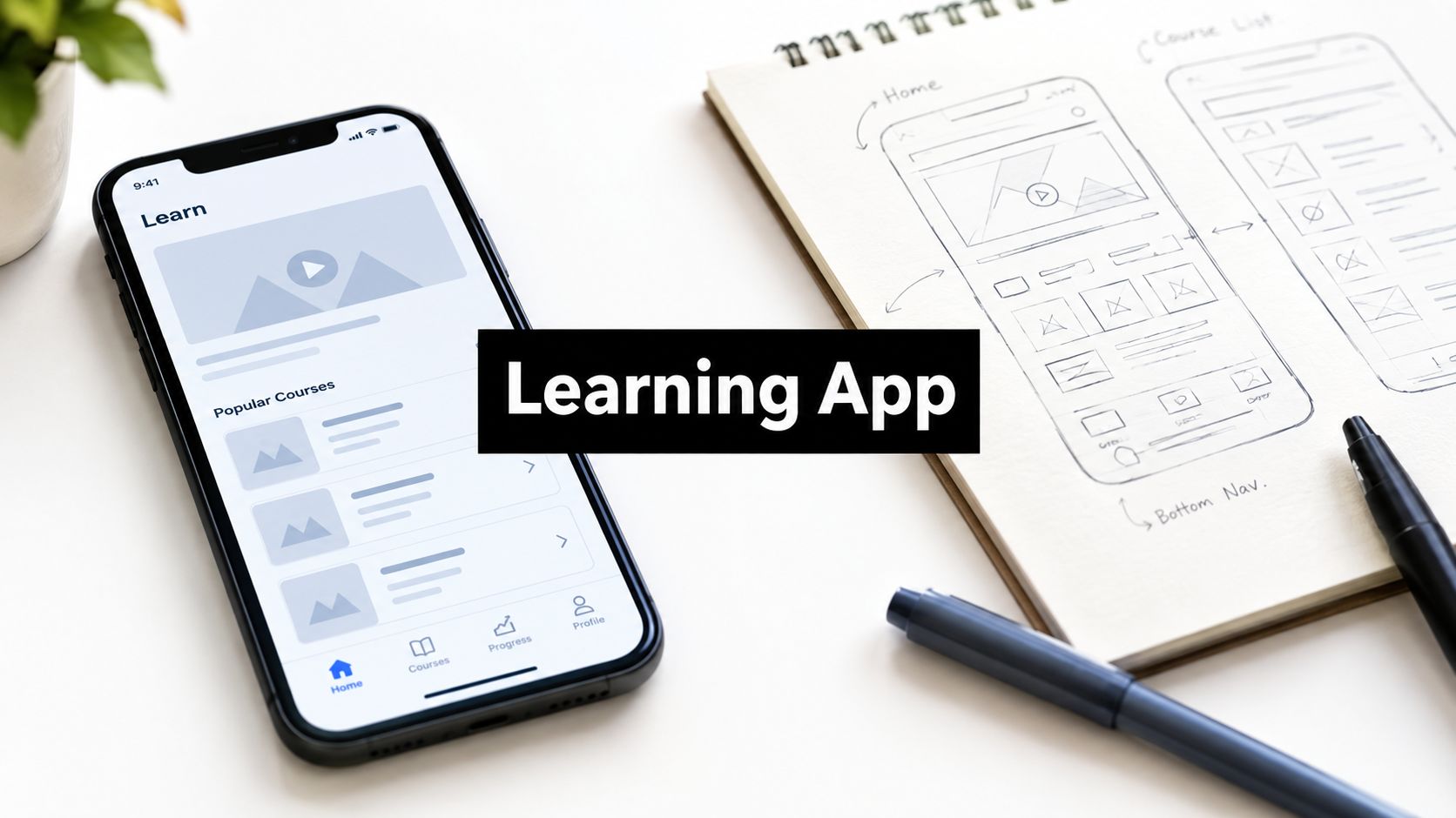
A founder sketches a language lesson on a napkin, then opens a laptop and discovers that the idea has become a product system. It needs a learner profile, lesson content, quiz states, progress logic, accessible controls, reliable navigation, and code someone else can maintain. The team has enthusiasm for a week, but not unlimited time to turn every possibility into a feature.
Learning app development works best when you make the product smaller before you make it smarter. A short language-learning app for travelers is a useful reference: one learner, one practical outcome, and a short sequence of lessons that can be tested with real people. A resource such as an Irish learning app also shows how a focused language experience can organize learning around a specific audience rather than trying to serve every learner at once.
The opportunity is substantial. One market analysis estimated the global mobile learning app market at $23.4 billion in 2025 and projected it to reach $95.7 billion by 2034, with a 17.8% compound annual growth rate. The same analysis estimated that K–12 applications represented 38.5% of the market in 2025. That market analysis is useful context, but it doesn't change the first product decision: build one learning loop that works.
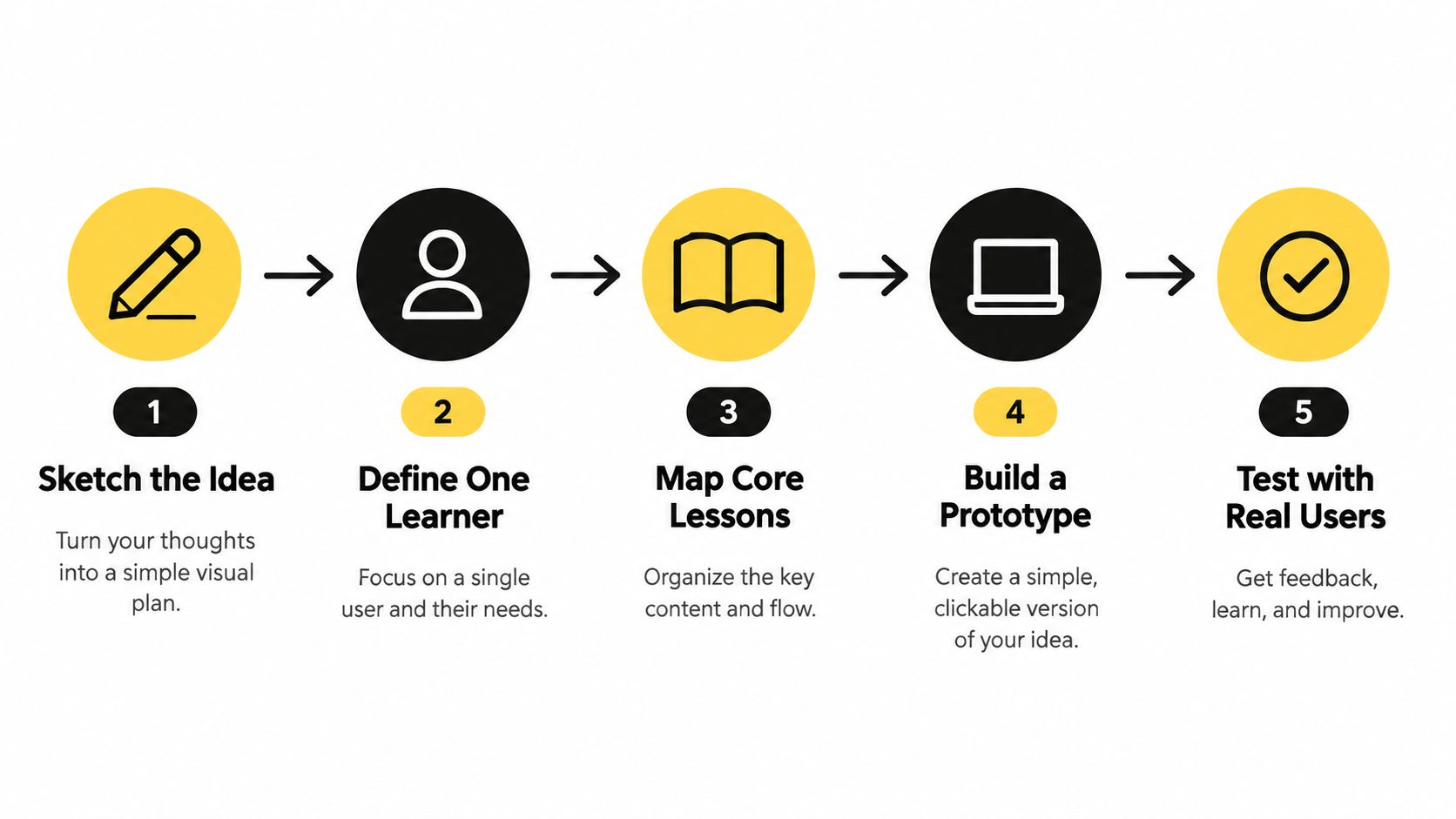
The practical path is straightforward. Sketch the idea, define one learner, map the core lessons, generate a working prototype, and test it with users. A mobile app idea guide can help turn a rough concept into a more concrete product brief before screens and code multiply.
The Realistic Path from Idea to Working Learning App
The traveler app might begin with a sentence such as, “Help people speak basic Spanish during a trip.” That sounds clear until the team asks what the learner should do. Order coffee? Ask for directions? Understand a hotel check-in? Each answer creates different lessons, vocabulary, quiz formats, and completion criteria.
A useful prototype doesn't attempt to teach a language. It helps a defined traveler complete a narrow task, such as ordering food politely in Spanish after completing three short lessons. That decision gives the team something observable. You can watch a learner open the app, complete a lesson, answer a question, and use the phrase in a realistic situation.
Five decisions before the first generated screen
Start with the learner's context, not the feature list. A traveler using a phone between flights needs short content, readable text, audio controls, and progress that survives interruptions. They don't need a community feed in the first prototype.
Then define the smallest complete loop:
- The learner chooses a practical goal.
- The app presents a short lesson.
- The learner recalls or recognizes the material.
- The app explains the result.
- Progress records what happened.
That loop is more valuable than a polished collection of disconnected screens. It exposes whether the content, interaction, and data model support one another.
Practical rule: If you can't describe the learner's first successful session in a few sentences, the scope is still too broad.
An AI-assisted builder changes the speed of the first pass, not the responsibility for the decisions. You can generate a lesson screen, quiz flow, and progress view quickly, but you still need to decide whether the generated navigation makes sense, whether quiz feedback teaches anything, and whether the stored progress matches what the interface claims.
By the end of a focused build, the target isn't a finished education platform. It's a production-shaped prototype with a real lesson flow, one quiz interaction, honest progress states, and enough structure for another person to test and critique.
Scoping Your First Learning App Without Overbuilding
Most scope problems appear before anyone writes code. “Basic Spanish for travel” is an audience and a topic, not a product definition. Turn it into a compact brief that answers three questions: who is learning, what will they achieve, and which screens prove it?
For the reference app, choose a traveler with limited study time who wants to order food confidently. The outcome might be: after three lessons, the learner can recognize and produce a small set of restaurant phrases, select an appropriate response, and complete a short simulated order.
Write that outcome in a one-page PRD before generating screens. The document can be plain text, a shared document, or a carefully written prompt. The format matters less than the decisions inside it.

A scope template that survives contact with the product
Use this structure:
- Learner: A traveler preparing for a short trip who prefers brief mobile sessions.
- Outcome: Complete a restaurant interaction using the target phrases with useful feedback.
- Lesson format: Short text, optional audio, one example, and one recall activity.
- Core screens: Goal selection, lesson player, quiz feedback, and progress summary.
- Success evidence: The learner completes the flow, understands the correction, and can repeat the phrase in context.
- Deferred features: Leaderboards, social feeds, open-ended AI tutoring, subscriptions, and broad course catalogs.
The deferred list protects the prototype. Leaderboards can distract from whether the lesson works. Social feeds introduce moderation and empty-state problems. An AI tutor can produce impressive conversations while making it difficult to evaluate whether the learner is improving. Build those features only after the core learning behavior deserves expansion.
Your prompt should include content behavior, not just visual style. Specify that the lesson needs a visible audio control, that quiz answers should show an explanation after selection, and that progress should distinguish started, completed, and reviewed lessons. Tell the builder what happens when the learner leaves halfway through.
A good first brief is specific enough for a designer to sketch and a developer to challenge. It also gives generated code a boundary. Without that boundary, the builder may produce attractive screens that don't represent a coherent learning experience.
Designing Lessons, Quizzes, and Progress That Actually Teach
A learning app needs more than content displayed inside a phone frame. The interface must help the learner take in an idea, retrieve it, understand mistakes, and know what to do next. Three interaction shapes carry most of that work: the lesson player, the quiz or recall moment, and the progress view.
The lesson player should reduce cognitive load
For the traveler app, don't place a full dialogue, translation, pronunciation note, and grammar explanation on one dense screen. Present one phrase with its meaning, give the learner an optional audio control, then reveal a short usage example. An expandable explanation works when the learner needs detail without forcing every learner to read it.
Keep the primary action in a predictable location. A bottom action such as “Continue” is easier to find than a link that changes position based on content length. Audio should have a visible label and a state that makes playback clear. If a video or audio lesson carries essential meaning, include captions or a transcript rather than treating media as decoration.
Quizzes need useful states
Multiple choice works well for recognition, such as selecting the phrase that fits a restaurant situation. Free recall is more demanding and better suited to a later checkpoint, where the learner types or speaks an answer. Do not use the same question type for every lesson just because it is easy to generate.
The important state is not only correct or incorrect. Show the selected answer, the expected answer, and a concise explanation. Let the learner continue after a mistake without turning the error into a dead end. Quiz patterns from resources such as MasteryMind quiz features can provide useful references for thinking about question types and feedback states, even when your own content model is different.
Progress should describe behavior honestly
A progress bar labeled “complete” shouldn't fill because the learner opened a screen. Store meaningful events, such as lesson started, lesson finished, question answered, and review due. A streak can encourage regular use, but it shouldn't shame someone for missing a day. “Keep practicing” is a better recovery message than a red failure state.
Accessibility belongs in these decisions from the beginning. In a 2025 U.S. disability survey, 46.4% of respondents reported complicated layout or navigation as a problem, while 42.9% reported missing captions or transcripts. Those findings, reported in the survey discussion, explain why accessibility can't be deferred until launch.
Use readable text sizes, sufficient contrast, clear focus order, labels that describe controls, and tap targets that don't require precision. The UI design and prototyping guide is a useful place to connect these choices to early screen work rather than a final compliance pass.
Structuring Data, Routing, and Components in RapidNative
A generated interface becomes difficult to own when the screens look consistent but the underlying data is improvised. Model the learning experience before polishing its appearance. For the traveler app, a simple structure might include courses, lessons, activities, questions, answer options, and learner progress.
A lesson should reference its activities instead of containing unrelated copies of the same content in multiple screens. A quiz question should identify its prompt, answer choices, correct answer, explanation, and interaction type. Progress should belong to the learner and lesson, not to a visual component that happens to display a bar.
Choose navigation around learner intent
Use a stack for the main journey, such as goal selection to lesson to quiz feedback. Use tabs for stable destinations that learners revisit, such as Learn, Progress, and Profile. Use a modal for a temporary choice, such as selecting a course or viewing a short pronunciation note.
Don't put every destination in a tab bar. Too many persistent choices compete with the lesson itself. The navigation model should answer a simple question: where does the learner go after this action, and what state should remain when they return?
Reusable components make those decisions durable. A LessonCard should display the same completion state wherever it appears. A QuizOption should handle selected, correct, incorrect, and disabled states consistently. A ProgressSummary should read from the same progress store as the lesson list, so the two screens can't disagree.
RapidNative generates React Native and Expo projects, uses NativeWind for styling, and allows the exported code to move into a real repository. Treat that generated output as something your team will inspect and extend, not as an untouchable artifact. Ask for named components, clear route boundaries, and a single source of truth for learner progress.
The architecture still needs human review. Check dependencies, inspect authentication and data handling, reproduce the main behavior from the requirements, and add tests around navigation and progress updates. AI-assisted development is useful when it removes repetitive setup. It becomes risky when nobody understands what the exported code does.
A short product walkthrough can make those structural choices easier to evaluate:
Before accepting a generated screen, ask whether its state survives a restart, whether an interrupted lesson resumes correctly, and whether the component can be reused without copying logic. Those answers matter more than how quickly the first screen appeared.
Collaborating in Real Time Without Breaking the Prototype
The collaboration session starts with a small disagreement. The PM wants the lesson introduction shortened. The designer wants the quiz answer cards moved higher so the thumb doesn't travel across the screen. The developer notices that the progress endpoint returns a lesson identifier, while the screen expects a course identifier.
In a static design file, each person might defend a separate artifact. In a running prototype, the team can make the disagreement visible. The PM changes the copy, the designer adjusts the interaction, and the developer checks whether the new screen still represents the underlying state.
The traveler app exposes an awkward edge case: what should happen when someone answers a question and closes the app before reading the explanation? The first version resets the quiz. That feels minor during a demo, but it breaks the learner's mental model. The team decides to persist the question state and return the learner to the feedback screen.
Give collaboration a small operating system
One person should own the prompt or change request at a time. That doesn't mean one person makes every decision. It means the team can identify which instruction produced a change and revert or refine it without guessing.
Use iteration for a change that preserves the current direction. Fork when the team wants to test a distinctly different lesson flow, navigation model, or visual language. Comparing two working variants is faster than arguing over descriptions, but only if each variant has a clear hypothesis.
Preview links and QR codes make feedback immediate. A teammate can test the flow on a phone, and a real learner can report that the audio button is hard to find or that the completion message feels confusing. Keep notes close to the prototype, with short explanations such as “Progress records completion after feedback is read because the explanation is part of the lesson.”
A prototype should preserve decisions, not just screens.
Don't ask collaborators to review everything at once. Give each person a narrow job: follow the lesson without help, try to recover from an incorrect answer, or check whether the progress screen reflects completed work. Focused sessions reveal more than broad approval.
The team should also maintain a known-gap list. Mark missing content, mocked data, unresolved accessibility behavior, and backend assumptions separately. That list prevents a polished preview from being mistaken for a finished product.
Testing, Accessibility, and Quality Before You Hand Off
AI-generated code still needs an evidence-based quality loop. Start with the behavior a learner can observe, then inspect the implementation behind it. A short afternoon review can expose more risk than another round of visual polishing.
Run the traveler app from a clean start. Choose a goal, open each lesson, play the audio, answer correctly, answer incorrectly, close the app, reopen it, and inspect progress. Rotate the device if the app supports rotation, interrupt the lesson, and return through the system back action. A progress bar that fills without a stored completion event is a visual defect and a product defect.
Test the experience in three passes
Functional review checks whether the core path works end to end. Verify that the next button advances the right lesson, that feedback matches the selected answer, and that a completed lesson appears consistently on the home and progress screens.
Accessibility review checks contrast, dynamic text sizing, focus order, semantic labels, captions, and screen-reader announcements. Don't assume an automated check can understand whether a control's label makes sense in context. Ask a person to move through the flow without sight or without relying on precise gestures when possible.
Performance review uses a physical device, including an Android phone that isn't the fastest device available to the team. Watch for delayed screen transitions, oversized media, loading states that provide no feedback, and interactions that become sluggish when lesson content grows.
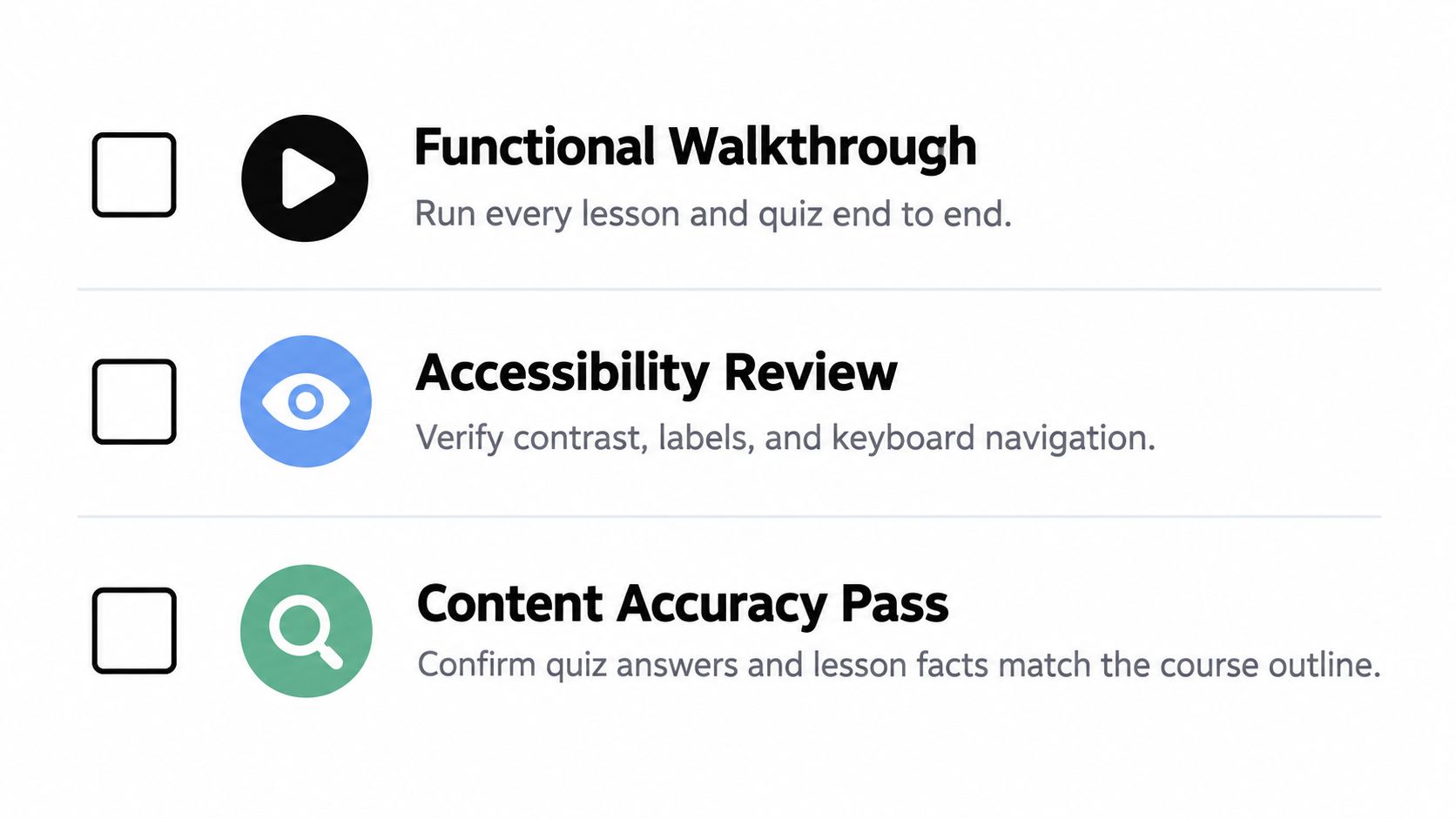
Content accuracy deserves its own pass. Compare every quiz answer with the course outline, verify translations and pronunciation notes, and check that an explanation doesn't contradict the lesson. A technically correct screen can still teach the wrong thing.
Fix issues where they originate
If captions are missing, update the content model and lesson component rather than adding a note for engineering. If a quiz resets after interruption, change the state and persistence logic in the prototype. If the progress bar is decorative, define the event that makes it advance.
The mobile application testing guide can help turn this process into a repeatable test script. Keep the script short enough to run after each meaningful change, and record the device, state, and expected result for every failure.
Quality gate: Don't hand off a screen until you can explain what the learner did, what the app stored, and what the learner sees next.
Handoff to Engineering and Your First Week Checklist
A useful handoff doesn't say, “The prototype is in the builder.” It gives engineering enough context to preserve the product decisions while replacing mocks, connecting services, and hardening behavior.
Export the project and include the prototype link, the one-page PRD, the data model, the progress rules, and a known-gap list. Note which content is temporary, which routes are final for the prototype, and which interactions still need product decisions. The React Native and Expo foundation can carry into production work, but the engineering team still needs to review dependencies, security, testing, and release configuration.
Learning App Prototype Handoff Snapshot
| Area | What to include in the handoff | Why it matters |
|---|---|---|
| Product scope | Learner profile, learning outcome, and deferred features | Prevents the first sprint from expanding into a platform rebuild |
| Content model | Courses, lessons, activities, questions, answers, and explanations | Gives engineering a stable structure for content and APIs |
| Navigation | Route map with entry points, exits, and interrupted states | Makes the intended learner journey explicit |
| Progress logic | Events that define started, completed, reviewed, and scored | Prevents progress screens from displaying misleading states |
| Accessibility | Labels, focus order, captions, contrast decisions, and text behavior | Keeps accessibility requirements visible during implementation |
| Known gaps | Mock data, unresolved edge cases, and performance concerns | Separates intentional prototype limits from accidental defects |
A focused first week
- Day one: Define one learner and one measurable learning outcome.
- Day two: Sketch the goal, lesson, and quiz screens.
- Day three: Build the lesson flow with one complete content path.
- Day four: Add one quiz, feedback state, and persistent progress rule.
- Day five: Test with two real users and record where they hesitate.
- Day six: Fix the highest-risk interaction and repeat the critical path.
- Day seven: Export the code, document gaps, and prepare the engineering handoff.
This workflow doesn't remove engineering. It gives engineering a clearer starting point. AI-assisted generation handles much of the repetitive interface work, while product judgment remains essential for learning outcomes, accessibility, data integrity, and safe code ownership.
RapidNative turns prompts, sketches, images, or PRDs into shareable React Native apps with live screens, navigation, reusable components, and exportable Expo code. Use it to build the focused lesson, quiz, and progress loop described above, then visit RapidNative to start shaping your learning app prototype.
Ready to build your app?
Turn your idea into a production-ready React Native app in minutes.
Free tools to get you started
Free AI PRD Generator
Generate a professional product requirements document in seconds. Describe your product idea and get a complete, structured PRD instantly.
Try it freeFree AI App Name Generator
Generate unique, brandable app name ideas with AI. Get creative name suggestions with taglines, brand colors, and monogram previews.
Try it freeFree AI App Icon Generator
Generate beautiful, professional app icons with AI. Describe your app and get multiple icon variations in different styles, ready for App Store and Google Play.
Try it freeFrequently asked questions
What is RapidNative?
RapidNative is an AI-powered mobile app builder. Describe the app you want in plain English and RapidNative generates real, production-ready React Native screens you can preview, edit, and publish to the App Store or Google Play.
Can I export the code?
Yes. RapidNative generates clean React Native and Expo code that you can export at any time. No lock-in, no proprietary format. Hand it to your developers or keep building inside RapidNative.
Is RapidNative free to use?
Yes. You can build apps on the free plan with no credit card required. Paid plans unlock unlimited AI generations, code export, and direct publishing to the App Store and Google Play.
Do I need to know how to code?
No. Most users build apps by describing what they want in plain English. Developers can drop into the code whenever they want more control, but coding is optional.
How long does it take to build an app?
Most users have a working first screen in under a minute. A full MVP usually takes a few hours instead of the weeks or months traditional development requires.