From Mobile App Idea to Working Prototype in Days
Turn your mobile app idea into a real, testable prototype this week. A practical, step-by-step guide to ideation, validation, and rapid prototyping.
By Suraj Ahmed
26th Sep 2026
Last updated: 26th Sep 2026
You've got a notebook full of mobile app ideas, a Figma file with increasingly polished screens, and a calendar that keeps losing weekends to “one more design pass.” The uncomfortable question is getting louder: are you building a useful product, or just producing a convincing demo that nobody needs?
That uncertainty is normal. The expensive mistake is treating it as a reason to build for another month. A stronger approach closes the distance between an idea and real user signal within seven days, using validation and prototyping as one continuous loop. You test the promise, build only the smallest flow that can prove or disprove it, watch people use it, and change course while the cost of learning is still low.
The Moment Every Builder Knows Too Well
A product manager I've worked with once kept three lists: promising mobile app ideas, ideas that seemed technically easy, and ideas that could make money. None of the lists helped him choose. He spent weekends sketching onboarding screens for a neighborhood service app, then abandoned them after discovering a similar product. A second prototype looked cleaner, but the target users never returned for a follow-up conversation.
The anxiety wasn't choosing the wrong color or framework. It was choosing the wrong problem and discovering it after spending months solving it. Earlier prototypes made the decision harder because they created sunk cost. Every discarded screen felt like evidence that the team had already invested too much to stop.
Then a colleague challenged the process: stop researching in the abstract and start learning from users. The team replaced another round of competitive analysis with a small landing page, a concrete offer, and a manual version of the service. People didn't just describe what they might want. They tried to complete the task, asked practical questions, and revealed which part of the promise mattered.
Practical rule: An app idea earns more development time when users change their behavior, not when they praise the concept.
Mobile products now compete inside a mature, habit-driven environment. In 2025, people spent about 5.3 trillion hours in apps, averaging roughly 3.6 hours per day per user, and opened about 10 apps daily while using around 34 apps per month, according to Mordor Intelligence's mobile application market overview. That scale creates opportunity, but it also raises the standard. A useful app must win a place in an existing routine.
The rest of the process should therefore answer one question quickly: can a specific person complete a valuable action and show enough intent to continue or pay? If the answer is unclear, more features won't help. If the answer is promising, a working prototype gives you better evidence than another presentation deck.
Finding Ideas That Deserve Your Time
“Brainstorm 20 app ideas” sounds productive because it creates a visible list. It rarely creates a strong product direction. Most generated ideas are variations on familiar software, detached from a defined audience, a recurring frustration, or a workflow you can realistically improve.
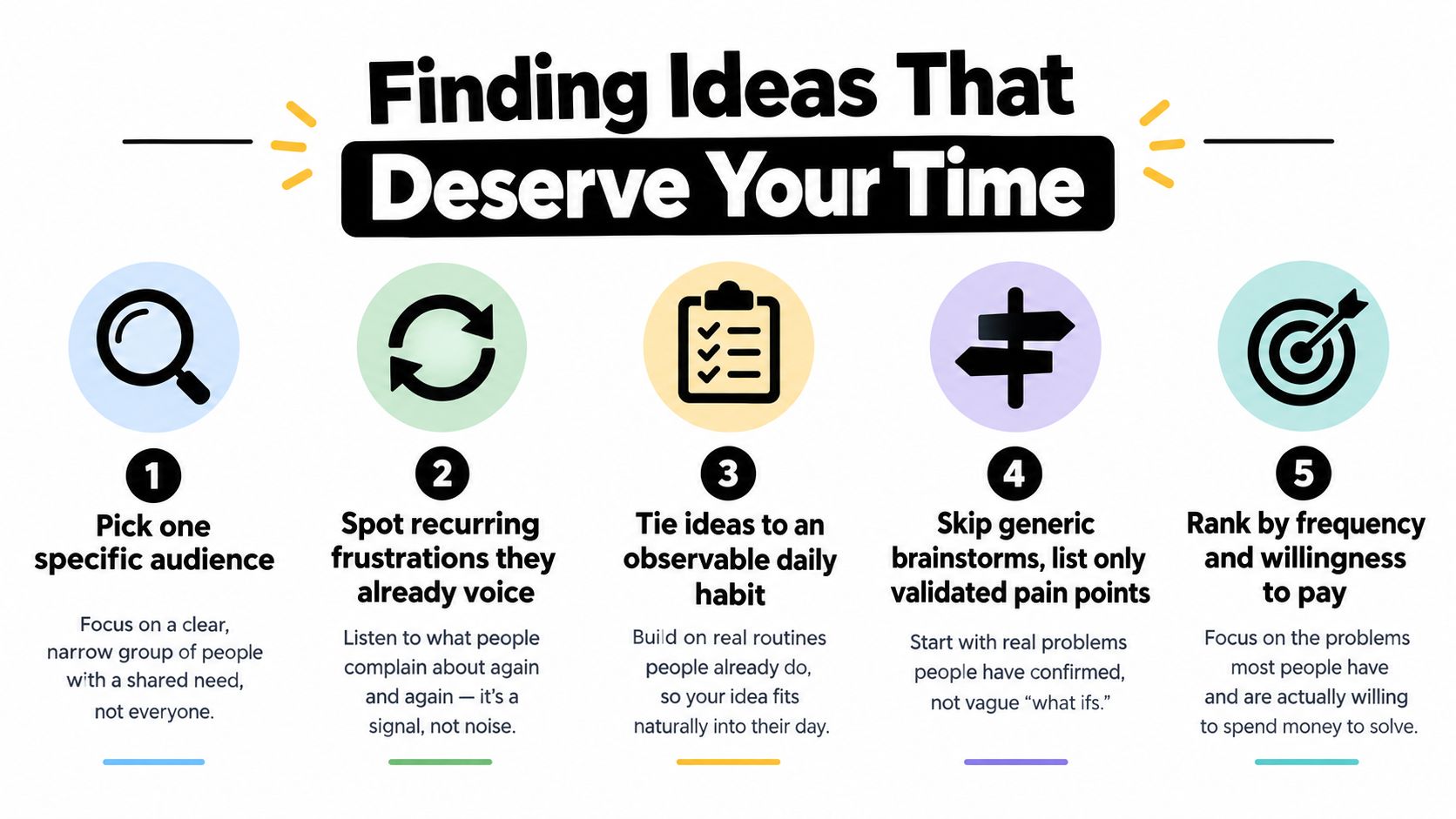
Start with one audience instead. Read the complaints that audience already writes in Reddit threads, Slack communities, App Store reviews, support tickets, and industry forums. Look for workarounds, repeated manual steps, screenshots shared for context, and phrases such as “I still have to…” or “Why can't this just…?” Those details are stronger raw material than a blank brainstorming document.
A useful mobile app idea often fits the way the phone is used. Ask questions that force mobile-native thinking:
- What happens away from a desk? A field technician might need to photograph equipment, record a voice note, and send a status update with unreliable connectivity.
- What benefits from the camera? A resale seller could scan an item, capture condition evidence, and create a listing without typing a long description.
- What must happen quickly? A commuter may need one tap to save a delay, share a location, or reorder a regular service.
- What can work offline? A translator, checklist, or inspection workflow may need to remain useful when the network disappears.
- What behavior repeats? A recurring task creates a better opportunity than a rare inconvenience, provided users already feel enough pain to change their routine.
The best ideas usually come from observing how people compensate for a bad tool. A parent copying school schedules into a personal calendar, a freelancer chasing invoice updates through email, or a clinic worker photographing forms for later entry each reveals a gap between intent and execution. You're not looking for novelty. You're looking for a narrow promise that can be delivered better on a phone.
Rank pain before features
Once you have raw observations, rank them by frequency, urgency, existing workaround, and willingness to pay. Don't score an idea because it sounds impressive. Score the evidence around the problem.
An idea that helps a narrow group complete an unpleasant task every week is usually more testable than a broad “AI assistant for everyone.” An app for contractors that turns site photos into a structured handover may have a clearer first user and workflow than a general photo organizer, even if the second concept sounds larger.
Use this practical guide to validating a startup idea to turn those observations into explicit assumptions. Write the audience, painful situation, promised outcome, acquisition path, and payment moment on one page. Then generate prompts only to expand the evidence you already have, for example: “What mobile-first workflows could reduce the time a field technician spends documenting a completed job?” That prompt is useful because it has a user, context, and constraint.
Proving the Idea Before You Build It
Validation tactics differ in the strength of signal they produce. An interview tells you what someone says. A click shows curiosity. A completed task shows usability. A payment, deposit, or repeated return shows that the problem has economic or behavioral weight.
That doesn't make interviews useless. They're valuable for learning the user's language, discovering exceptions, and finding the moment when the problem becomes urgent. They're weak as a final demand test because people are generous with hypothetical approval, especially when the product is free, distant, or presented by a friend.
Choose the test that matches the risk
A smoke-test landing page works when you need to test whether a clear promise earns attention. Put one audience, one problem, one outcome, and one call to action on the page. Measure targeted visitor click-through and email capture, then inspect the quality of signups. A large list of people who never answer a follow-up is not strong evidence.
A fake-door test works when you can place a proposed action inside an existing channel, such as a newsletter, community, or current product. Label the feature clearly enough to avoid misleading users, then measure whether people click to request access. Click-through indicates interest in the promise, not proof that users will complete the workflow.
A pre-sale or paid waitlist is stronger because it tests willingness to exchange money, not just attention. Ask for a deposit, paid pilot, or explicit purchase commitment. If nobody will pay, don't immediately conclude the problem is worthless. Check the audience, price framing, buyer, and promise first. Still, payment resistance is more useful than a page full of polite “sounds great” responses.
A concierge MVP lets you deliver the outcome manually to a small group of real users. For example, instead of building an automated expense categorization app, ask users to forward receipts and return a categorized summary yourself. Watch whether they provide the inputs, use the result, and request the next delivery. Manual work exposes the true workflow before automation hides it behind assumptions.
| Validation Tactics Ranked by Signal Strength | What It Measures | Signal Strength | Minimum Evidence |
|---|---|---|---|
| Smoke-test landing page | Message relevance and signup intent | Low to medium | Qualified visitors take the stated action and respond to follow-up |
| Fake-door test | Interest in a specific feature or offer | Medium | Targeted users click and request access or explain their need |
| Concierge MVP | Real task completion and repeat value | High | Several real users complete the workflow and ask for the outcome again |
| Pre-sale or paid pilot | Willingness to pay and buyer urgency | Highest | At least one target customer commits money or a paid pilot |
The exact sample size depends on the market, price, and decision you're making. Don't use a fixed interview quota as a substitute for judgment. Five conversations can expose a broken assumption, while many signups can remain meaningless if they come from the wrong audience.
Signal beats volume: a smaller number of users completing a meaningful task is more valuable than a larger number expressing interest in theory.
Capture behavior, not compliments
For each test, define the event that would change your decision before launching it. If you're testing a contractor handover app, that might be uploading a site photo, generating a report, and sending it to a client. If you're testing a subscription manager, it might be connecting an account and identifying an unwanted renewal.
Log where users hesitate, what they do instead, and whether they return without prompting. Ask, “What would you do if this disappeared tomorrow?” rather than “Would you use this?” The first question probes dependence. The second invites encouragement.
A mobile app startup autopsy of 126 cases found that 62.7% of failures involved being outmaneuvered, outspent, or insufficiently differentiated, while 15.1% were attributed to discovering no market need and 1.6% to product or technical issues, as summarized in the published mobile app failure analysis. The practical lesson isn't that market need is unimportant. It's that a technically functional app can still lose because the positioning, distribution, or differentiation never became strong enough.
Turning the Idea Into a Real Prototype
A prototype should make one value hypothesis observable. For a mobile app idea, map the smallest end-to-end journey as entry point, core action, payoff. A field worker opens a job, photographs the completed work, and receives a shareable report. A traveler opens a translation screen, points the camera at a sign, and gets an understandable result. A freelancer sees an overdue invoice, selects a reminder tone, and sends it.
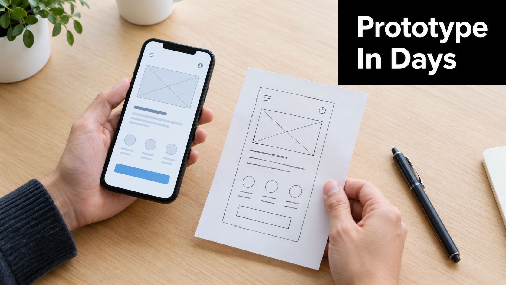
Start with three to five screens on paper, in Whimsical, or in another lightweight design tool. Don't add authentication, settings, profiles, notifications, or an elaborate dashboard unless one of them is part of the hypothesis. If the test is whether users can create a report from a photo, the first prototype shouldn't spend its limited time on account recovery.
Build the narrowest believable flow
A modern prompt-to-app workflow can compress the jump from sketch to interaction. Describe the screens, navigation, data states, and primary action in natural language, then use the generated React Native interface as a starting point. Tools such as RapidNative can generate screens with navigation, components, and working state in minutes rather than forcing the team to hand-code every first-pass view.
Treat generated output as a draft. Replace placeholder copy with the language users used in interviews, model realistic empty and error states, and make the tested action visually unmistakable. An AI-generated interface may look complete while skipping the detail that determines whether the task succeeds, such as permission timing, a useful confirmation, or a clear recovery path.
The distinction between a clickable mockup and a working prototype matters. A static design can tell you whether people understand the general layout. A functioning flow can show whether they know what to tap, whether the form is too demanding, whether the output is useful, and whether they finish without help.
Use this guide to building a mobile prototype when deciding which interaction must be real and which can remain simulated. A prototype can use seeded data, but the user should experience the important consequence of the action. If you're testing a report workflow, the report should contain believable fields and be shareable, even if the underlying automation is manual.
Put it on a phone early
A phone reveals problems that disappear in a desktop frame. Text wraps differently, buttons compete with the keyboard, camera permissions interrupt the flow, and a one-handed task can become awkward. Preview the prototype on the device your target users carry, not only in a browser.
Expo supports a loop of starting a project, editing code, seeing updates, and repeating while testing on a device or emulator. Its documentation describes Expo as a production-grade framework for React Native apps across Android, iOS, and web, which makes it a practical option when the team wants one codebase for an early cross-platform flow. Expo's workflow documentation explains that iterative cycle directly.
For early sharing, Expo Go's documentation and FAQ describe a free app that lets developers preview an app on a physical device without going through App Store or Google Play review. That removes unnecessary release friction for stakeholder demos and first usability sessions.
Tag only the events that answer the hypothesis: screen viewed, core action started, core action completed, result accepted, and return behavior. If analytics implementation takes longer than the flow itself, use a simple observation sheet first. The purpose is learning, not building an analytics museum.
For teams working toward a fixed learning date, a resource on deadline-driven MVP launch can help keep scope tied to a real delivery point. The discipline is useful, but don't confuse shipping on time with proving the product. A fast prototype that measures the wrong behavior only produces fast confusion.
Knowing When the Prototype Is Ready to Ship
The prototype is ready when it can answer one important question cheaply. It isn't ready because every screen has final polish, and it isn't automatically ready because it runs without crashing.
Consider three milestones side by side:
| MVP Stages Compared | Includes | Tests | Signal Quality |
|---|---|---|---|
| Raw MVP | Sketch-level clickable flow with simulated or limited data | Whether users understand the promise and can find the core action | Useful for early comprehension sessions |
| Polished MVP | Real data, one or two essential integrations, and a clearer usability path | Whether users can complete the job with little guidance | Strong enough for focused acquisition tests |
| Full app launch | Store-ready polish, onboarding, analytics, support content, and retention loops | Whether the product can acquire, activate, retain, and support customers repeatedly | Appropriate after core demand and payment intent are credible |
A raw MVP should answer, “Do users understand what this does, and do they attempt the main action?” It's ideal for the first handful of sessions because changes remain cheap. If users can't explain the outcome or repeatedly tap the wrong control, don't add payment integration. Fix comprehension.
A polished MVP earns its place when the core flow makes sense and the team needs to test a more realistic behavior. Add the smallest useful integration, such as payment, push notifications, or authentication, only when that integration affects the decision. A five-second usability test is a practical filter: show the opening screen briefly, remove it, and ask what the user thinks they can do next.
A full launch is a different commitment. It includes the operational surface area teams often underestimate, including store assets, onboarding, analytics, support documentation, privacy handling, and mechanisms that encourage users to return. Building that layer before repeatable activation and willingness to pay have appeared turns uncertainty into overhead.
Stop at the cheapest version that produces honest signal. If users complete the core action without your hand on their shoulder, widen the funnel. If completion collapses, return to the prototype and find the break.
The common errors run in opposite directions. Stopping too early leaves the team with opinions instead of behavior. Stopping too late drains momentum and makes every learning expensive. For a sharper distinction between these stopping points, compare MVP, prototype, and proof-of-concept scopes.
Your First Week With a Mobile App Idea
Run the week as one loop, not as separate “research” and “development” phases.
- Day 1: Write the problem hypothesis, choose one audience, draft one landing page, and define the action that represents intent.
- Day 2: Run five short problem interviews. Listen for the words users use, the workaround they already tolerate, and the moment the problem becomes urgent.
- Day 3: Put the offer in front of targeted visitors through a fake door or pre-sale. Record clicks, replies, and payment intent rather than collecting compliments.
- Day 4: Turn the strongest flow into a prompt-to-app prototype. Generate the screens, wire the single action that matters, and test it on your own phone.
- Day 5: Watch three target users attempt the core task without coaching. Note hesitation, misinterpretation, abandonment, and the language they use afterward.
- Day 6: Share a device build with a small waitlist and instrument the activation event. Keep the build narrow enough that every session teaches you something.
- Day 7: Review three stop-go signals: confirmed problem, intent to pay, and core-task completion above 60 percent. The completion threshold is a decision rule for this sprint, not a universal benchmark.
The week's output isn't necessarily a launch. It's a decision supported by observed behavior. Continue when users recognize the problem, attempt the workflow, complete the valuable action, and show credible payment intent. Iterate when the problem is real but the flow fails. Pivot when the audience or promise is wrong. Pause when neither the pain nor the behavior justifies more effort.
The mobile app economy is already measured in hundreds of billions of dollars, with one 2026 estimate at about USD 377.99 billion and a projection above USD 1.23 trillion by 2035, while another estimate places the 2026 market at USD 391.3 billion and forecasts USD 864.5 billion by 2031, as compiled by Itransition's mobile app statistics overview. That scale makes disciplined validation more valuable, not less. You don't need a grand concept to matter in a large market, but you do need a specific user, a painful job, and evidence that the first version earns action.
RapidNative turns a sentence, sketch, image, or product document into shareable React Native screens so you can test a mobile app idea with real interactions instead of static opinions. Visit RapidNative to create the narrowest working flow, preview it on a device, and keep your first week focused on learning rather than rework.
Ready to build your app?
Turn your idea into a production-ready React Native app in minutes.
Free tools to get you started
Free AI PRD Generator
Generate a professional product requirements document in seconds. Describe your product idea and get a complete, structured PRD instantly.
Try it freeFree AI App Name Generator
Generate unique, brandable app name ideas with AI. Get creative name suggestions with taglines, brand colors, and monogram previews.
Try it freeFree AI App Icon Generator
Generate beautiful, professional app icons with AI. Describe your app and get multiple icon variations in different styles, ready for App Store and Google Play.
Try it freeFrequently asked questions
What is RapidNative?
RapidNative is an AI-powered mobile app builder. Describe the app you want in plain English and RapidNative generates real, production-ready React Native screens you can preview, edit, and publish to the App Store or Google Play.
Can I export the code?
Yes. RapidNative generates clean React Native and Expo code that you can export at any time. No lock-in, no proprietary format. Hand it to your developers or keep building inside RapidNative.
Is RapidNative free to use?
Yes. You can build apps on the free plan with no credit card required. Paid plans unlock unlimited AI generations, code export, and direct publishing to the App Store and Google Play.
Do I need to know how to code?
No. Most users build apps by describing what they want in plain English. Developers can drop into the code whenever they want more control, but coding is optional.
How long does it take to build an app?
Most users have a working first screen in under a minute. A full MVP usually takes a few hours instead of the weeks or months traditional development requires.