Mobile App Competitive Analysis: A Practical 2026 Playbook
Run a mobile app competitive analysis in 2026 with this step-by-step guide. Compare retention, ASO, UX, monetization, and turn insights into shipping wins.
By Riya
15th Oct 2026
Last updated: 15th Oct 2026
The most popular advice about mobile app competitive analysis is also the least useful: make a feature comparison, collect screenshots, and rank competitors by stars. That produces a tidy presentation, but it rarely explains why users return to one app and abandon another. A serious analysis must connect acquisition to activation, retention, monetization, and re-engagement, then turn the findings into something your team can test.
That distinction matters because a competitor with fewer features and weaker ratings may still create a faster path to value. A feature-heavy leader may also serve a different audience, country, platform mix, or business model, making it a poor benchmark. The practical question isn't “Which app has the most?” It's “Which observable behavior gives this competitor an advantage with our target users?”
Why Most Mobile App Competitive Analyses Miss the Point
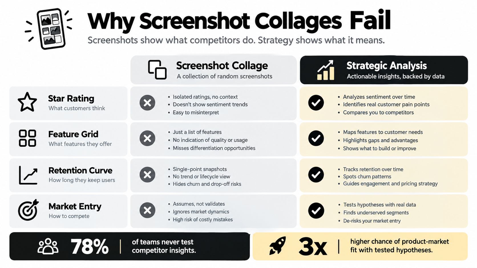
A screenshot collage shows what an app looks like at one moment. It doesn't show whether a new user completes onboarding, reaches the core action, returns tomorrow, or encounters a paywall before understanding the value. Ratings provide useful context, but they compress many experiences into one public signal and rarely reveal which screen caused a user to leave.
Retention is the harder and more valuable lens. Adjust's 2024 benchmark data reported a median Day-1 retention rate of 26%, falling to 13% by Day 7 and 7% by Day 30, which means roughly three-quarters of newly acquired users didn't return the next day (retention benchmark data). An app that wins installs but loses users immediately may have an acquisition advantage and a product problem at the same time.
The three tests of useful analysis
A working mobile app competitive analysis should pass three tests:
- Behavioral: It identifies the user action associated with activation, repeat usage, or conversion.
- Segmented: It records the country, platform, category, cohort definition, and acquisition context behind each comparison.
- Testable: It produces a hypothesis that product and design teams can reproduce in a prototype or controlled experiment.
For example, suppose a habit app has fewer reminders than its largest rival. That fact doesn't establish a competitive weakness. The rival may ask users to choose one habit, provide a useful first prompt, and make the next session obvious. Your app may offer more settings but leave users uncertain about what to do after registration. The behavioral difference matters more than the feature count.
Practical rule: Treat every competitor observation as incomplete until you can connect it to a user action and a measurable outcome.
A useful teardown can still include store screenshots, feature grids, pricing, and reviews. Those inputs become valuable when they support a decision. Guidance on how to analyze rival apps in NZ is useful for broadening the comparison beyond visible store elements, especially when local market context affects which rivals deserve attention.
The artifact you want isn't a deck of screenshots. It's a decision record that answers three questions: what behavior appears to work, where does that behavior vary by market or platform, and what can we test before committing engineering capacity?
Define the Decision, Audience, and Competitor Set
Start with one decision statement. “Understand the market” is too broad to guide research. “Decide whether to shorten onboarding for first-time users on Android in Brazil” is specific enough to determine which apps, flows, and metrics belong in the analysis.
Write the statement before opening an app store. Then define the audience in one paragraph:
We serve first-time users who want to build one daily habit, use Android phones, prefer a low-friction setup, and need a clear reason to return after the first session.
That sentence filters the comparison set. A meditation app may be an indirect substitute if it competes for the same daily routine, while a refined productivity suite may be irrelevant despite having similar reminder features. Separate the candidates into three groups:
- Direct rivals: Apps offering a similar product to the same audience.
- Indirect substitutes: Other ways users solve the same problem.
- Aspirational references: Products with an interaction or retention mechanic worth studying, even if they target a different category.

Lock the comparison conditions
Geography must be defined early. In the first half of 2024, India led mobile-app downloads with roughly 19 billion installs, followed by Brazil at about 12.5 billion and the United States at nearly 10 billion, while user behavior, device mix, and payment preferences differed across those markets (market download data). A US competitor isn't automatically the right reference for an Indian or Brazilian launch.
Record these fields for every candidate:
- Audience and intent: The problem the user is trying to solve.
- Country and language: The exact market and store localization.
- Platform: iOS, Android, or both.
- Category and business model: Subscription, advertising, transaction, or mixed.
- Observation date: When the store listing and product flow were captured.
- Cohort definition: The install event, activation event, and return window used.
Keep the set small enough to inspect. A shortlist of direct rivals, substitutes, and one or two aspirational examples is more useful than an undifferentiated catalogue. For a broader market setup, the app market research guide can help connect category research with the product decision you're trying to make.
The final output of this stage should fit on one page: a decision statement, an audience definition, a segmented competitor list, and a data dictionary. If the team can't agree on those four items, more screenshots won't resolve the ambiguity.
Build a Quantitative Benchmark You Can Trust
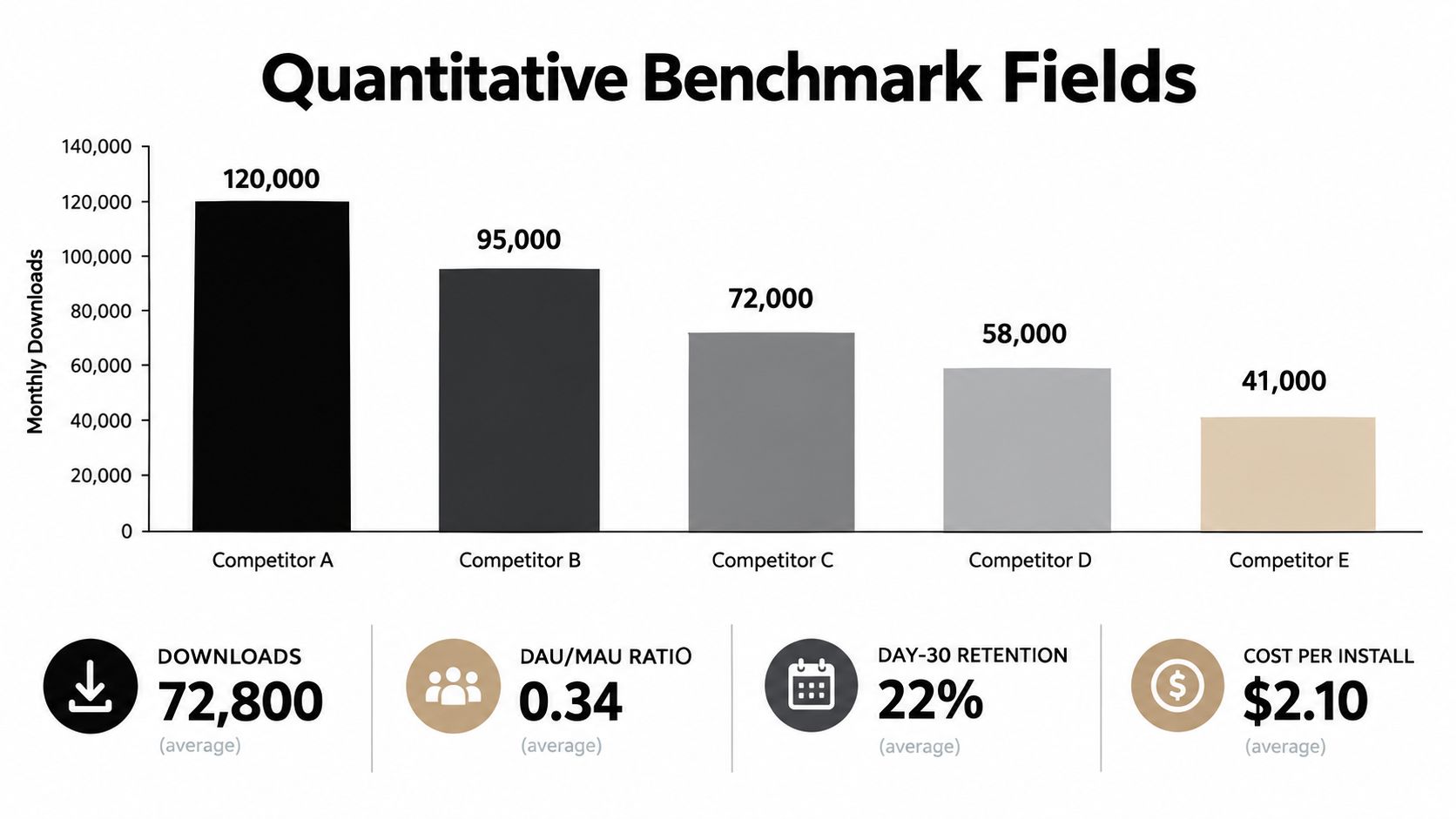
Store rank is an observation, not a business outcome. Your scorecard should bring together acquisition, activity, retention, monetization, sentiment, and market context, while clearly separating measured data from estimates.
Track downloads, DAU/MAU, Day-1, Day-7, and Day-30 retention, revenue, average revenue per user, ratings, review themes, and estimated lifetime value where reliable sources exist. Add platform, country, category, acquisition channel, and cohort definition to every row. A global retention value without those labels can create false confidence.
Compare like with like
A fitness app's Android retention in one country shouldn't be compared directly with an iOS finance app's global average. The difference may come from user intent, platform behavior, monetization, or acquisition mix rather than product quality.
A 2025 AppsFlyer benchmark drawing on 1,100 apps, 10.6 billion installs, and 4.6 billion opens reported Android Day-30 retention of 4.15% in Japan versus 2.73% in the United Kingdom, showing how a single global average hides regional gaps (regional retention benchmark). Use that principle operationally: create matched cohorts by country, platform, channel, and category before interpreting a competitor's curve.
Use a repeatable scorecard
A practical row might include:
- Acquisition: Downloads and estimated acquisition source.
- Engagement: DAU/MAU, session frequency, and the first meaningful action.
- Retention: Day-1, Day-7, and Day-30 return behavior.
- Commercial: Revenue, pricing structure, paywall timing, and estimated LTV.
- Experience: Ratings, review sentiment, onboarding completion, and task friction.
- Confidence: Measured, estimated, inferred, or unknown.
Refresh the scorecard quarterly. Competitor updates, campaigns, pricing changes, and market conditions can make a static spreadsheet misleading. Record the date and source for every value, and don't hide missing data behind a polished average.
Survivorship bias is another common failure. If you study only category leaders, you may mistake scale for superior product execution. Include smaller or newer rivals that serve the same audience, then ask which user journey appears to drive repeat usage.
A benchmark is trustworthy when another team member can reproduce the comparison without asking what you meant by “active user” or “retained.”
Tear Down ASO, Onboarding, Monetization, and Tech Signals
The quantitative scorecard tells you where a competitor appears strong. A structured teardown helps explain what a user experiences. Run the same journey on comparable devices and networks, then record the sequence rather than relying on memory.
Start with the store listing. Capture the title, subtitle or short description, first screenshots, preview video, review themes, update notes, localization, and the promise made before install. Then follow the first-session journey:
- What does the app request before showing value?
- How many choices must the user make?
- What action counts as activation?
- When does the app introduce a paywall?
- What reason does the user have to return?
Permissions deserve their own row. Apple states that App Store product pages show the data types an app may collect and whether information is used to track users or linked to a person, device, or identity (Apple's privacy disclosures). Compare when each permission appears, not only what the disclosure says. A notification request after a user creates a reminder may feel relevant. The same request during the first launch may interrupt comprehension.
Record the experience in one view
| Surface | Competitor A | Competitor B | Your App (current) |
|---|---|---|---|
| Store promise | |||
| First meaningful action | |||
| Onboarding friction | |||
| Paywall timing | |||
| Permission timing | |||
| Core task completion | |||
| Loading and empty states | |||
| Review themes |
Performance belongs in the same matrix. UX research summarized by Glassbox reports that 53% of mobile visitors leave a page when it takes longer than three seconds to load, while a two-second delay increases bounce rates by 103% (mobile UX performance research). Those figures concern mobile web experiences, but the threshold is still a useful question for app launch screens, feeds, search, and checkout. Test the same device class and network conditions, and separate server delay from image loading, permissions, and empty states.
For verification-heavy flows, document the identity and phone steps separately. A practical overview of mobile app verification methods can help teams compare whether competitors use SMS, email, authenticator prompts, or layered checks. The point isn't to copy a mechanism. It's to understand where trust and friction enter the journey.
For store messaging and metadata checks, use an app store optimization checker alongside manual review. Tools can surface patterns, but only a hands-on task test can show whether the promise survives contact with the product.
Turn Competitor Signals into Testable Prototypes
A teardown earns its place in the roadmap only when it changes a decision. Start with an observation, convert it into a behavioral hypothesis, build the smallest credible variant, and define the evidence that would make you keep or reject it.

Consider a personal-finance app. A competitor appears to use shorter onboarding and gets users to a budget dashboard quickly. Don't write “shorter is better.” Write a falsifiable version:
Users who answer only the questions needed to create their first budget will complete the first session more often than users who complete the full profile flow.
Build two prototypes. Variant A follows your current sequence. Variant B removes nonessential questions and presents the dashboard after the first useful setup action. Keep the task, device class, instructions, and starting conditions comparable.
Measure:
- First-session completion.
- Time to the first meaningful result.
- Errors and backtracking.
- Comprehension of the next step.
- Stated confidence.
- Return intent, without treating it as actual retention.
Don't lead participants toward the competitor. Ask them to complete a task, observe where they hesitate, and ask what they expected after they finish. If Variant B reduces time but leaves completion unchanged, that isn't a failed experiment. It may indicate that speed helps only after a separate trust or comprehension problem is solved.
Use small rounds for defects, larger cohorts for decisions
Apptopia's benchmarking guidance notes that a five-person usability sample can identify 55% to 99% of problems, while ten-person samples consistently identify at least 80% in the cited research summary (mobile benchmarking guidance). Use small rounds to find severe defects and confusing steps, not to claim a final conversion result.
After fixing the obvious problems, validate the leading variant with a larger, controlled cohort. Keep the hypothesis narrow. Test one onboarding change rather than copying an entire competitor experience.
A useful research record contains five lines: observation, hypothesis, prototype change, success metric, and decision rule. For example, “Competitor reaches the first useful dashboard earlier. Test a reduced setup flow. Success means higher completion with no increase in setup errors. Ship only if the effect holds in the target country and platform.”
That format keeps competitive research from becoming imitation. You're borrowing a question, not an interface.
Account for Region, Privacy, and Cohort Definitions
A competitor number is only meaningful when you know what sits behind it. Country, platform, consent environment, category, monetization model, and cohort window can all change the apparent result. Treat those dimensions as part of the product analysis, not as reporting details added at the end.
Adjust reported that global App Tracking Transparency opt-in rose from 32% to 35% by Q1 2025, with gaming at 39% and e-commerce at 35%. The same report said 2024 e-commerce installs grew 55% in MENA versus 27% in Latin America (privacy and regional app data). Those differences complicate any claim that one competitor has better acquisition or personalization. Measurement quality and regional demand may be contributing to the result.
Put the definition beside the metric
For every benchmark, record:
- Install event: First install, reinstall, or attributed install.
- Activation event: The exact action that indicates initial value.
- Return window: Day-1, Day-7, Day-30, or another stated interval.
- Platform and country: Never leave either implied.
- Consent state: Whether tracking or personalization depends on permission.
- Revenue scope: Gross, net, subscription, advertising, or estimated.
- Acquisition source: Organic, paid, referral, or unknown.
Privacy disclosures also reveal product choices. Compare requested permissions, declared data categories, tracking status, and request timing across competitors serving the same audience. A narrower permission strategy may reduce early friction, while a broader one may support personalization. Neither is automatically superior. The test is whether the value exchange is clear and whether users accept it without abandoning the core task.
A useful retention cohort framework can help keep the definitions visible in dashboards and experiment records. Before accepting a surprising result, ask whether the cohort includes the same acquisition channels, whether re-installs are handled consistently, whether one platform dominates the sample, and whether consent changes what can be observed.
Measurement check: If you can't explain who entered the cohort, what they did, and when they returned, don't use the number to choose a roadmap item.
Hand Off Findings, Run Quarterly, and Ship the Wins
A competitive analysis should reach engineering as a short decision brief, not as a research archive. Give each finding an owner and connect it to a product action:
- Observation: What the competitor does and where you observed it.
- User risk or opportunity: Which audience behavior may be affected.
- Hypothesis: What you believe will change.
- Prototype: The smallest version worth testing.
- Metric: Activation, task completion, retention, conversion, or performance.
- Owner and date: Who will test it and when the decision is due.
Review the scorecard quarterly, but don't refresh every field mechanically. Keep competitors that still inform the current decision, retire comparisons that no longer match the audience or market, and add emerging substitutes when user intent changes. Before approving a build, ask whether the signal is behavioral or merely visual, whether the benchmark is normalized by country and platform, and whether the team can test the idea without reproducing the entire competitor.
A living mobile app competitive analysis should produce a small queue of experiments, not a permanent slide deck. Give one person responsibility for the scorecard, require dated evidence for each conclusion, and close the loop by recording what happened after shipping.
RapidNative helps founders, product managers, designers, and developers turn competitor observations into shareable React Native prototypes, using prompts, sketches, images, or PRDs and exporting clean code for engineering handoff. Build and test the next onboarding, retention, or monetization hypothesis with RapidNative before committing to a full implementation.
Ready to build your app?
Turn your idea into a production-ready React Native app in minutes.
Free tools to get you started
Free AI PRD Generator
Generate a professional product requirements document in seconds. Describe your product idea and get a complete, structured PRD instantly.
Try it freeFree AI App Name Generator
Generate unique, brandable app name ideas with AI. Get creative name suggestions with taglines, brand colors, and monogram previews.
Try it freeFree AI App Icon Generator
Generate beautiful, professional app icons with AI. Describe your app and get multiple icon variations in different styles, ready for App Store and Google Play.
Try it freeFrequently asked questions
What is RapidNative?
RapidNative is an AI-powered mobile app builder. Describe the app you want in plain English and RapidNative generates real, production-ready React Native screens you can preview, edit, and publish to the App Store or Google Play.
Can I export the code?
Yes. RapidNative generates clean React Native and Expo code that you can export at any time. No lock-in, no proprietary format. Hand it to your developers or keep building inside RapidNative.
Is RapidNative free to use?
Yes. You can build apps on the free plan with no credit card required. Paid plans unlock unlimited AI generations, code export, and direct publishing to the App Store and Google Play.
Do I need to know how to code?
No. Most users build apps by describing what they want in plain English. Developers can drop into the code whenever they want more control, but coding is optional.
How long does it take to build an app?
Most users have a working first screen in under a minute. A full MVP usually takes a few hours instead of the weeks or months traditional development requires.