React Native Expo Components Reference and Guide
Explore React Native Expo components with practical examples, categories, and performance tips. Build faster and export clean code with RapidNative.
By Riya
19th Sep 2026
Last updated: 19th Sep 2026

A lot of product teams hit the same wall at the same time. The founder wants a testable mobile flow this week. The designer wants the app to feel native instead of like a web mockup in a phone frame. The engineer wants code that won't get thrown away the moment validation is done.
That's where React Native Expo components become more than UI building blocks. They become the shared language between product, design, and engineering. A screen isn't just a picture anymore. It's navigation, inputs, lists, assets, feedback states, and accessibility behavior that can survive the jump from prototype to production.
Introduction to React Native Expo Components for Product Teams
A practical way to think about React Native Expo components is this. They're the parts your team assembles into a working mobile product, using Expo as the runtime and tooling layer that keeps those parts shippable across iOS, Android, and often web.
For a founder or PM, that means a login flow, dashboard, settings page, booking screen, or checkout sequence can be described as reusable parts instead of one-off screens. For a designer, it means the same button, card, form row, tab bar, and modal pattern can appear consistently across the app. For a developer, it means those pieces live in code as components that can be composed, tested, and exported without rewriting everything later.
What counts as a component in an Expo app
In daily work, teams usually deal with a few layers at once:
- Base primitives like
View,Text, andPressablefrom React Native. - Expo-provided capabilities for navigation, images, assets, and device integration.
- Native-feeling controls when the product needs platform-correct pickers, menus, sheets, or input behavior.
- Design-system wrappers such as
PrimaryButton,FormField,SettingsRow, orProfileHeader.
That last layer matters most for product teams. Nobody wants to redesign or re-argue the same text input six times. Once you standardize the component, every screen gets faster to build and easier to review.
Practical rule: If a UI pattern appears on more than one screen, promote it from a screen detail into a reusable component.
A typical startup workflow looks like this. The team sketches a few mobile screens, gets alignment on the user flow, turns those screens into live components, and then decides which pieces should remain custom and which should lean on native controls. If that handoff is clumsy, teams lose time rebuilding what they already validated.
From fast validation to real code
A component-first workflow helps here. Tools that generate live React Native screens from prompts, designs, or product docs can speed up early iteration, but they only stay useful if the output can move into a normal Expo codebase cleanly. That's the difference between a throwaway prototype and a reusable system.
One practical option is RapidNative, which generates React Native and Expo code with reusable components and lets teams export modular code to their own repo. Used well, that gives product teams a fast way to validate flows while preserving a path to engineering ownership.
For non-technical stakeholders, the key idea is simple. Components are the contract. If the contract is clean, the product can move faster without turning into a redesign or rewrite cycle every sprint.
How to use this guide
Different readers usually need different entry points:
- Founders and PMs should focus on navigation, forms, and feedback. Those choices shape scope and usability early.
- Designers should pay close attention to reusable component behavior, native controls, and accessibility defaults.
- Developers should care about architecture compatibility, dependency choices, and export structure.
The teams that move fastest usually don't treat components as decoration. They treat them as product infrastructure.
How Expo SDK Evolution Shapes Modern Component Choices
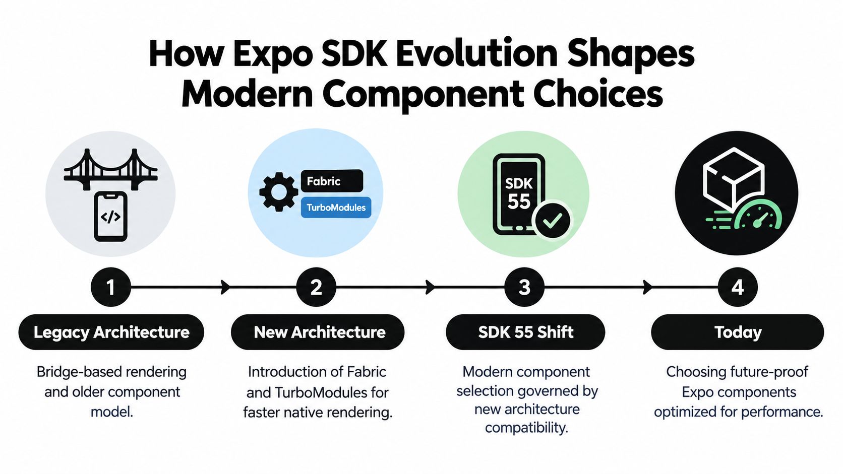
A lot of teams still choose React Native Expo components the way they did a few years ago. Pick a UI kit, style it hard, and deal with native quirks later. That approach breaks down faster now because Expo's runtime has changed, and component decisions now affect architecture fit, accessibility behavior, and how easily a prototype can become production code.
Why the architecture shift changed component decisions
Expo's move toward the New Architecture changed the screening process for every dependency that renders UI. According to the Expo New Architecture guide, all expo-* packages in the Expo SDK support the New Architecture, including bridgeless mode, and modules built with the Expo Modules API support it by default.
That changes what “safe to use” means.
A component can still look fine in a demo and still be a poor fit for a current Expo app if it depends on older native assumptions, lags on Fabric support, or behaves inconsistently under modern rendering paths. I usually treat component selection as an architecture review, not a styling decision.
Expo SDK 55 made that line much clearer. The Expo SDK 55 changelog notes support for React Native 0.83 and React 19.2, and it marks the removal of the Legacy Architecture in favor of the New Architecture. For product teams, the practical takeaway is simple. New projects should bias toward libraries that already work cleanly in the runtime Expo is standardizing around.
Teams comparing stack options usually run into the same conclusion in broader platform planning. The trade-offs in Expo vs React Native for product teams map directly to component choices because the component layer is where architecture debt shows up first.
Why SDK 56 changed the UI layer itself
SDK 56 mattered for a different reason. It expanded what Expo can provide as first-party UI primitives, not just what it can host. Expo's SDK 56 release made Expo UI stable and positioned it as part of the default toolkit for teams that want native controls without pulling in a stack of separate community packages.
That shift matters if you treat components as a system that starts in RapidNative and later moves into a real repo. The closer your base components are to Expo-supported primitives, the less cleanup you do during export, and the easier it is to keep behavior consistent across generated screens and hand-built screens.
Expo UI also changes the accessibility conversation. Components built as native controls usually start from better platform behavior for focus, semantics, and interaction patterns than many custom-styled replacements. You still need to test real flows with VoiceOver, TalkBack, keyboard input, and larger text sizes, but the default position is better.
What this changes in practice
In current Expo apps, I use three filters.
- Use React Native primitives for branded layout work, simple content blocks, and places where full visual control matters more than native control behavior.
- Use Expo-supported native UI primitives for inputs and controls where platform conventions matter, especially pickers, toggles, segmented choices, and other interaction-heavy elements.
- Be skeptical of aging community UI dependencies if they duplicate what Expo now covers, add native surface area you do not need, or have unclear New Architecture support.
This is the part many teams miss. Components are not just screen parts. In a healthy Expo codebase, they become the design system contract between product, design, and engineering. If that contract begins with accessible defaults, Expo SDK 56 native primitives, and New Architecture-ready building blocks, the exported code stays reusable instead of turning into a prototype you have to replace later.
Component Categories at a Glance and When to Use Each
Most apps don't fail because they lack components. They fail because the team uses the wrong kind of component for the job. A custom modal gets used where a bottom sheet would feel natural. A plain text input stands in for a platform picker. A list screen loads media like a landing page.
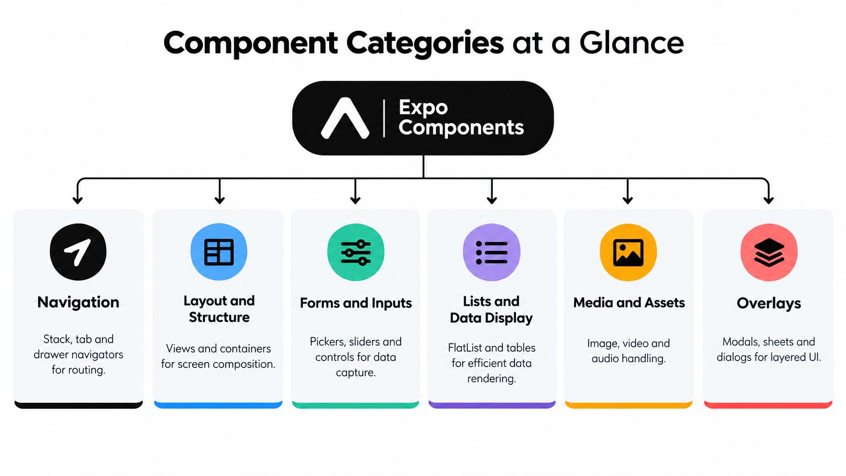
A cleaner approach is to sort React Native Expo components by the product job they do.
The categories that matter in real products
Here's the taxonomy I use when reviewing a mobile interface:
- Navigation for moving users between flows, tabs, stacks, and protected areas.
- Layout and structure for screen composition, spacing, cards, sections, and containers.
- Forms and inputs for collecting settings, profile data, payments, onboarding details, and search queries.
- Lists and data display for feeds, order history, search results, dashboards, and catalogs.
- Media and assets for images, icons, local files, and visual branding.
- Overlays for modals, sheets, dialogs, menus, and temporary focused tasks.
If you want a broader look at common UI building blocks, this overview of React Native UI components in product interfaces is a useful companion.
Choosing between JS-driven and native behavior
The trade-off isn't just category. It's whether the component should stay mostly JavaScript-driven or use a more native primitive.
For example, a marketing-style hero card with layered gradients, custom typography, and unusual spacing is usually easier to build from React Native primitives. A date picker or segmented control usually shouldn't be reinvented if the product benefits from platform conventions.
Design-system rule: Use custom wrappers for consistency. Use native primitives for behaviors users already recognize from their OS.
Here's a quick decision matrix teams can use during planning.
| Product Need | Recommended Category | Use Native Primitive When |
|---|---|---|
| Onboarding flow with back/next steps | Navigation | The flow needs platform-consistent transitions or nested stacks |
| Account settings screen | Forms and Inputs | Toggles, pickers, and grouped settings should feel like system controls |
| Activity feed or marketplace results | Lists and Data Display | Performance and scroll behavior matter more than highly custom item chrome |
| Product gallery or profile media | Media and Assets | Images need reliable loading, caching, or bundled fallback assets |
| Confirmation dialog or action menu | Overlays | The action is temporary, focused, and should match platform expectations |
| Home dashboard with branded sections | Layout and Structure | The design relies on custom arrangement more than OS-native widgets |
A practical way to map screens
When teams scope a feature, I like to annotate each screen in plain language:
- Route container for where the screen lives in navigation
- Reusable shell for header, padding, and safe area behavior
- Task components for forms, cards, rows, or data tiles
- State components for loading, empty, error, and success feedback
- Overlay components for actions that interrupt or branch the flow
That simple breakdown makes handoff cleaner for everyone. PMs can reason about scope. Designers can spot repeated patterns. Developers can split code into modules that won't collapse into a single giant screen file.
Navigation Components and Routing Patterns That Scale
Navigation is where many promising mobile prototypes fall apart. The screens look fine in isolation, but the app becomes messy once you add onboarding, auth, tabs, settings, deep links, and a modal flow that doesn't quite belong anywhere.
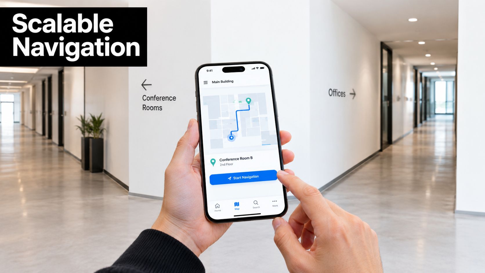
Expo's navigation docs describe React Navigation as component-based and able to compose stack, tab, and drawer navigators entirely in code, which is exactly why it scales to complex product flows instead of locking you into a fixed template, as shown in the Expo navigation documentation.
Start with product flows, not navigator types
The common mistake is picking a navigator first. The better approach is to map user intent first.
For a typical startup app, I usually model navigation like this:
- Entry flow for splash, onboarding, sign-in, and password reset.
- Core app shell for tabbed areas like home, search, inbox, and profile.
- Detail flow for drill-down screens such as item detail, order detail, or conversation view.
- Utility overlays for modals, sheets, share actions, and temporary tasks.
That structure stays readable when the product grows. It also matches how component libraries are usually organized in a real codebase.
If you want examples of these app structures in practice, this guide to React Native navigation patterns for multi-screen apps is a useful reference.
Patterns that work well in Expo apps
A few routing patterns consistently hold up.
Stack for sequential work
Use a stack when users move forward and back through a linear task. Good examples are onboarding, checkout, booking, or editing a profile. The mental model is simple. Each screen advances the task.
A stack also works well when the header behavior needs to stay predictable across related screens.
Tabs for stable destinations
Tabs are best when users need repeated access to a small set of top-level destinations. Home, activity, saved, messages, and profile are common examples.
Don't put setup steps or rare admin tools in tabs. If the destination isn't part of everyday use, tabs become clutter instead of navigation.
Drawer for dense utility navigation
Drawers still make sense in products with a large set of secondary destinations, internal tools, or enterprise workflows. They're less useful in consumer apps that need immediate clarity.
A drawer should reduce visual load, not hide important actions from users who already struggle to find them.
The cleanest mobile navigation often comes from using fewer patterns, not more of them.
Compose navigation as reusable components
Instead of putting all route definitions in one file, break them into reusable navigators and layout components:
- AuthNavigator for sign-in and account recovery
- MainTabs for primary destinations
- SettingsStack for account, notifications, and billing
- SharedHeader for title, back action, and right-side actions
- ModalRouteShell for focused overlays
This is also where generated screens can stay useful. If a product team creates and validates flows visually first, those screens should export into these shells cleanly rather than arriving as disconnected pages.
A short demo can help if you're explaining routing behavior to non-engineers or onboarding a teammate:
Where teams usually overcomplicate things
Navigation gets brittle when every screen owns its own header logic, auth checks, and modal behavior. It also breaks down when deep linking is treated as a later concern.
A better rule is to keep navigation concerns close to route boundaries. Put screen-specific UI inside the screen. Put flow rules in the navigator. Put shared chrome in reusable layout components.
That separation gives designers clearer review targets and gives engineers far fewer surprises when a prototype becomes a shipped app.
Forms Inputs and Native Controls for Reliable Data Capture
A founder reviews the onboarding flow in a prototype, taps through it in 30 seconds, and signs off. The first real users spend three minutes fighting date entry, selecting the wrong plan, and missing validation errors that only show up in red text. Forms fail in small ways first. Then conversion drops.
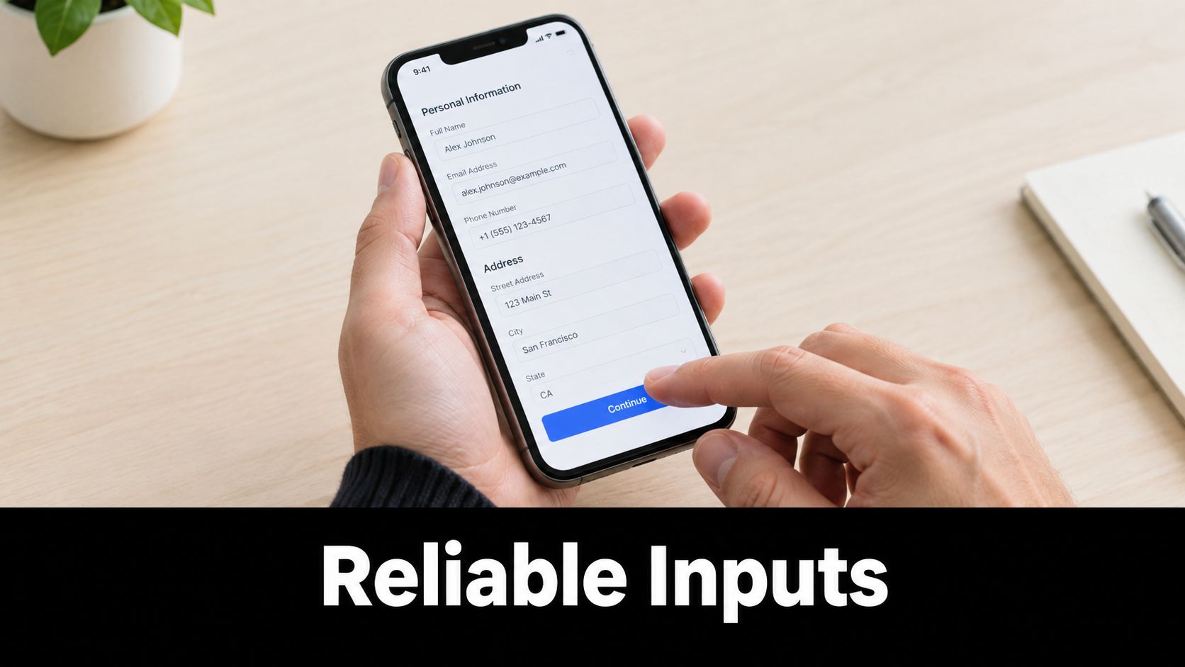
Teams usually create that failure by treating every field like a branded text box. In production, data capture works better when the component set reflects intent. Free text belongs in a text input. A bounded choice should use a picker, segmented control, switch, slider, or date control that behaves like the platform expects.
Expo has made that split more practical. As noted earlier, the newer native UI path gives teams access to platform-backed controls instead of relying only on JavaScript-rendered equivalents. That matters if the goal is not just to style a screen, but to build a reusable design system in RapidNative that exports cleanly into an Expo codebase and still feels native on both platforms.
Build form components as a system, not one screen at a time
The durable pattern is simple. Separate field structure, control, and validation.
A good form component library usually has three layers:
- Field wrapper for label, helper text, error text, spacing, and required state
- Control component for text input, picker, switch, segmented control, date input, or slider
- Validation contract for touched state, errors, async loading, and submission rules
That structure keeps design and engineering aligned. Designers can review one field shell and know how errors, spacing, and labels will look across the app. Engineers can swap the control under the wrapper without rewriting layout logic on every screen.
I use this pattern constantly with Expo apps that start as product prototypes and later ship as real code. A FormField wrapper exported from RapidNative should survive that transition. The control inside it can change as product requirements get sharper.
Use native controls where platform behavior matters
Not every field needs a native replacement. Some do.
Country selection, notification preferences, date picking, plan selection, and numeric ranges usually benefit from native controls because users already know how those interactions should feel. Platform conventions reduce hesitation. They also reduce edge-case work for the team.
A typical production form might combine:
- React Native layout and typography primitives for branding and instructional copy
- a native picker for country, state, or plan selection
- a native switch for settings and consent toggles
- a custom button and form summary that match the product's visual system
That mix is usually the right trade-off. Full custom UI gives tighter brand control, but it also creates more maintenance work and more accessibility risk. Native controls give up some visual flexibility, yet they often ship faster and behave more reliably under the New Architecture.
Know what to replace and what to keep
Some older community form packages are easy to retire if they only exist to mimic system controls. If a dependency is there for a basic picker, slider, or sheet-style selection flow, it is worth checking whether the Expo-native option now covers the same use case with less integration overhead.
Keep custom components when they express product logic, not just cosmetics.
A branded password field with inline strength feedback can stay custom. A reusable consent row with legal copy and analytics hooks can stay custom. The underlying switch, date control, or segmented selector should still use the most reliable primitive available.
Implementation note: Build one reliable
FormFieldwrapper first. Then change the control underneath it only when the product or platform requires it.
Accessibility belongs in the component contract
Accessibility problems in forms usually come from component defaults, not last-minute QA. If the design system starts with unlabeled icon actions, color-only errors, or custom pressables with no role, every exported screen inherits those problems.
Independent guidance in this React Native accessibility guide for Expo apps covers the basics well: icon-only buttons need accessibilityLabel, custom touchables need accessibilityRole, and changing state should be exposed to assistive technology.
For a reusable Expo component system, that means every form primitive should define:
- Visible or programmatic labels for each control
- Roles and state for custom interactive elements
- Error messages that screen readers can reach
- Focus and announcement behavior for validation, loading, and success states
If those defaults are missing, the library is not reusable. It just lets the team repeat the same mistakes across more screens.
Lists Media and Assets for Performant Content Display
Lists are where product reality shows up. A demo may only render five items, but the shipped app has search results, catalogs, messages, notifications, order history, and media-heavy cards competing for memory and attention.
The first rule is simple. Treat the list container, the row component, and the media inside each row as separate performance decisions. Teams often optimize one and ignore the others.
List patterns that stay fast
For feeds and long result sets, use list primitives designed for virtualization and keep each row narrow in responsibility. A row should render data, not compute half the screen.
A practical checklist looks like this:
- Memoize row components when rows receive stable props and update frequently.
- Keep item layout predictable so rendering work doesn't balloon during scroll.
- Avoid nesting heavy scroll containers unless the UX requires it.
- Move formatting work up the tree when it can be done before render.
When a list feels slow, I usually inspect the item component first. The bottleneck is often an overloaded row with multiple image states, conditional subtrees, and inline callbacks.
Use Expo's image and asset tools deliberately
Images are where many otherwise clean Expo apps become inconsistent. Some assets are bundled, some are remote, and some need native naming conventions for platform catalogs.
Expo's image docs describe expo-image as a cross-platform React component for loading and rendering images, and note that images bundled in Xcode asset catalogs or Android drawable resources can be loaded by name with source={{ uri: 'app_icon' }}, omitting the extension and supplying dimensions manually, as shown in the expo-image reference.
Expo's asset docs also explain that an asset is any file bundled with the app source and needed at runtime, including images, fonts, and sounds, and that static files can be referenced with require('path/to/file') for use in an image component, according to the Expo asset documentation.
That gives you two reliable patterns:
- Bundled local assets for logos, onboarding illustrations, icons, and fallback images
- Remote images for user-generated or frequently changing content
What works well in production
I recommend a simple media policy in shared component libraries:
| Asset Type | Good Default |
|---|---|
| Brand logo or icon set | Bundle with the app |
| Empty state illustration | Bundle with the app |
| User avatar | Load remotely with a local fallback |
| Marketplace product image | Remote first, but constrain layout carefully |
| Header background art | Prefer bundled if it rarely changes |
Load strategy should match ownership. If the file changes with product releases, bundle it. If it changes with user data, fetch it.
For list-heavy screens, pair this with small reusable building blocks such as Avatar, CardImage, EmptyStateGraphic, and MediaRow. That keeps your screen files smaller and gives design and engineering a common place to improve rendering behavior over time.
Modals Gestures and Feedback With Accessibility Built In
Overlay interactions can make an app feel polished, but they're also where teams accidentally ship confusing, fragile behavior. A bottom sheet that can't be reached by screen reader focus, a custom swipe action with no role, or an icon-only close button with no label will all pass visual review and still fail real users.
Pick the right overlay for the user's task
A modal is best when the user must complete or dismiss a focused task before continuing. A bottom sheet works well for contextual actions, short forms, or a lightweight chooser. Inline expansion is often better when the content belongs to the current screen and doesn't deserve a separate layer.
I use a simple filter:
- Modal for confirmation, blocking decisions, or multi-step interruption
- Bottom sheet for action selection, filters, or quick-edit tasks
- Inline expansion for details the user may want to glance at and ignore
When teams default to the bottom sheet for everything, they usually create hidden complexity. Users lose context, nested interactions get awkward, and accessibility review becomes harder.
Gesture support should follow discoverability
Gestures are useful when they complement visible affordances. Swipe to archive, drag to reorder, pull to refresh, long-press to open actions. Those are all familiar patterns.
Problems start when a gesture is the only way to trigger something important. If the user can't see the action, many won't discover it. If a screen reader user can't trigger it, the component system has encoded exclusion into the product.
A strong reusable component should include both:
- the gesture interaction itself
- a visible or accessible fallback action
That might mean a swipeable row also exposes an overflow menu, or a reorder handle also exposes button-based movement for assistive workflows.
Accessibility defaults belong inside the component
The core rules are not complicated, but they need to be built into every reusable overlay and interactive control:
- Icon-only controls need labels through
accessibilityLabel - Custom touchables need roles through
accessibilityRole - State changes should be announced when the interface changes dynamically
- Focus order must stay predictable when overlays open and close
Don't document accessibility as a reminder in Figma comments. Put it in the component API and review checklist.
For example, if you build a reusable IconButton, the component should require or strongly encourage an accessible label. If you build a BottomSheetActionRow, it should already expose the correct role and selected state. If you build a Toast or inline validation component, it should support announcing state changes.
A quick validation routine before export
Before a component graduates into your design system, test it in isolation with a short pass:
- Open it without touch assumptions and confirm the actions are still understandable.
- Move through it with a screen reader and listen for labels, roles, and state.
- Trigger success and error states and confirm those changes are exposed meaningfully.
- Close the overlay and make sure focus returns somewhere sensible.
Component discipline pays off. If you solve these details once in shared primitives, every screen inherits better behavior. If you skip them once, every generated, exported, or copied component inherits the bug.
Exporting Reusing and Looking Up Components With RapidNative
A reusable component system only matters if it survives handoff. That is the actual test. Can the team move from idea to live screen to maintainable Expo code without rebuilding the same UI twice?
What exportable components look like in practice
The healthiest pattern is a layered one:
- Screen files handle route-level composition
- Feature components handle domain-specific UI like checkout summary or profile editor
- Shared design-system components handle buttons, fields, cards, rows, modals, and state views
- Platform-aware wrappers decide when to use React Native primitives versus newer native controls
That structure keeps generated UI from turning into a dead-end artifact. You can validate quickly, then keep the parts that proved useful.
A practical exported codebase should make it obvious where to find:
| Task | Likely Component Area |
|---|---|
| Add a new tab screen | Navigation or app shell |
| Reuse a labeled input | Shared form components |
| Update image behavior | Media or asset wrapper |
| Change modal actions | Overlay primitives |
| Improve empty states | Shared feedback components |
A better handoff model for product teams
When teams work from prompts, sketches, or PRDs, the usual failure mode is that the output looks right but isn't organized for ongoing work. Export matters because engineering needs code ownership, not just preview links.
The stronger workflow is to validate with live components early, then fold the stable parts into a shared Expo codebase. Navigation patterns become route modules. Form controls become field wrappers. Repeated list rows become shared display components. Accessibility rules move into the primitives, not the ticket comments.
Shared components reduce debate only when the code is clean enough to adopt without negotiation.
This is also where quick lookup pays off. A product team should be able to answer practical questions fast:
- Need a native-feeling settings screen? Start with grouped controls and reusable field rows.
- Need a searchable content feed? Start with list rows, image wrappers, and navigation targets.
- Need a booking flow? Start with stack navigation, constrained inputs, and confirmation overlays.
Keep the system small enough to use
Design systems often fail because they become catalogs instead of tools. A product team doesn't need fifty button variants. It needs a few stable primitives with clear jobs and predictable behavior.
The same is true for React Native Expo components. Reuse the patterns that remove friction. Delete the abstractions nobody trusts. Keep native behavior where users expect it. Keep accessibility inside the component contract. Keep export structure boring enough that any engineer on the team can extend it.
That's what turns a fast prototype into a real mobile product.
RapidNative gives product teams a practical way to generate React Native and Expo screens from prompts, designs, or product docs, then export clean modular code into a real repo without locking the team into a closed builder. If you're building a reusable component system and want faster iteration between product, design, and engineering, visit RapidNative.
Ready to build your app?
Turn your idea into a production-ready React Native app in minutes.
Free tools to get you started
Free AI PRD Generator
Generate a professional product requirements document in seconds. Describe your product idea and get a complete, structured PRD instantly.
Try it freeFree AI App Name Generator
Generate unique, brandable app name ideas with AI. Get creative name suggestions with taglines, brand colors, and monogram previews.
Try it freeFree AI App Icon Generator
Generate beautiful, professional app icons with AI. Describe your app and get multiple icon variations in different styles, ready for App Store and Google Play.
Try it freeFrequently asked questions
What is RapidNative?
RapidNative is an AI-powered mobile app builder. Describe the app you want in plain English and RapidNative generates real, production-ready React Native screens you can preview, edit, and publish to the App Store or Google Play.
Can I export the code?
Yes. RapidNative generates clean React Native and Expo code that you can export at any time. No lock-in, no proprietary format. Hand it to your developers or keep building inside RapidNative.
Is RapidNative free to use?
Yes. You can build apps on the free plan with no credit card required. Paid plans unlock unlimited AI generations, code export, and direct publishing to the App Store and Google Play.
Do I need to know how to code?
No. Most users build apps by describing what they want in plain English. Developers can drop into the code whenever they want more control, but coding is optional.
How long does it take to build an app?
Most users have a working first screen in under a minute. A full MVP usually takes a few hours instead of the weeks or months traditional development requires.