Screen Flow Diagrams Explained for Mobile Teams
Learn what screen flow diagrams are, how to build them for mobile apps, and see real examples to align product teams faster.
By Rishav
18th Sep 2026
Last updated: 18th Sep 2026
You're explaining a mobile feature in a planning meeting. The founder sees a simple journey, the designer sees several screens, and the developer asks what happens when verification fails, the network is slow, or the user closes the app halfway through. Everyone agrees on the idea, but each person is carrying a different version of the product in their head.
That gap creates familiar problems: missing screens, unclear navigation, dead ends, and late questions during implementation. A screen flow diagram gives the team a shared map before polished design or code begins. It shows the actual screens users encounter, the actions that connect them, and the alternate states that appear when the ideal path breaks.
For mobile founders and product managers, the value is practical. You can test whether a feature makes sense, estimate its scope, explain it to stakeholders, and hand a clearer brief to design and engineering. This guide focuses on state-aware wireflows, not just happy-path arrows. You'll see how to model loading, empty, error, success, permission, validation, and abandon paths so the diagram reflects the product users will experience.
Introduction Why Mobile Teams Get Lost Without a Map
A founder might describe an onboarding feature like this: “A new user signs up, verifies their email, and reaches the dashboard.” That sentence sounds complete until the team asks what happens when the email address is invalid, the verification message hasn't arrived, the user refuses a permission request, or the account already exists.
Without a visual flow, those questions appear at different times and in different places. A designer may create a signup screen and a dashboard. Engineering may add an authentication failure state later. QA may discover that there's no defined route back from an expired verification link. The team hasn't necessarily made bad decisions. It hasn't made the decisions visible.
A screen flow diagram turns the feature into something everyone can inspect together. The founder can ask whether the journey supports the product idea. The product manager can identify scope and dependencies. The designer can see which states need layouts. The developer can understand navigation, conditions, and recovery behavior before building components.
Practical rule: If a user can see it, tap it, wait for it, dismiss it, or abandon it, consider representing it in the flow.
The diagram doesn't need polished colors or final copy. Low-fidelity screens are usually more useful at this stage because they keep attention on structure and behavior. A simple rectangle labeled “Verification pending” can expose a product decision that a beautiful mockup might hide.
By the end of the planning process, your team should be able to trace a mobile task from entry to completion, explain every connector, and identify what happens when the user takes a different route. That shared understanding makes validation faster and gives implementation a more reliable starting point.
What Screen Flow Diagrams Are and Why They Matter
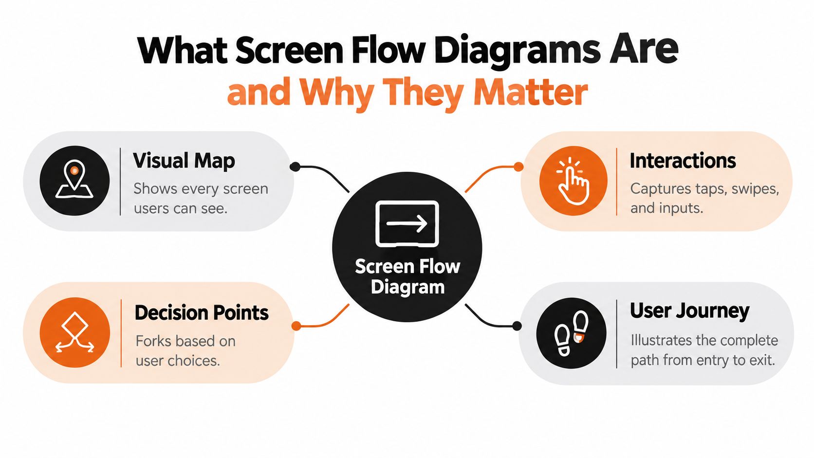
A screen flow diagram is a visual map of the screens, interactions, and decision points in a digital product. For a mobile app, it shows the screens a user sees, the action that moves them forward, and the branches that appear when a condition changes.
A subway map is a useful analogy. It doesn't reproduce every street, building, or physical detail around a station. Instead, it shows the stations, the connections, and the points where a passenger changes direction. A screen flow works similarly. It focuses on the user's route through the product rather than the final visual styling of each screen.
Take a basic onboarding journey:
- Entry: Welcome screen
- Action: Tap “Create account”
- Screen: Signup form
- Action: Tap “Continue”
- Decision: Is the submitted information valid?
- Branch: Show inline validation or open verification
- Screen: Verification
- Screen: Dashboard after successful completion
The important detail is that each stage is represented by an actual UI state. “Verify account” by itself is an abstract task label. A verification screen, connected by an arrow labeled “submit,” tells the team what the user sees and what caused the transition.
A screen flow differs from a generic flowchart. Earlier flowcharting practices date back to the motion studies of Frank and Lillian Gilbreth between 1908 and 1924, which led to the creation of Therbligs. Frank Gilbreth introduced the first flowchart to ASME members in 1921, and ASME adopted a standardized set of 5 symbols in 1947. That same year, Herman Goldstine and John von Neumann developed a visual alphabet that became a basis for modern computer flowcharts. The history and lineage of screen flow diagrams help explain why structured visual notation remains useful.
A modern screen flow is often called a wireflow. It combines wireframe-like screen layouts with directional connections, allowing a team to trace a use case from beginning to end. Miro's screen flow template describes this approach as a way to identify major UI components and map how users move through an app or website.
For founders and PMs, the benefit is early visibility. You can spot a missing confirmation screen, an unnecessary login step, or a dead-end error branch while the change is still easy to discuss. For developers and QA, the same artifact clarifies what needs to be implemented and tested.
Key Components and Conventions That Make Flows Readable
A readable flow uses a small visual vocabulary consistently. The exact drawing tool matters less than whether every person can interpret the diagram the same way.
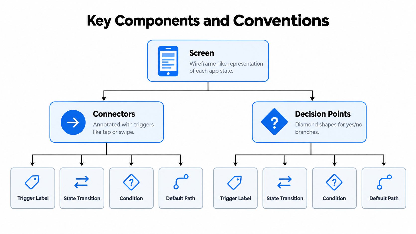
Screens represent visible product states
Use a simple phone-shaped frame or wireframe rectangle for each screen. Include enough detail to identify the state, such as a title, primary action, form field, message, or navigation control. You're not designing the final interface yet. You're documenting what the user can see and do.
A single feature may require several versions of what appears to be the same screen. A search screen can have an initial state, a loading state, results, no results, and an error message. If those states change the available actions, they deserve distinct representations or clear annotations.
Connectors explain what causes movement
An arrow should answer a simple question: What caused the user to leave this state? Label it with an action such as “tap Search,” “swipe up,” “submit form,” “allow permission,” “auto-advance,” or “dismiss modal.”
Unlabeled arrows force readers to guess. They also create ambiguity during implementation. A transition caused by a user tap behaves differently from one triggered automatically after a network response, even if both lead to the same destination.
A wireflow should show the actual screens users traverse and the interaction that triggers each transition, not just a list of tasks.
Decision points expose conditions
Use a diamond or another clearly distinct shape for a condition. Examples include “Is the user logged in?”, “Did validation pass?”, “Is location permission granted?”, or “Are results available?”
Label each outgoing branch with its condition. “Yes” and “No” can work for simple decisions, but specific labels such as “valid,” “invalid,” “permission denied,” or “items found” make the path easier to review.
Numbering creates a shared reference
Number screens so people can refer to them in tickets, design comments, and bug reports. “The error state after Screen 04” is more precise than “the error thing near the middle.” Numbering also helps a developer connect a diagram to implementation tasks without requiring everyone to use identical terminology.
The common layout convention is to place the happy path left to right, then position branches above or below the main route. This gives the primary journey a clear reading direction while keeping alternate outcomes visible. UX guidance on screen flow structure and annotations also recommends annotating arrows and including loading, empty, error, success, and abandon states.
These conventions make the diagram useful beyond design review. Engineering can estimate navigation and state work. QA can derive test paths. Product can see where a seemingly small feature gains complexity through conditions and recovery routes.
How to Create a Screen Flow Diagram for Your Mobile App
Start with one user goal, not the entire app. “Help a user find and save a nearby class” is a workable goal. “Map the fitness app” is too broad to review effectively.
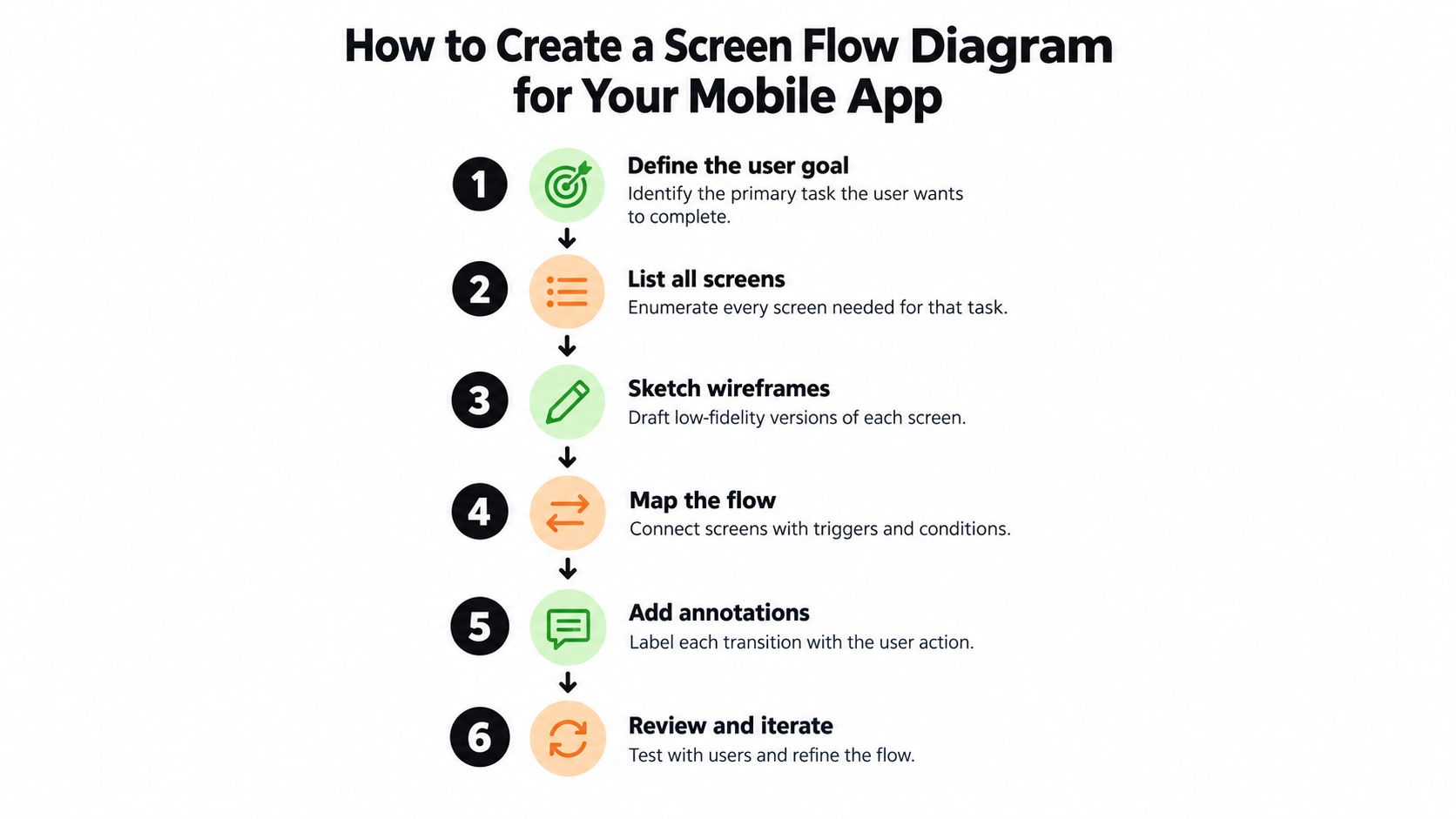
1. Define the goal and entry point
Write the user's desired outcome at the top of the canvas. Then identify where the journey begins. It might start at the home screen, a deep link, a notification, or an onboarding prompt.
The entry point affects what the user already knows and what the first screen needs to explain. A user arriving from a notification may expect a specific detail screen, while a first-time user opening the app may need context before taking action.
2. Break the task into 4 to 8 subtasks
For mobile planning, UX guidance recommends breaking a task into about 4 to 8 subtasks, from entry to completion. Mobile screen flow guidance from Software Ideas uses this bounded structure to expose decisions without turning a single diagram into an unreadable map.
For a class-booking flow, the subtasks might be:
- Open the discovery screen.
- Search or browse classes.
- Review results.
- Open a class detail.
- Choose a time.
- Confirm the booking.
- View the success state.
Keep the first pass linear. You're establishing the backbone before adding the conditions that complicate it.
3. Sketch low-fidelity screens
Create a small wireframe for each subtask. Include the controls required for the action, not every possible visual detail. A search screen needs an input, a search action, and perhaps filters. A detail screen needs the information required for the decision and a clear booking action.
Validate each decision against the UI the user sees. A decision called “location available?” is incomplete if the corresponding screen doesn't show a permission prompt, an explanation, or a way to continue without location access.
4. Connect the happy path
Lay the primary route from left to right. Connect each screen with an arrow and label the trigger. Use “tap Book,” “submit search,” or “select date,” rather than vague labels such as “continue.”
At this stage, ask whether each transition is intentional. If a user can reach a screen only through an automatic redirect, show that. If a back action returns to a previous state instead of creating a new screen, annotate the behavior rather than inventing unnecessary frames.
5. Add the states teams usually miss
Now add loading, empty, error, success, and abandon branches. For the class search example, “submit search” may lead to a loading state, then either results, no results, or a network error. If the user closes the booking sheet, that's an abandon or return path that should be visible.
These states help the team estimate the scope. Every branch adds behavior, interface decisions, and test coverage. Mapping them early makes hidden complexity discussable before it becomes late-stage rework.
6. Number, share, and revise
Number the screens and share the diagram with product, design, engineering, and QA. Ask each person to trace a realistic route, including a failed action and a cancellation. Collaborative templates such as Whimsical's mobile app wireframe resource emphasize mapping, connecting, sharing, and gathering feedback before high-fidelity design.
A short walkthrough can reveal that the user story breaks at a permission prompt or that a “simple” task contains too many screens. Revise the flow while the cost of change is still low.
For a direct handoff from planning to prototype, connect the diagram to a mobile UI design and prototyping workflow only after the states and transitions are clear.
Best Practices and Common Pitfalls to Avoid
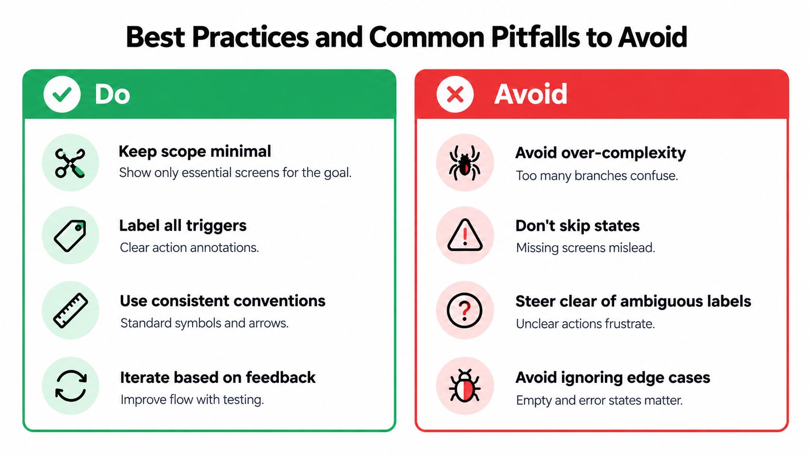
The strongest mobile flows are deliberately narrow. They answer one user goal clearly, then show enough alternate behavior to keep the experience honest. A diagram becomes harder to review when it tries to represent every feature, setting, and notification in the same canvas.
| Do | Avoid |
|---|---|
| Keep the flow bounded around one goal | Combining unrelated journeys |
| Label every trigger | Leaving arrows open to interpretation |
| Show real UI states | Using generic task placeholders |
| Add recovery and abandon paths | Ending every route at the happy path |
| Share early for feedback | Waiting until polished design |
Transient states need a place
Many production issues happen inside a screen rather than between destination screens. Include modals, toasts or snackbars, inline validation, keyboard-open layouts, permission dialogs, and same-screen changes when they affect what the user can do. This screen-flow reference on transient and edge states specifically calls out these states alongside loading and empty conditions.
A form that displays an inline error may not move anywhere, but the state changes. The user sees new guidance and may need to correct a field. A keyboard-open layout can cover the primary action. A permission dialog can interrupt the expected route. These are flow decisions, even when the app technically remains on the same screen.
Scope complexity at the branches
A decision point deserves more attention than a decorative screen. “Is the account verified?” can lead to a dashboard, a pending screen, a resend action, or support guidance. Each route should end in a usable state, return to a meaningful place, or clearly represent abandonment.
If a branch can happen in production, it belongs in the conversation before implementation.
Avoid generic labels such as “process,” “next,” or “handle error.” Name the event and outcome. “Tap Retry after network error” gives engineering and QA something testable. “Failure path” does not.
Finally, review the diagram on a phone-sized frame. Mobile flows are affected by keyboard visibility, permission interruptions, back navigation, and limited space. A desktop-friendly canvas can make a mobile journey look simpler than it feels in use.
Real World Examples and Templates You Can Reuse
A founder validating a marketplace idea doesn't need a polished prototype to test whether the main journey works. A small set of wireframe screens can answer the important questions: Can a user find an item? Can they understand the result? Can they recover when nothing matches?
Search and results
Start with:
Home: The user sees a search field and taps it.
Search: The user enters a phrase and taps “Search.” Label the connector “tap Search.”
Loading: The app waits for results. This is a visible state if the request takes time.
Results: Matching items appear. The user taps one result to open details.
Empty: No items match. Add actions such as “change search” or “clear filters.”
Error: The request fails. Add “tap Retry” and a route back to browsing.
The structure is simple, but it communicates more than “home to results.” A product manager can discuss whether filters belong before or after the first search. A developer can see that results, empty, loading, and error require distinct behavior. A designer can decide whether the empty state should offer suggestions.
A practical mobile template from Visual Paradigm's mobile app user flow example uses a home screen, search, and results connected by arrows, while recommending annotations for conditional behavior and empty states. That structure works for retail, travel, content, and internal business apps.
Onboarding and account access
A second reusable pattern begins with Welcome, then Signup, Verification, and Dashboard. Add branches for invalid form input, an existing account, a missing verification message, and a user who exits before completion.
The diagram should show whether the user can return to the form, request another verification message, sign in instead, or continue as a guest. Those choices affect navigation and product policy, so they belong in the flow rather than in an informal conversation.
Detail, action, and confirmation
Many mobile features follow another pattern:
- Browse or search
- Open detail
- Choose an option
- Confirm
- See success or recover from failure
For a booking app, “Choose a time” may branch when a slot becomes unavailable. The user might return to the detail screen, choose another slot, or cancel. A low-fidelity flow lets stakeholders debate that behavior without getting distracted by typography or brand colors.
Use these templates as starting structures, not fixed recipes. Share them while the screens are still rough. A stakeholder who can point to a broken route on a simple diagram is helping the team avoid a more expensive correction later. For more patterns, see these user flow diagram examples for mobile products.
From Diagram to Working App With Modern Workflows
A screen flow becomes more valuable when the team can turn it into something people can click. Instead of treating the diagram as a document that ends at handoff, use it as the behavioral brief for a prototype.
A founder can validate whether the journey makes sense. A PM can compare the intended scope with the required states. A designer can refine the screens after seeing the navigation in context. A developer can inspect the route structure and reusable components before integrating production services.
Collaborative, AI-assisted workflows can connect these stages. A team may start with a whiteboard, prompt, sketch, image, or product requirements document, then produce a shareable React Native prototype with connected screens. Teammates can preview the result through a link or QR code, review the flow together, and revise the interface before committing to a full build.
RapidNative is one option for this handoff model. It turns prompts, sketches, images, or PRDs into shareable React Native apps, renders screens and navigation live, supports real-time collaboration, and exports modular code built with React Native, Expo, and NativeWind. The design-to-code workflow is most effective when the source flow already names the states, triggers, and decision points clearly.
Your practical next move is straightforward:
- Choose one mobile task.
- Map its happy path from entry to success.
- Add loading, empty, error, permission, validation, and abandon states.
- Number the screens and review every arrow with engineering and QA.
- Convert the approved flow into a clickable prototype.
- Test the journey, revise the map, and only then increase visual fidelity.
Use RapidNative to turn your approved screen flow into a shareable React Native prototype with connected screens and live previews. Start with one mobile journey, include its real edge states, and invite your team to validate the working flow before development begins.
Ready to build your app?
Turn your idea into a production-ready React Native app in minutes.
Free tools to get you started
Free AI PRD Generator
Generate a professional product requirements document in seconds. Describe your product idea and get a complete, structured PRD instantly.
Try it freeFree AI App Name Generator
Generate unique, brandable app name ideas with AI. Get creative name suggestions with taglines, brand colors, and monogram previews.
Try it freeFree AI App Icon Generator
Generate beautiful, professional app icons with AI. Describe your app and get multiple icon variations in different styles, ready for App Store and Google Play.
Try it freeFrequently asked questions
What is RapidNative?
RapidNative is an AI-powered mobile app builder. Describe the app you want in plain English and RapidNative generates real, production-ready React Native screens you can preview, edit, and publish to the App Store or Google Play.
Can I export the code?
Yes. RapidNative generates clean React Native and Expo code that you can export at any time. No lock-in, no proprietary format. Hand it to your developers or keep building inside RapidNative.
Is RapidNative free to use?
Yes. You can build apps on the free plan with no credit card required. Paid plans unlock unlimited AI generations, code export, and direct publishing to the App Store and Google Play.
Do I need to know how to code?
No. Most users build apps by describing what they want in plain English. Developers can drop into the code whenever they want more control, but coding is optional.
How long does it take to build an app?
Most users have a working first screen in under a minute. A full MVP usually takes a few hours instead of the weeks or months traditional development requires.