Mobile App Development Mockup Guide from Wireframe to Hi-Fi
Build a mobile app development mockup from wireframe to high-fidelity design. Practical steps, tool picks, and validation tips for founders, PMs, and designers.
By Riya
17th Oct 2026
Last updated: 17th Oct 2026
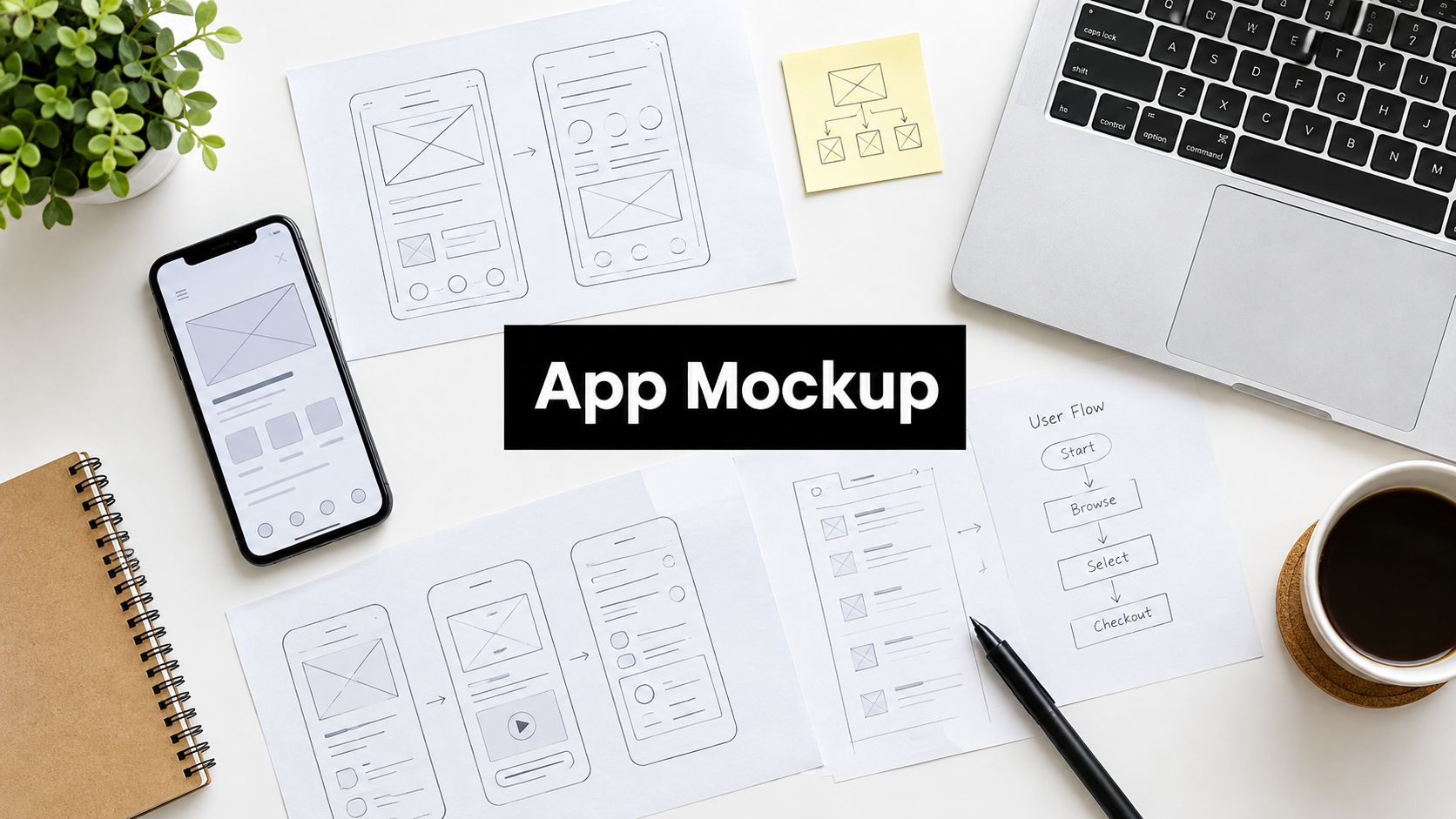
You've pitched the app, explained the business model, and shown a convincing slide deck. Then someone asks what happens when a user tries to book, pay, or recover from a mistake, and the conversation turns into guesswork. For a startup founder validating a mobile product, that's the moment to build a mobile app development mockup, not commission another polished presentation.
Why a Mobile App Mockup Deserves More Than a Pretty Frame
Consider a founder building a booking app for freelance designers. The pitch shows a calendar, a profile, and a confirmation screen, but it doesn't establish whether someone understands whose availability they're viewing or whether selecting a time completes the booking.
A attractive screen can conceal those unanswered questions. Treat the mockup as a research instrument instead: give a prospective user a task, observe what they do, and change the interface when their behavior contradicts your assumptions. The useful deliverable isn't just the screen. It's the decision you can make after testing it.
Make Uncertainty Visible Before Building
Research cited in a peer-reviewed mHealth prototype evaluation found that increasing usability-test participants from 5 to 10 raised the minimum proportion of discovered problems from 55% to 82%, while the mean rose from 85% to 95%. Those findings aren't a guarantee for your app, but they support testing with a carefully selected group before committing engineering effort.
For the booking concept, that means watching someone find an available appointment rather than asking whether they like the calendar. A misunderstanding about availability calls for a flow change, not a different accent color.
The practical reasons for doing this work are straightforward.
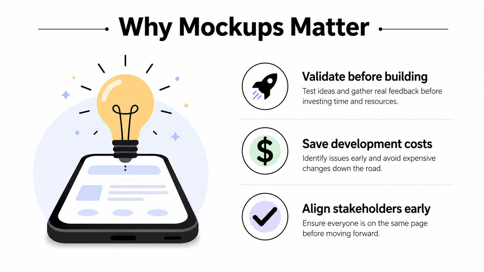
Working principle: A mockup earns its place when it helps the team reject, revise, or support a product assumption.
Keep that evidence connected to delivery. Wistec's mobile app development process provides broader process context when you're deciding how prototype validation fits into development planning.
Designers should identify what remains uncertain; developers should identify which behaviors require implementation to evaluate. As the founder, your job is to prevent an approved picture from becoming an assumed requirement. Document what users demonstrated, what the prototype simulated, and what still needs investigation.
Scoping the Low-Fidelity Wireframe for One Real User
Start with first-time freelance designers booking a discovery call. Don't expand the same test to agency administrators, returning customers, and service providers. They bring different knowledge and responsibilities, so mixing them makes it harder to interpret hesitation.
Write a task that describes an outcome without naming the interface control: “Arrange a discovery call for your upcoming project.” Avoid “Tap Book a Call,” which gives away the navigation decision you're trying to evaluate.
Keep the initial scope visible while sketching.
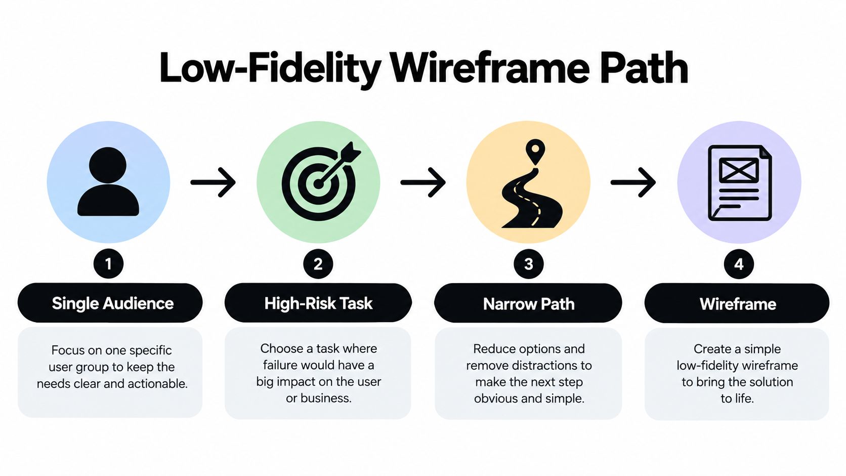
Sketch Only the Necessary Path
For this example, a three-screen wireframe can show a booking entry point, an appointment-selection screen, and a confirmation. That's a proposed scope, not a universal screen-count rule. Add another screen only if the task requires it.
- Entry point: Show enough project context for the user to understand why they're booking.
- Selection: Include availability, time-zone wording, and the action that commits the choice. Leave decorative calendar details out.
- Confirmation: State whether the appointment is booked or merely requested, and explain what happens next.
Draw arrows between screens and label the actions that trigger them. Use screen-flow diagrams to make the path readable without someone having to narrate every transition.
Paper works for this stage. Move the next sheet into view when the participant selects an action, and record where you had to improvise because the wireframe didn't specify a response.
For a visual companion to the sketching process, use this walkthrough.
Nielsen Norman Group's discount-usability guidance recommends five participants, qualitative observation, think-aloud testing, and narrow prototypes supporting a single path. Ask participants to describe what they expect as they work, but don't explain unfamiliar labels for them.
Finish with a list of observed misunderstandings. “Participants couldn't distinguish requested from confirmed appointments” is actionable. “The calendar needs improvement” isn't.
Choosing the Right Fidelity for the Question You Are Asking
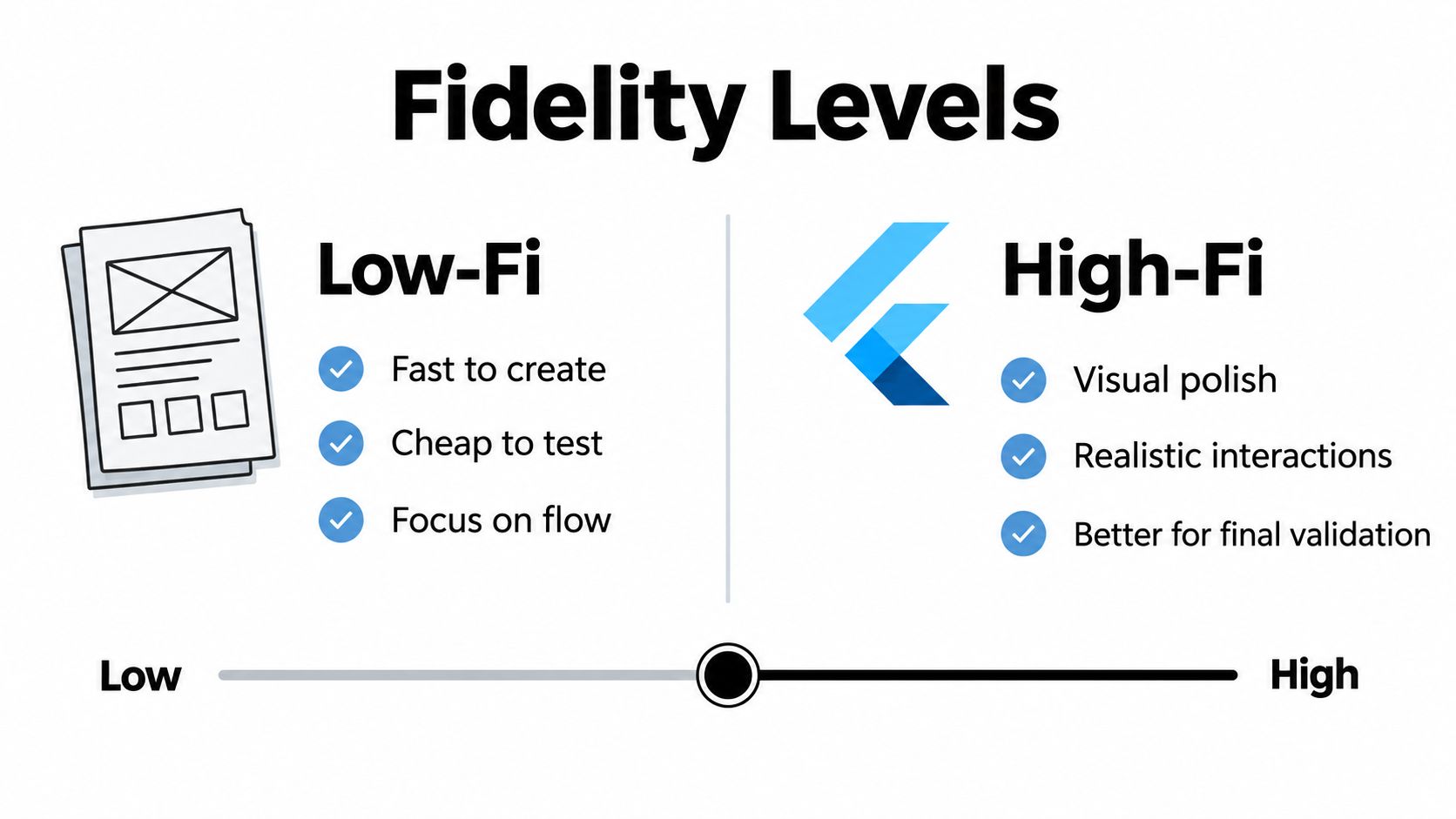
Fidelity is the degree of detail and behavior represented in a prototype. It isn't a quality score. A paper sketch can answer a navigation question more economically than a polished build, while a static screen can't establish whether a swipe interaction feels usable.
A 2024 University of British Columbia study compared a functional Flutter booking app with an equivalent paper prototype on phone-sized sheets. Fidelity had only a minimal effect on quantitative usability ratings, although it changed the type of qualitative feedback participants offered.
That distinction matters when deciding where to spend your next design effort.
| Unanswered question | Appropriate starting point | What remains untested |
|---|---|---|
| Does “Request appointment” mean what users expect? | Paper or low-fi wireframe | Actual submission behavior |
| Can users locate their upcoming call? | Linked layouts with clear navigation | Native back behavior |
| Is the primary action visually distinguishable? | Styled screen with realistic content | Touch accuracy during use |
| Does dragging the calendar conflict with scrolling? | Functional interaction on a phone | Production performance unless implemented |
Require a Decision Before Adding Detail
Before increasing fidelity, write the decision the added detail will support. “Evaluate whether the confirmation action remains visible when the keyboard opens” is a useful reason to build more behavior. “Make it feel finished for stakeholders” is a presentation requirement, not usability evidence.
Increase fidelity when the unanswered question requires it, not when the current artifact looks embarrassingly simple.
There's still a legitimate place for polished stakeholder presentations. Keep their purpose separate from user testing, and don't interpret approval of the visual direction as confirmation of the task flow.
For the discovery-call app, retain the rough version while the team resolves terminology. Add visual hierarchy when participants understand the path, and implement calendar behavior when selecting availability becomes the research question. Each upgrade should make something previously uncertain observable.
Building an Interactive High-Fidelity Mockup
Build around the validated booking path, not around a complete feature inventory. Interactive should mean that the prototype responds coherently to the actions under examination, including attempts to go back, change a choice, or submit incomplete information.
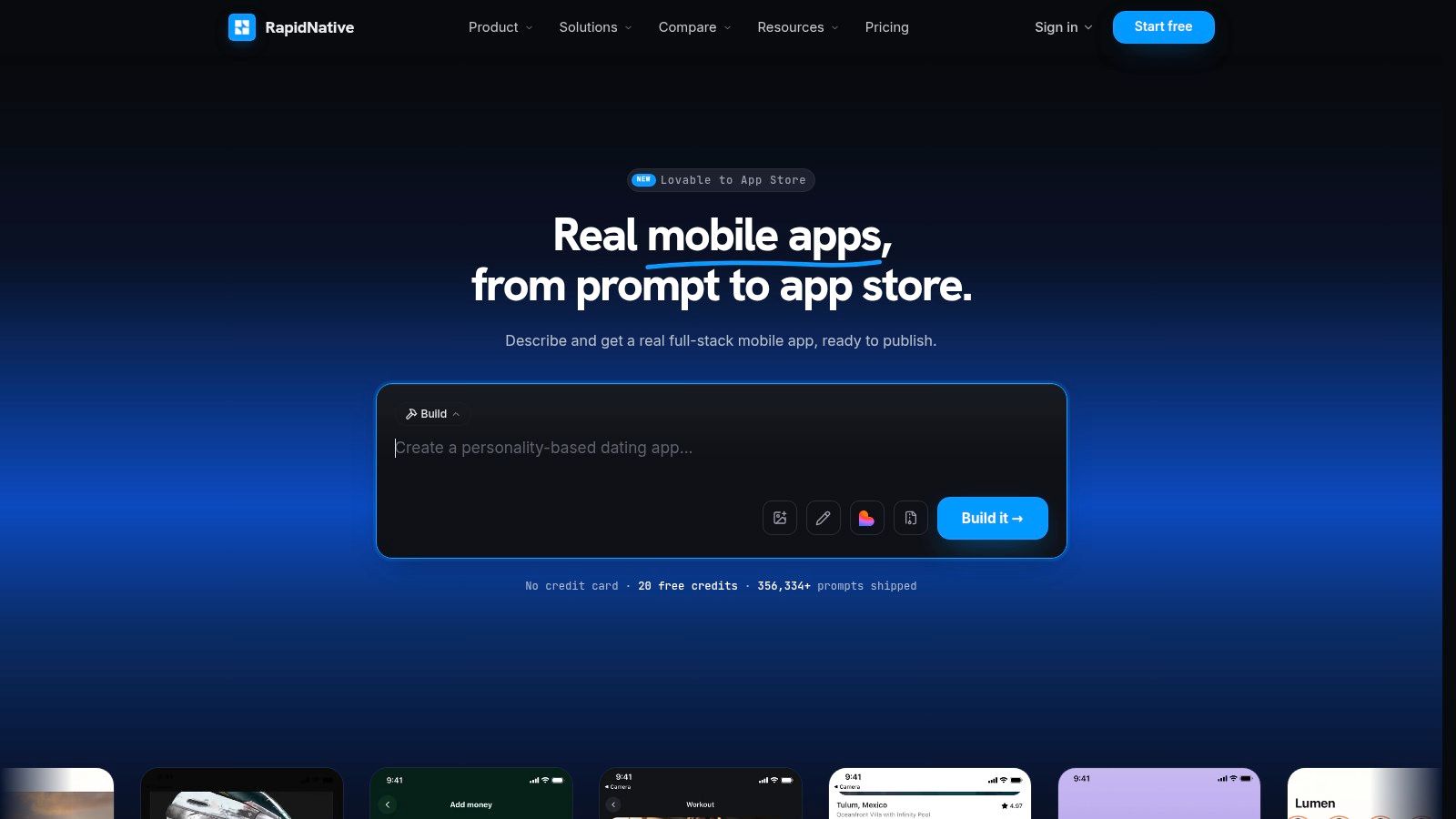
RapidNative is one option alongside Figma for this work: it can turn prompts, sketches, images, or product requirements into shareable React Native apps. Use a prompt-to-app or whiteboard-to-app starting point to establish the screen skeleton, then inspect the generated navigation and components rather than treating the initial output as an approved design.
The builder view shows the kind of working interface you'll refine.
Replace Decorative Placeholders With Test Content
Use plausible, explicitly fictional project details rather than Lorem Ipsum. In the booking example, include a project title, appointment description, availability, time-zone explanation, and confirmation copy. If the product charges for calls, use the planned pricing and disclosure language rather than inventing a test price.
Create reusable buttons, form fields, appointment cards, and status messages. A shared component makes it easier to revise behavior consistently after testing.
- Loading: Show what happens while availability is retrieved, including whether another tap is accepted.
- Empty: Explain what the user can do when no appointments are available.
- Error: Preserve their selection and provide a recovery action.
- Success: Confirm the result and distinguish it from an intermediate acknowledgment.
Define the Interaction Contract
Specify what taps, scrolling, swipes, and back actions do. If the prototype simulates a booking response rather than contacting a service, record that limitation for the moderator and developer.
The MUG-10 framework recommends at least five representative users per iteration, repeated moderated testing, and behavior-based comparison between product versions when a design decision is uncertain. Apply that comparison to a concrete alternative, such as selecting a time before entering project details versus afterward.
Before sharing, walk through the entire task without using the editor. Verify that controls respond, state changes are visible, entered information survives expected navigation, and simulated behavior is documented. A clickable slideshow shouldn't be mistaken for a functional booking system.
Auditing Information Architecture and Touch Targets First
Start the review with where information lives and how people reach it. A clear button won't solve a feature placed under an unexpected category, and larger text won't clarify an ambiguous booking status.
An expert-derived classification of mobile usability issues assigned 27.36% to information architecture, 20.75% to user-interface design, 16.04% to performance, and 10.38% to interaction patterns. These are shares within that dataset, not predictions for your app, but they provide a useful reason to examine structure before decoration.
Review in Dependency Order
- Hierarchy and labels: Ask where a first-time designer would look to change a call. Check whether “Bookings,” “Requests,” and “Appointments” describe distinct things or inconsistently name the same thing.
- Controls and input: Inspect tappable regions, gesture conflicts, keyboard coverage, focus movement, and back behavior.
- Waiting and recovery: Review slow loading, unavailable data, interrupted submissions, and offline transitions. Identify which require a functional build to test.
- Visual presentation: Assess typography, spacing, contrast, and color after the task structure is coherent.
Don't ask reviewers to approve all of those concerns in a single aesthetic discussion. Record structural failures separately from visual preferences so the founder can prioritize changes without dismissing either discipline.
Inspect the Full Tappable Region
Android's accessibility guidance for touch targets specifies a focusable area of at least 48 by 48 dp and recommends approximately 8 dp between targets. Padding can provide the required area even when the visible artwork is smaller.
Show that region in the component specification. For the calendar, inspect the date cells, close control, and appointment-selection actions rather than judging only the icon dimensions.
Review shortcut: Outline tappable containers during inspection. Remove the outlines for user testing, but retain their dimensions in the handoff.
Use accessibility in mobile apps as a companion when documenting focus, labels, and text behavior. Meeting a target-size guideline doesn't establish that the whole flow is accessible; it resolves a specific control requirement.
Testing the Mockup on Real Devices With the Real Audience
A 2025 mobile banking prototype study involving 100 participants found that all task-success rates exceeded 80%, while two of three completion rates were higher on actual Android and iPhone devices than on desktop. The result doesn't mean every phone test will outperform desktop testing. It means you shouldn't assume the environments are interchangeable.
For the discovery-call app, a desktop preview can support discussion of layout and wording. It doesn't establish whether someone can select an appointment accurately while holding a phone or complete the form with the keyboard covering part of the screen.
Match the Environment to the Claim
A QR code or preview link is a delivery mechanism, not a validation method. Open it on representative iOS and Android hardware, then record whether it runs in a browser or a native app. Browser-based testing won't establish native permission prompts, notification behavior, or operating-system navigation that the preview doesn't implement.
Recruit people who match the defined freelance-designer audience, using the recruitment approach already established. A friendly coworker who knows the product language is useful for catching broken links, not for establishing first-use comprehension.
Run a Focused Moderated Session
Plan a 20-minute session as a practical scheduling choice, not a research threshold. Give the participant the booking task, ask them to think aloud, and observe without directing their taps.
- Record outcomes: Capture completion, time-on-task, errors, abandonment, and post-task ease.
- Include relevant constraints: Try large text, one-handed use, interrupted sessions, and low connectivity where they reflect the intended audience's circumstances.
- Document the environment: Note device, operating system, text settings, preview type, and prototype version.
Don't treat the participant-count heuristic as proof that every accessibility need or context has been covered. Recruit within the same audience while including the relevant differences in experience and access needs.
Convert failures into tickets containing the attempted task, expected result, observed behavior, environment, and proposed acceptance condition. “Keyboard hides confirmation action on the tested phone” gives developers something reproducible; “Mobile felt awkward” doesn't.
Handoff From Mockup to Engineering Without Surprise
A validated mobile app development mockup is ready for handoff when engineers can distinguish required behavior, tested evidence, simulation, and unresolved decisions. A screen collection alone doesn't communicate those boundaries.
Freeze a named version for implementation and attach the corresponding observations. Keep subsequent experiments separate so developers aren't building against an interface that changes during their work.
Specify Components and Layout Behavior
Document reusable components as contracts, not screenshots. A booking button needs its label, enabled and disabled conditions, loading behavior, focus treatment, and response to repeated activation.
For layout, define spacing tokens as shared named values and explain when each applies. Avoid isolated measurements scattered across screens that require developers to guess whether differences are intentional.
- Phone layouts: Describe how content wraps, scrolls, and responds to smaller viewports and enlarged text.
- Tablet layouts: Specify whether the calendar and appointment details remain stacked or become adjacent. Choose breakpoints from content behavior rather than assuming a wider phone layout is sufficient.
- Accessibility annotations: Include accessible names, reading order, focus destinations after errors, and how status changes should be announced.
Write acceptance conditions in observable language. For example: “When no appointments are available, display the empty state and an alternative action; don't leave the calendar blank.” That's more useful than asking engineering to reproduce a frame.
Include Privacy and Recovery in the Product Contract
Apple requires app privacy details in App Store Connect for every new app and app update, including the data practices of integrated third-party partners. Its privacy labels describe collection and whether data is linked to identity or used for tracking.
Include explanations and consent-related screens in the handoff wherever the planned product needs them. For the booking app, document what account and project information is collected, why it's needed, and which services receive it. Don't promise behavior in interface copy that the planned implementation can't honor.
If paid booking enters scope, define cost disclosure and field-specific recovery before implementation. Baymard's benchmark of 50 major mobile ecommerce sites found that 33% didn't show total order cost before requesting credit-card data, while 92% used generic validation errors without precise correction guidance.
Translate that into requirements: show the complete applicable cost before payment entry, explain the specific field problem, and preserve valid information after a failed submission. Don't copy payment fields into the mockup without deciding those behaviors.
Review Exported Code as an Engineering Starting Point
For the builder workflow described earlier, export the React Native, Expo, and NativeWind project into the team's repository. Review routing and reusable components, identify simulated services, and check that component boundaries suit the planned implementation.
Clean, modular output doesn't remove the need for engineering review. Developers still need to assess dependencies, data handling, persistence, authentication, and the difference between prototype responses and production services.
For distributed collaboration, SpecStory, Inc.’s guide for remote hybrid product teams is a useful handoff resource. Keep the decisions alongside the implementation using a shared workflow for collaborating on code, rather than leaving critical explanations in a presentation meeting.
Handoff test: A developer who missed the design review should still understand what must happen, what was tested, and what remains undecided.
The working pipeline is simple: scope the wireframe, match fidelity to the question, build the required interactions, audit structure and controls, test in the intended environment, and hand over explicit behavior. Success means the team has better evidence for what to build, not merely better artwork for the pitch.
RapidNative offers prompt-, sketch-, image-, and PRD-to-app workflows for creating shareable React Native prototypes and exporting code to your own repository. Visit RapidNative to build your discovery-call flow, preview it on a phone, and prepare a testable handoff before expanding the product.
Ready to build your app?
Turn your idea into a production-ready React Native app in minutes.
Free tools to get you started
Free AI PRD Generator
Generate a professional product requirements document in seconds. Describe your product idea and get a complete, structured PRD instantly.
Try it freeFree AI App Name Generator
Generate unique, brandable app name ideas with AI. Get creative name suggestions with taglines, brand colors, and monogram previews.
Try it freeFree AI App Icon Generator
Generate beautiful, professional app icons with AI. Describe your app and get multiple icon variations in different styles, ready for App Store and Google Play.
Try it freeFrequently asked questions
What is RapidNative?
RapidNative is an AI-powered mobile app builder. Describe the app you want in plain English and RapidNative generates real, production-ready React Native screens you can preview, edit, and publish to the App Store or Google Play.
Can I export the code?
Yes. RapidNative generates clean React Native and Expo code that you can export at any time. No lock-in, no proprietary format. Hand it to your developers or keep building inside RapidNative.
Is RapidNative free to use?
Yes. You can build apps on the free plan with no credit card required. Paid plans unlock unlimited AI generations, code export, and direct publishing to the App Store and Google Play.
Do I need to know how to code?
No. Most users build apps by describing what they want in plain English. Developers can drop into the code whenever they want more control, but coding is optional.
How long does it take to build an app?
Most users have a working first screen in under a minute. A full MVP usually takes a few hours instead of the weeks or months traditional development requires.